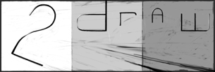
boards2draw inksci-fi style
50% - zoom in - zoom out
drawn in 13 hours with Lascaux Sketch Classic
Collaborators
iconZack
Captain
6 versions
7 hours 17 min
iconmethod3
teh f00z4h
4 versions
6 hours 7 min
Edit
» edit/delete entry
» modify users
» revise image
» unlock image
Zack (May 5, 2004) — edit
still needs a lot of work... going to try for a lot of special effects.
lol it is the teenage mutant ninja spark plug
--
Mwaha! I'll be working some ideas on this now... ph34r.
~method3
--
gunmetar!!! feel free to continue messing around, hopefully I didn't do anything that would bother you. love the radiating lines addition. -z
Zack (May 5, 2004)
drawn in 1 hour 56 min
Fin_beast (edited May 5, 2004)
This is very different from the others, but still really really cool.
I can't wait to see this finished. Seriously. :D
fleeting_memory (May 5, 2004)
teenage mutant ninja sparkplug teenage mutant ninja sparkplug teenage mutant ninja sparkplug heros in a power cell plug power! I'm ok
laurael (May 5, 2004)
Anything TMNT related is cool with me. I do like the lettering too...awesome...
Zack (May 5, 2004)
Actually, the TMNT thing is just a joke on how that thing, which started out as a random machine-like thing, ended up looking like a spark plug pumped on steroids. BUT WILL IT STAY THAT WAY?!?! WHO KNOWSASGFJGS!!!1
laurael (May 5, 2004)
I knew that(about the joke thing)...you 'mentioned' them...lol...okay...I'm outta here again...
Knockoff (May 6, 2004)
I love the colors. There some what close color to each other. Plus I like the red white blue thing. Not to mention the awesome text.
TyShitsukoi (edited May 9, 2004)
I think......THIS SHOULD BE THE NEW LOGO! love it.
Konaru (May 12, 2004)
I think this looks cool as it is, the sketchyness of the spark plug in the back is good contrast with the lettering design, looks really cool that way
Zack (May 20, 2004)
drawn in 2 hours 18 min
still a lot more to do...
Zack (May 20, 2004)
drawn in 1 hour 3 min
hurrah for layers '. - ` .' (confetti)
Ty854 (May 21, 2004)
v.2 is the best. i dont really like all the gold in v.3, but if i had to choose i would definitely want this as the logo. it is sweet.
Zack (May 24, 2004)
drawn in 2 min
the T-shirt version
laurael (Jul 13, 2004)
You ever going to FINISH this? What other ideas for this do you have in that head of yours? Maybe something related to drawing, behind the 2draw logo??
Zack (Jul 13, 2004)
Ha ha ha!
TheInfamousFlatline (Jul 28, 2004)
I must say, I liked versions 2 and 3 the most. ( I would wear one of those as a T-Shirt. lol X3 )
Zack (Jul 31, 2004)
drawn in 51 min
continuing...
method3 (Aug 9, 2004)
I have a suggestiong with v.5, if you're going to have this as a t-shirt logo, you may want to fade out the stripes near the edges. Most t-shirt places don't allow you to have things wrap all the way around the shirt. Unless you are going for a rectangle type thing. Anyway, cool technical type design.
method3 (May 8, 2005)
drawn in 2 hours 31 min
I was just messing for a long time, I don't exactly remember what my idea was in the first place. I know the blue techo-thingy now looks out of place, didn't feel like changing the colors afterwards.
Zack (May 8, 2005)
drawn in 1 hour 5 min
n.b.: top four layers currently invisible
playing with layer mixing stuff, and isolated the gadget; feel free to play with colors using the preserve transparency option
method3 (May 9, 2005)
drawn in 1 hour 45 min
Ugh, some parts just don't quite fit. The color scheme is ok... not as good as I thought it might turn out. Also I redid the line area on 2 separate layers... now I see there are some problems there.
Ian (Jul 23, 2005)
I <3 this! V5 is best though in my opinion.
SimplyX (Aug 17, 2005)
The latest version is the best style. I thought version 5 was just as great even though the lines needed to be smooth for the space object.
KittyKatMeowz (Sep 11, 2005)
awsome
Jodylicious (Mar 12, 2006)
I really like version 7, it's teh awesomes, it's by far my favorite as of now. The latest version isnt bad either, but I still like 7 alot more.
method3 (Mar 28, 2006)
Maybe need to go back to version 5 and see what happens? I agree, it's a good version but needs maybe some more clean/bold lines.
method3 (Apr 19, 2006)
drawn in 1 hour 21 min
'splode. I thought I (and alot of other people) wanted to see a revamped version 5 by Zack, but it took longer than expected since all the layers had to be reworked a bit.
Deino (Apr 19, 2006)
All the color schemes and designs are cool, but my favorite has to be V8
sal (Apr 19, 2006)
i like v6 and v7 0_0
method3 (Apr 20, 2006)
drawn in 27 min
I added the grey back in, plus some other contrast that I think was missing in the other too-blue version.

*edit* I just noticed that for some reason the right middle bars aren't overlapping the object anymore. Will try to find a way to fix that and make a better version.
Zeal (May 14, 2006)
I think the object being above the lines looks great.. I would wear any of those on a shirt.. : D
My favorite would be V6 or V9
Backstabbed_and_broken (Jun 20, 2006)
w0w!
iamawalnutt (Oct 9, 2006)
cool. Good idea
choc_gum_dropz (Jan 23, 2007)
this one is my favourite I think.
ShiShi-Danna (Mar 15, 2009)
wow...how do you people do this kinda stuff? O.o
dorothyblueeyes (Sep 2, 2012)
i like it, altho my tastes run to the black/white simpler "2 and robot".i guess simplicity appeals to me, but this is excellent.(i don't know how people do these,either.heh.)
Cookie2 (Jun 22, 2021)
wow. just wow.
davincipoppalag (Jun 22, 2021)
zack designs computer games now.. he's quite good
Cookie2 (Jun 22, 2021)
:0
post comment
You need to be logged in to post a comment. If you don't have an account, sign up now!