| |||||||||||||||||||||||
| Public Boards/Advanced | |||||||||||||||||||||||
|
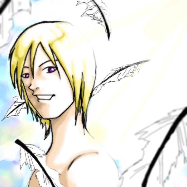
tappie_chan
(Oct 20, 2003)
Hmmm...yes, my first drawing on the new 2draw will be an angel. Its like 1:31 am, so obviously there will be some kinks I need to work out. Oh, the type tool isn't working. Maybe I'm using it wrong? can anyone help me? Gahhhh...somethings bothering me about this...hopefully its something that can be worked out in color. Can one of the moderators grant me some more space to finish this pic please? I beseech thee. I cannot leave it uncompleted. Thanks ^_________________^ one more thing... I LOVE THIS SITE!!!!!!!!YAAAAAAAYYYYYYYY!!!!!!!!!! ^_______________________^ *ahem* sorry 'bout that he he ^^; |
| ||||||||||||||||||||||
| Public Boards/Intermediate | |||||||||||||||||||||||
|
marcello
(May 21, 2002)
Ok, there *would* be an animation, but for some reason my computer dies when I'm almost done with the picture... this is from the last screen-save I took.I'll try to finish it, but it's quite piss-offy.
QTgillie (Mar 20, 2008)
This is so pretty!
Broken_Heart_ (Jun 29, 2009)
WaW..very nice..Good-Job
dorothyblueeyes (Jan 25, 2012)
it is very lovely, but i was wondering,do most of the showcase wind up as female pix?the tiger was different, yes.maybe that's what lotsa younger artists draw a lot, lots of anatomy. i forgot, we did do that a lot. " figures, figures,nudes," and when you get outa school, you get a job at kinkos, running machines.tsk tsk.
davincipoppalag (Mar 19, 2020)
'cello draw |

| ||||||||||||||||||||||
|
UppityCracker
(Mar 13, 2003)
Mr. Monkey likes Cigars. The glasses don't have any lenses, he just wears them to look more intelligent. Edit: Aww shitty my new edit didn't show up, oh well.
azure15 (Aug 20, 2009)
pffffffhahahaha! this is so awesome i cant even stand it! it brings joy to my cold heart.
PoMenaceTrees (Jun 18, 2015)
Man somebody has been snoopin around my house with a dang camera. I thought there were laws about posting pictures of folks without their permission. Harumph!, least wise ya kept it decent.
davincipoppalag (Oct 31, 2019)
this always reminded me of George Burns
AmigeEctordiss (Aug 25, 2023)
when i smell that ZAZA |

| ||||||||||||||||||||||
|
Darksun
(May 8, 2002)
Game over man! Game over!
inglesurlg13 (Feb 16, 2005)
WOW! that is really awsome! its so.. shiney ^_^ i just wanna reach in and touch it. Also, it looks metalic or like its wearing armor.. SWEETNESS!
Punky (Nov 12, 2005)
Wow.I love the contrast between the red and the blue shading. :D Congrats on the showcase.
Stilzken (Nov 7, 2010)
Oh, well my alien's gonna go cry in a corner now :(*heh, jokes* Anyway, the blending of the blue and red with the black is awesome. The colours make it seem like a red alert is flashing. I love seeing different interpretations of the Alien.
davincipoppalag (Dec 12, 2019)
Needed to be seen again |

| ||||||||||||||||||||||
| Main Forums/2draw.net | |||||||||||||||||||||||
 |
tappie_chan (Oct 11, 2003)
do you have to specify the person you will collab with, or can you just put up the line art and leave it open for anyone to complete?
9 comments
|
||||||||||||||||||||||
| Public Boards/Beginner | |||||||||||||||||||||||
|
Zinc
(Jun 6, 2003)
Took me 4 hours.. Hahahaha.Edit: Fixed a few things that were irking me.
Gigandas (Feb 23, 2004)
I really like this XD.And Darth Maul is awesome.Everything looks good going around the picture until I run into the eyes which are just too perfectly in a football-like shape.Unless his make-up is done that way, no human eye is shaped perfectly like a football.But what the best thing on this drawing is the design on the face*eats that stuff up XD*.Nice job overall, man XD.
davincipoppalag (Feb 23, 2004)
I'm not familiar with the character..but I think this is well done... the eyes are different colors on purpose? Is that what the character has?
masamune (May 12, 2004)
I think the eye on the left is shaded because if you look the deepest shading on the right one it's the same colour.This is great! (And dauth Maul was a robot soooooo....go figure XD)
Cordelia_Pink (Jul 13, 2004)
I thought the actor who played this was really cool. lol But he wasn't really what I'd call THE villan in Star Wars 1. He didn't have much dialogue... more like body language and facial expressions. lol Anyhow good pic. looks just like him. |

| ||||||||||||||||||||||
| Public Boards/Intermediate | |||||||||||||||||||||||
|
5 comments
– latest 4:
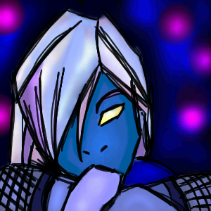
tappie_chan (Sep 20, 2003)
This is really beautiful V.V. I especially love the blueness of it (cuz blue IS the best color). he's a pretty sexy angsty dude. o.OOO.o i like it a lot ^_______^
mazi (Sep 21, 2003)
the black looks pretty damn cool. that scratchy black effect is nice. FOR uses that too.heh and yeah the bg could use a bit of work but i cant say much -_-
Knockoff (Sep 21, 2003)
Very spiffy. ;) The colors are awsome, I like the hair, Its very purdy-ful,. And actually I like the background,. Anyways nice job! (O yea Is that actually tappie- I mean shes been gone so long-Welcome back-and red is the best color) *hisses* |
| ||||||||||||||||||||||
|
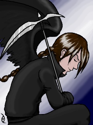
Summourn
(Aug 3, 2003)
I liked it better before I colored it.... ;___; .. eh, oh well. :3
mazi (edited Aug 4, 2003)
wow this is really good. really nice face structure
purplestarfishy (edited Aug 4, 2003)
wow that is the best pic ive seen here ever its so amazing!!! =^.^=
Aunvi (edited Aug 4, 2003)
Another Awesome pic by Summourn! ^^P
tappie_chan (edited Aug 4, 2003)
very nice. i like the sketchyness of it (good, artistic sketchiness is hard for me to pull off). the shading is also quite beautiful. *now, the constructive criticism* there just seems to be something a little...off about it. nothing major, it just seems that the head might be a tad too big or the bend of the body is a bit odd (i think that the downward curve of the wrinkle in her clothes [on the left side of her torso] that does it)or, i could be delusional O_^ |

| ||||||||||||||||||||||
|
Summourn
(Aug 1, 2003)
Hi ^_^ I'm new here... this is my first picture...
Knockoff (edited Aug 2, 2003)
Yes welcome! great first picture!
Aunvi (edited Aug 2, 2003)
AWSEOME! That is an AWESOME first pic!
Minitsaru (edited Aug 2, 2003)
wow i loove the eyes! very cool!
tappie_chan (edited Aug 4, 2003)
ooOoOoo i really like your style! it reminds me of...something. the eyes are wonderful!^_______^ welcome buddy! |

| ||||||||||||||||||||||
|
mazi
(Aug 4, 2003)
alright so its duo maxwell. good times.im starting to make up with lascaux.. we used to fight a lot lol. getting the hang of it.
Aunvi (edited Aug 5, 2003)
that is Awesome. I like the highlights and the coloring.
raenboe (edited Aug 7, 2003)
This is awesome. The lineart rocks, along with everything else! Great job! Core: We want to see how 'awesome' your art is compared to this. So we can see who has the right to tell who their art is ugly.
Ari (edited Aug 9, 2003)
*squeals* IT'S DUO!!! YAYNESS!!! And such a great picture of him, too! :) :) :) |
| ||||||||||||||||||||||
| |||||||||||||||||||||||
| 2draw.net © 2002-2026 2draw.net team/Cellosoft - copyright details - 1.53sec (sql: 35q/0.65sec) |
as for the text tool, it uses your current brush (eraser, blur, etc.) to draw the text, so if you're not in paint brush mode, it won't do what you might expect. There are advantages though (being able to erase or blur with text instead of freehand). Also, for the crispiest text, use a 1x1 brush, but you can get interesting effects if you play with that as well (for example, text shadow).
And last but not least, I highly recommend using java 2 if you aren't, because java 2 supports any font you have installed which is a lot better than the default 3 or so ones.