| |||||||||||||||||||||||
| Public Boards/Advanced | |||||||||||||||||||||||
|
arrrr!
angelbate
(Jan 22, 2004)
a character which will be used for a livejournal userpic (not my character or journal). C & C appreciated, esp pointers on coloring metal.
ssmario100 (Aug 8, 2006)
Looks like Link's Sister.
tyler_da_bomb2 (Aug 20, 2006)
this is frecking sweet i think this is one of the coolest sword ive seen
jawat (Oct 10, 2009)
Her expression is striking.
clockwork-fairy (Sep 8, 2025)
soooo pretty! the perspective on the sword is really great. |

| ||||||||||||||||||||||
| Public Boards/Intermediate | |||||||||||||||||||||||
|
staci
(Mar 6, 2004)
maybe one more
Consequential_Biopsy (Mar 9, 2004)
Not much more to say than 'bloody fantastic'. The composition and simplicty of the pic are great, and you are getting damn good at drawing these faces!
mazi (Mar 9, 2004)
awesome, looks like an uber old portait, esp with the offwhite bg. love the expression.
two-na (Mar 14, 2004)
wow, this one stuck out, love the contrast you use in all of your images, so COOL
Hedwiga (Apr 11, 2004)
greta garbo!! awesome! |

| ||||||||||||||||||||||
| Public Boards/Beginner | |||||||||||||||||||||||
|
Alicia
(Feb 20, 2004)
Simplicity does not detract from beauty.
tappie_chan (Feb 20, 2004)
this looks like something i would hang on my wall. i love it. its so soft and beautious ^__^
Alicia (Feb 20, 2004)
thanks |
| ||||||||||||||||||||||
|
Carlucci
(Nov 27, 2003)
Awwite!
Harmanye (Nov 27, 2003)
"This does not look good foh homestahwunner."This is fabulous, looks just like him!
tappie_chan (Jan 2, 2004)
this is excellent! i ADORE homestar! nice job.
Missy509 (Jan 2, 2004)
OMG I love homestar!! it looks just like him !! |

| ||||||||||||||||||||||
| Main Forums/2draw.net | |||||||||||||||||||||||
 |
mikhail (Jan 1, 2004)
well, xod linked me this site... its... ill let u decide for yourself really, this really isnt for the children... so whadduthink, is this art, do u like it or find it sexy? or the extreme opposite... i usually dont mind gore... or porn--but when u combine them.. that really doesnt work for me
20 comments
|
||||||||||||||||||||||
| Specialty Boards/Collaborations | |||||||||||||||||||||||
|
if you wanna join just say so...
27 comments
– latest 4:
15grifficorntears (Feb 21, 2004)
I wanna join ~wimper~
Noremac (Feb 22, 2004)
now rygals strait pimpin G. hell yeah thats nicei did one......HURRAY!!
SaheraNights (edited Mar 14, 2004)
I wanna join..wait..i'm too late -cries- |

| ||||||||||||||||||||||
| Public Boards/Beginner | |||||||||||||||||||||||
|
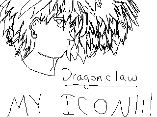
DragonClaw
(Jan 1, 2004)
just trying out some eyes. if you see this plz tell me what you think and if there are any changes i should make
Deformed (Feb 4, 2004)
Well guess what Marcello, I am an EXTREME YOU hater. I think It rocks.
DragonClaw (Feb 9, 2004)
and that is why your are my new best friend rikku
Deformed (Feb 10, 2004)
YAY!! ive got a new friend!!! *does stupid dance* YAYYYYY!!!
Childlike_Vampire (Feb 10, 2004)
I wish I could mean enough to somebody to have energy spent hating me...*sniff*Wasn't a big fan of this pic, cos of how it looks like DBZ...and while I've never actually watched the show, I think the animation is crap. Not bad shading though, I spose. |

| ||||||||||||||||||||||
| Misc. Boards/Sprites | |||||||||||||||||||||||
|
DragonClaw
(Jan 1, 2004)
i have no idea y i did thid
tappie_chan (Jan 1, 2004)
is this the pic you were talkin about D.C? the eye closest to us looks fine. I don't know if you drew or mean for us to see the other eye, but if you do want that eye there, make it roughly the same height and smaller in width (in comparison to the other eye), and a *little* lower (because of the perspective). if you don't want the eye there, add some more hair. otherwise the eyes look fine. its kind of a cool stylistic thing that the top of the eye is hidden by the eyebrow (its not really anatomically correct, but it doesn't look bad to me at all). nice yo! |
| ||||||||||||||||||||||
| Public Boards/Beginner | |||||||||||||||||||||||
|
ky
(Nov 17, 2003)
This is Kielstrom (or Kiel'), from an older drawing of mine, Silent Green (http://www.cellosoft.com/2draw/view/2540). He was a prince, but now is king.
quintessence (Nov 18, 2003)
I actually know which picture you're talking about, though that seems like ages ago. o_o Nice job, he does look matured. I liked his outfit in the first picture; like it here too.
RabidMalikFanGirl (Nov 18, 2003)
*stares* Nope. Can't touch it. Too pretty. Awesome Ky ^^
taori (Nov 19, 2003)
Rowr. *Glomps him* I love his little... hair...spikey...hat... things? They're so... perfectly shaded... and smooth... *stalks*
tappie_chan (Dec 31, 2003)
this is really beautiful. i have to say, i think that this is one of the best of yours i've seen. i love it. |

| ||||||||||||||||||||||
|
jazzysinger
(Dec 29, 2003)
This is Rivers. I drew him in pencil for my drawing class, and it turned out awesome, so i thought i would attempt it on this sight. i had to stop drawing it cause my computer is acting screwy, and i wanted this saved before something happened to it. not finished, but i am sure you can imagin it.
Vinegar (Jan 3, 2004)
rivers is sexy. and yet another person who wants to draw him..
DragonClaw (edited Jan 3, 2004)
He can be an ass if he wants to. Believe me, I know (from the extremely short grammar lesson he gave me...), but I really like this picture, you're a true artist.[edited for clarity]
jazzysinger (Jan 3, 2004)
Marcello, is this going to go into the intermediate boards. because, it has pretty good shading, and i spent a lot of time on this picture. Plus others think this belongs in the intermediated board.
marcello (Jan 3, 2004)
pictures generally aren't moved to a higher board unless there's a necessary reason. but yes, this is perfectly acceptable intermediate board material. |
| ||||||||||||||||||||||
| |||||||||||||||||||||||
| 2draw.net © 2002-2026 2draw.net team/Cellosoft - copyright details - 1.50sec (sql: 39q/0.62sec) |