| |||||||||||||||||||||
| Public Boards/Intermediate | |||||||||||||||||||||
|
BunnySlippers
(Feb 17, 2006)
No girlz allowed! They have cooties.note: I took a bazillion breaks during the making of this picture. note#2: I'll add a background later. |

| ||||||||||||||||||||
| Public Boards/Advanced | |||||||||||||||||||||
|
Gigandas
(Apr 26, 2004)
She's much prettier in real life.I'm just trying my best to get it down close enough, artificially...
fleeting_memory (Jan 10, 2007)
I'm still shocked that this isnt showcased.
Wraith (Aug 14, 2007)
What a beautiful lady! Damn Gigandas, It's just like the ref, but in black n white. Duration 1 day 5 hours! My god! I would never have the patience for that! Yeah I'd say this is Showcase, but then who am I?
Roxana1890 (Jun 21, 2008)
wow.that hair.those eyes.everything is perfect.looks like a real photo.your talent is unlimited.definately one of the best drawings on this website.
shell (Apr 2, 2010)
Oh my God this is stunning. She's stunningly beautiful. You're stunningly skilled. Amazing work. |

| ||||||||||||||||||||
| Public Boards/Beginner | |||||||||||||||||||||
|
shining_star_sam
(Feb 2, 2006)
Something sweet >.<
mx (Feb 3, 2006)
it certainly is sweetconsider moving the angel up via the copy tool...so that the feet don`t touch the edge of the canvas....this will provide a "flying or floating" effect. Also try to add some definition to the face...especially where the hair meets it...that to me is the largest problem area
saru7 (Feb 4, 2006)
It's pretty. The glowy-ness is nifty. XP
mx (Feb 6, 2006)
Yes....good improvement :) |

| ||||||||||||||||||||
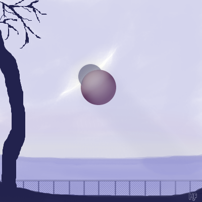
|
Pantera
(Feb 1, 2006)
It is :)
davincipoppalag (Feb 2, 2006)
The door to the parallel dimension begins to open...soft interesting scene Helena.
Felistorm (Feb 3, 2006)
Loving the fence and the planets and well all of it. One of those you can see a story beginning in there. :D
mx (Feb 3, 2006)
id like to think that that is not planets...rather like a hole in the canvas or objects on it....It seems as if there is even the faintest of shadows that go diaganol that even add more depthinteresting |
| ||||||||||||||||||||
| Public Boards/Intermediate | |||||||||||||||||||||
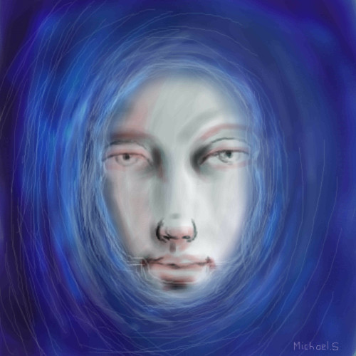
|
mx
(Feb 2, 2006)
had to get some structure back in my art - lately ive lost it
terracotta (Feb 2, 2006)
I love the mouth and eyes in this painting. It's kind of eerie...I did a painting almost exactly like this. I was really depressed at the time. I hope you're not.
Shanghai (edited Feb 2, 2006)
I feel like my art is like grabbing handfuls of sand. I keep getting new things but I keep losing things too, and they won't all fit at once, but if I stop grabbing it all slips away.
davincipoppalag (Feb 2, 2006)
Very nice drawing.I like the otherworldly look you gave it, too.
mx (edited Feb 3, 2006)
well....guys....its weekend YAY...so im not depressed btw. Generally i am depressed actually...but not today-thanks terra |
| ||||||||||||||||||||
|
TaCO
(Jan 30, 2006)
I don't feel like finishing this, so I'll call it done.Sorry i just get bored with pics. I used a ref, but I changed it around Alot!!!!!! And the time is way off
Opium (Feb 20, 2006)
Very nice! she has that red clay feeling to her. Artistic, yet greaceful. Good job Derrick :)
Anna (Feb 25, 2006)
This is really good, Derrick. It reminds me of the same softness that's in redpanda's technique.
Renuar (Mar 8, 2006)
Very dream like. Alluring...i think so. Good work
davincipoppalag (Mar 8, 2006)
You should do more like this one Derrick |

| ||||||||||||||||||||
|
mx
(Sep 16, 2005)
what a darn struggle...not supposed to be so depressing
featherstone (Oct 5, 2005)
I think so too, especially like the glassy looking eyes
Renuar (Oct 27, 2005)
Amazing eyes, colours, style. I look forward to seeing more from you.
mx (Feb 1, 2006)
i find this painting of mine a bit odd....it reminds me very much of some russian style paintings/statues...almost communistic, but not as good of course
DeadlyBlondeArcher (Feb 1, 2006)
I don't know what you had in mind as your initial intention for this piece, but if it isn't what you envisioned it would be.... be satisfied for what it is now... it's a very interesting piece of art. I like the way the lines and colors meet and are all fluid together. You achieved something very aesthetically pleasing here. |

| ||||||||||||||||||||
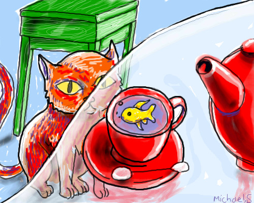
|
mx
(Dec 13, 2005)
version 2 of the "look away series"
davincipoppalag (Dec 13, 2005)
I really like this. Fish tea is a great way to start the day!
Deino (Dec 13, 2005)
Ei, Gato-eh!Nice drawing :)
mx (Feb 1, 2006)
some parts of the composition works, others not. |
| ||||||||||||||||||||
|
mx
(Jan 11, 2006)
just practicing
mx (Jan 11, 2006)
hmm...thanks....can u elaborate on the nose a bit? Is it wrongly positioned?
darkshadow (Jan 12, 2006)
i dont know just feels off to me but i would not change it
mybettastorm (Jan 13, 2006)
i dont know just feels off to me but i would not change it Yeah, I think the nose looks perfectly fine. I like this. :D
mx (Feb 1, 2006)
well...thank you so much |

| ||||||||||||||||||||
| Public Boards/Beginner | |||||||||||||||||||||
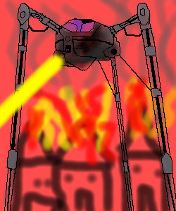
|
friend
(Nov 30, 2005)
EH! Movie looks cool.
davincipoppalag (Jan 31, 2006)
I liked the original movie better, but the effects were good in this one.
mx (edited Jan 31, 2006)
this reminds me of the intencity of the film, even though it seems a bit unfinished
Tman (Jan 31, 2006)
not to be mean and all but it seems kinda sketchy...
Ty854 (Jan 31, 2006)
Nice job! I really like the pointy headed people who are on fire in the background! |
| ||||||||||||||||||||
| |||||||||||||||||||||
| 2draw.net © 2002-2025 2draw.net team/Cellosoft - copyright details - 1.18sec (sql: 34q/0.34sec) |
drawn in 23 min