| |||||||||||||
| Public Boards/Beginner | |||||||||||||
|
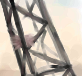
Crane
concannon
(Jun 7, 2005)
So I look at the clock, think "okay, I've got ten minutes 'til I get booted offline", and promptly begin a drawing. I'M A CLEVER ONE.Okay, it's mostly that I haven't drawn anything in a really long time and I was feeling antsy. This is a little tidbit from an idea I want as a full scale painting (watercolor, most likely); a forest of cranes, filled with bird nests, etc, all kind of dull and drab, with a really washed out sky. Dunno where it came from...probably something about deforestation, or something. ...er. And now I away to finish reading Frankenstein.
Zack (Jun 7, 2005)
nifty, I was actually thinking about drawing some construction machines recently. something about the pathos of overworked and rusty machines interests me. the contrast of placing a birthing place in the midst of gloomy, decaying structures is pretty cool.
davincipoppalag (Jun 8, 2005)
I used to see nests in the bell buoys ..this looks like that to me..
ironoxide_red (Jun 15, 2005)
Oh, I love cranes, and watercolor. I'd like to see some "dull and drab"! |
| ||||||||||||
| Public Boards/Intermediate | |||||||||||||
|
longway
(Jul 28, 2004)
my clown addition......lol
LEELEE (Jul 29, 2004)
another great one...good job
thug (Jul 29, 2004)
very spooky and creepy, I'm lovin' all the clowns too. Great job longway!
emmamommalag (Jul 29, 2004)
Dang! This is another really good one. He does look mummified. Great job, longway.
merwee (Apr 28, 2005)
so scary....i like it |

| ||||||||||||
| Specialty Boards/Collaborations | |||||||||||||
|
Okay, now you can see it!
10 comments
– latest 4:
Anna (Jul 21, 2004)
I can't believe that I'm barely seeing this one! I love it!! What a great idea! You two did great together :D
DeadlyBlondeArcher (Jul 21, 2004)
This is so whimsical and funny. I think you two should write books and illustrate them. Reminds me of my vacation when I caught the first shark all the kids on the beach wanted to see his teeth when I came out of the water with him, so I had to pry his mouth open and let them look.
ironoxide_red (Jul 28, 2004)
Ooh! Better be sure the anaesthetic doesn't wear off too soon or that squid'll be in big trouble! Love the expression on his face. :)
LasRever (Apr 14, 2005)
This is great! A squid would probably make a pretty good dentist with all those long arms for those hard to reach teeth in the back. |

| ||||||||||||
|
Kloxboy
(Jun 13, 2004)
I designed a basic background so our characters have a lot of room to do the power move. I'll start tonight, I dunno if I'll finish though.
Ty854 (Dec 5, 2004)
Lol, thats going to be hard to beat.
Kloxboy (Dec 5, 2004)
Kinda, it's actually finished now, Zack and I decided that the power moves will be solo projects. But the final piece will be a collab, I think.
spiritdweller (Dec 5, 2004)
hehe you two are outta control...
K-Dizzle (Dec 5, 2004)
lol!... this is awesome. Zack's gonna need some serious help, cuz that bastard is beyond jacked...i love the way you color all of your work...very cool :) |

| ||||||||||||
|
The Cloxboy Church! heh
26 comments
– latest 4:I kept it basic Zack. You can make the game interface much more bright and detailed or whatever you wish.
ironoxide_red (Aug 6, 2004)
You know, I just love this one! :)
Gigge (Oct 6, 2004)
What happened to the tournie?
Xodiak (Oct 21, 2004)
Awesome video game! One must build it! For real! >:D|XOD|
Kenshin (Oct 21, 2004)
That is awesome.. The coloring and everything is great! |

| ||||||||||||
| Misc. Boards/Sprites | |||||||||||||
|
Harmanye
(Aug 7, 2004)
There is a reffy pic, but it was saved onto my computer, soo... auhhuh.Shadows. Yes. When you look this cool, only big losers and lesser wimps actually care that you're going to destroy their homeworld.
ironoxide_red (Aug 8, 2004)
If that thing came after me I'd be to scared to care about *anything*..! I like how you used the grey for the brighter parts. Perhaps it would be even scarier with a "body shaped" shadow?
Harmanye (Aug 8, 2004)
Probably. I dunno.I don't think The Shadows casted shadows on B5... I haven't seen the Shadow episodes in awhile though.
ironoxide_red (Aug 12, 2004)
I didn't know where this came from, I was just thinking of the grey shadow-y thing beneath him/it. Though I guess he wouldn' be casting a shadow if he already was one.. :)
bumpinthenight (Sep 30, 2004)
reawr.... spider hybrid...... shexshy... XD |

| ||||||||||||
| Public Boards/Intermediate | |||||||||||||
|
Kloxboy
(Jul 28, 2004)
for the evil clown series
ironoxide_red (Jul 29, 2004)
Evil, stupid, bald - very scary! He reminds me of the photo on the cover of my copy of A Confederation of Dunces. Nice work!
thug (Jul 29, 2004)
this rocks! reminds me of a nightmare I once had. If his mouth glowed red like coals that would be the guy who haunted my dream.
Aubrey (Aug 6, 2004)
I never got ta see this *sniffles* That guy does look very scary. That's a wicked grin you gave him Clox!
Xodiak (Sep 12, 2004)
When I will have my own little kids, I will take this one for their parties. >:)|XOD| |

| ||||||||||||
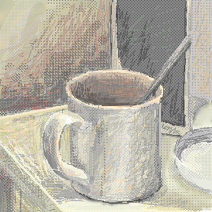
|
brainspiller83
(Jul 28, 2004)
Illustration from one of my favourite games- final fantasy 8. can't wait til i've finished it though!lil (brainspiller)
davincipoppalag (Jul 30, 2004)
Yes..very nice textures and shading in this one. good drawing!
LovelyLori (Jul 30, 2004)
nice job on this!
Cordelia_Pink (Aug 4, 2004)
oooh he's lookin' good... =) well, mysterious. nice job.
two-na (Sep 4, 2004)
this is my favorite of yours :) you're so artistic! ahhh |

| ||||||||||||
| Public Boards/Beginner | |||||||||||||
|
ironoxide_red
(Aug 8, 2004)
Amazing thing, halftones... Need some constructive criticism regarding technique.
davincipoppalag (Aug 10, 2004)
This is wonderful. I love the textures. Very nice drawing
ironoxide_red (Aug 12, 2004)
Shading, no shading... Style and/or realism. Could go either way, really. In this case it kind of ended up somewhere halfway between the two, mainly because I couldn't make up mu mind. And I haven't decided yet what style to go for the next time... :)
sephiroth54321 (Aug 16, 2004)
sorry I guess it's better than I could do (duh)
ironoxide_red (Aug 25, 2004)
Hey, no need to apologise - like you said, I did ask for criticism! :) |
| ||||||||||||
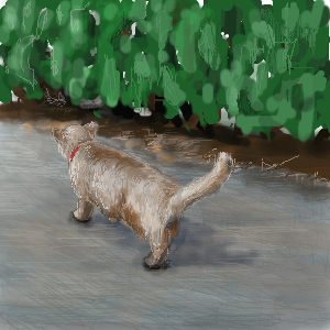
|
ironoxide_red
(Aug 11, 2004)
Well, I promised my sister to draw her a cat and I did. Not sure what board this should be on, I'm submitting it here and then the moderators can move it to Beginners if they think that's better, ok?
mx (edited Aug 12, 2004)
I think it should at least be in intermediate. (i think it has potential for going to the advanced...with work of course:) )Maybe consider adding more light to the road around the cat and add more definition to the cat. Have a play between "dark - light - dark" In other words...dont have the same tonalities next to each other, especially with the vocal point(the cat). Also get rid of the white in the top corners. It makes the painting feel very unlayered. It will seem much more finished if the white is gone:) I likes mx
Dragnakita (Aug 12, 2004)
Aww... I think that you have put this on the right board. The kitty cat is very cute. I think that you did a splendid job. I think that the bushes need a little help, though... more detail could have been added to them. The cat is really, really awesome, though. I also like the pavement. Overall great job.
ironoxide_red (Aug 12, 2004)
Oh, wait, I did put this on the Beginners board after all... Oh well. MX: Good points, though I think the whites could work - with a bit more work!:) I know I cheated a bit there, all I can say in my defense is I concentrated on the cat since my sis doesn't really care about bushes...;) Though I have a feeling something is very wrong with the perspective and/or anatomy of the cat... just can't put my finger on it.
mx (Aug 24, 2004)
well...i like it in any case:) |
| ||||||||||||
| |||||||||||||
| 2draw.net © 2002-2026 2draw.net team/Cellosoft - copyright details - 0.71sec (sql: 37q/0.23sec) |