 |
| |||||||||||||||||
| Public Boards/Intermediate | |||||||||||||||||
|
just a lil summit
frootcake
(Apr 16, 2006)
i saw, stole and drew this beer mat :) i'll finish it soon, i just fancied a warm up on the program, not used the new lascaux.
Sweetcell (Apr 17, 2006)
Came out great froot. The writing on the mug makes the glass look thick with the placement of the shadows, and it looks so frothy and good. Yumm yumm. What would finish this is a small trickle of beer down the side.
gerbear (Apr 19, 2006)
excellent draw.
Mali (Apr 19, 2006)
That's so very cool =D even though i dont like beer XD!
chan2005 (Apr 28, 2006)
wick beer texture! |
|||||||||||||||||
| Public Boards/Beginner | |||||||||||||||||
|
frootcake
(Jan 6, 2006)
ok well, 1stly this was a funny advert i saw on the net for an art class, and it's sortof in the theme on what i'm going to say, namely 'learning'. Yes, well I return to edinburgh to continue my studies tomorrow so i won't be posting or commenting on here as regularly as i have been, but i've thoroughly enjoying this holiday and drawing etc, and i look forward to seeing you all again in Easter (where we'll catch up properly). and i'll hopefully work on my unfinished pieces as soon as my workload eases. god bless and goodnight.
JoeNobody (Jan 6, 2006)
I love it......I so far have the first two steps down pat, still working on the transformation to 3.....
mks (edited Jan 6, 2006)
it's funny because it's true
davincipoppalag (Jan 6, 2006)
Good luck in your classes Dave. You will be missed around here, and we will look forward to your return.
Deino (Jan 9, 2006)
Very funny xD |
|||||||||||||||||
| Public Boards/Intermediate | |||||||||||||||||
|
frootcake
(Jan 6, 2006)
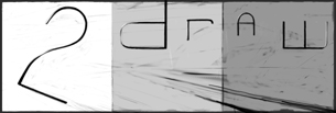
i guess this isn't really intermediate, but i wanted the big canvas since i think the white is necessary. my fave is the one on the right, the middle one was done using JTablet, and the one on left was done while zoomed in and movin around.
IkariIreuL (Jan 6, 2006)
haha funny
somebody (Jan 6, 2006)
hahaha I love the progression. Yeah I was amused. Great job. This one really caught my eye. I love it
LisaAnne (Jan 6, 2006)
Wonderful use of style with subject.
fleeting_memory (Jan 6, 2006)
I love this! I also love the extreme ADD display along the way! :) |
|||||||||||||||||
| Public Boards/Beginner | |||||||||||||||||
|
frootcake
(Jan 6, 2006)
i could probably work on this for ages, but i gotta tidy my room, infact i wouldn't be suprised if i don't have any room left.edit, i ment room as in kb for this picture, not like my room got so messy i have no room... before doin this, i thought "hey dba could do this justice" but hey its just a pciture at the end o the day. |
|||||||||||||||||
|
frootcake
(Jan 5, 2006)
i wanted it less that 20mins but im such a goddamn perfectionist
kejoco (Jan 5, 2006)
Looks awesome...only thing that stands out to me that doesn't seem to work with the rest of your drawing is the belly button other than that, extremely cool
frootcake (Jan 5, 2006)
shh dont point that out or else everyone will stare at it. i'm out o space, so i can't fix it :(
SimplyX (Apr 28, 2006)
this is great!!!! i always wondered what's the end of the rainbow. :)
Sweetcell (Apr 28, 2006)
Psychedelic, maybe this is what a person on acid sees. Great emotion in this. Very Axilish. |
This is hidden because it is rated 18+. Edit your privacy settings to make it visible.
| ||||||||||||||||
|
frootcake
(Jan 5, 2006)
i feel like i'll never master some of the tools on this program, also i still can't smoothly shade for sh*t
pandabarrie (Jan 5, 2006)
feathering layers? i dont think ive ever heard of that...anyway, i really like this! it reminds me of the sleeping bear sand dunes^^
Anna (Jan 5, 2006)
I have no idea how to feather layers but I do know a little about using opacity, flow, and blend. They're mah best friends.
kristine (edited Jan 5, 2006)
hey froot, you ever tried shi? its a tad bit easier is the shading dept., i think :) but i like this, it reminds me of the old days :) good job.
Felistorm (Jan 5, 2006)
Ok this just freaks me out. LOL But it is excellent. Interesting concept. o.O |
|||||||||||||||||
|
frootcake
(Jan 4, 2006)
padme, who became a zep inspired piece who became..grr
who became zep inspired again. shes likes long walks and pina coladas
kristine (Jan 4, 2006)
O_o which portrait? the girl? this is nifty im loving the lips :)
frootcake (Jan 4, 2006)
yea the girl. like the palette and the way her hood is diagonal like the hair in yours, only a loose resemblence, and yours is infinitely better |
|||||||||||||||||
|
frootcake
(Jan 4, 2006)
to ask you for your comments on another of my picturesits beginnin to get tiresome although i want to finish it, what can you see needs doin. thanks. also i liked this picture so i semi copied it
davincipoppalag (Jan 4, 2006)
It looks like one of the little houses in the village in BeetleJuice... with the hanging stars over it..still not happy,
Felistorm (Jan 4, 2006)
Looks like something I would see in a dream. Awesome! Love the idea. |
|||||||||||||||||
|
frootcake
(Jan 4, 2006)
any other woody allen fans in the building?sorry this crappy, i should delete it.
frootcake (Jan 4, 2006)
ahh cool, glad and suprised you recognised him. i've not actually seen many of his movies, watched manhattan yest and watching annie hall later. i like his stand up, just his wit in general comes across in his movies and at award ceremonies. cool well thanks for the comment
davincipoppalag (Jan 4, 2006)
Really good caricature..I recognized him right away.. lol
IamaCunt (Jan 4, 2006)
Good Job, really looks like Woody...I didn't even have to look at the description.
Kloxboy (Jan 4, 2006)
Excellent, looks like him. One of my favorite writer/actor/directors. Annie Hall is one of my favorite movies. I like almost all his films, good stuff. |
|||||||||||||||||
| Public Boards/Intermediate | |||||||||||||||||
|
frootcake
(Jan 2, 2006)
curiosity killed the catthink i'll add a thickish black line round it to fin, comments appreciated. trying to clear my studio, for better for worse
davincipoppalag (Jan 4, 2006)
Not sure I like the dark outlines..but it's a powerful piece.
featherstone (Jan 4, 2006)
this is really cool, Dave
SYTHE (Jan 4, 2006)
Alas poor dead guy, we hardly knew ye. Nice use of panel shading techniques. |
|||||||||||||||||
| |||||||||||||||||
| 2draw.net © 2002-2026 2draw.net team/Cellosoft - copyright details - 0.94sec (sql: 30q/0.47sec) |