| |||||||||||||||||||||||
| Public Boards/Intermediate | |||||||||||||||||||||||
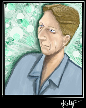
|
Belldandy
(Jan 28, 2006)
... |
| ||||||||||||||||||||||
|
mx
(Sep 16, 2005)
what a darn struggle...not supposed to be so depressing
featherstone (Oct 5, 2005)
I think so too, especially like the glassy looking eyes
Renuar (Oct 27, 2005)
Amazing eyes, colours, style. I look forward to seeing more from you.
mx (Feb 1, 2006)
i find this painting of mine a bit odd....it reminds me very much of some russian style paintings/statues...almost communistic, but not as good of course
DeadlyBlondeArcher (Feb 1, 2006)
I don't know what you had in mind as your initial intention for this piece, but if it isn't what you envisioned it would be.... be satisfied for what it is now... it's a very interesting piece of art. I like the way the lines and colors meet and are all fluid together. You achieved something very aesthetically pleasing here. |

| ||||||||||||||||||||||
| Public Boards/Beginner | |||||||||||||||||||||||
|
SYTHE
(Dec 18, 2005)
"When the doctor said I didn't have worms anymore, that was the happiest day of my life." -Ralph Wiggum-
JK-Arts (Dec 19, 2005)
awsome pic.
Creature201 (Dec 19, 2005)
In the immortal words of Mr. Burns, "Excellent".
monoplyguy (Feb 1, 2006)
mmmmmm......internet...auggggggggggg |

| ||||||||||||||||||||||
| Public Boards/Intermediate | |||||||||||||||||||||||
|
mx
(Jan 11, 2006)
just practicing
mx (Jan 11, 2006)
hmm...thanks....can u elaborate on the nose a bit? Is it wrongly positioned?
darkshadow (Jan 12, 2006)
i dont know just feels off to me but i would not change it
mybettastorm (Jan 13, 2006)
i dont know just feels off to me but i would not change it Yeah, I think the nose looks perfectly fine. I like this. :D
mx (Feb 1, 2006)
well...thank you so much |

| ||||||||||||||||||||||
|
thesolarwinds
(Jan 30, 2006)
for a certian saint, his very own island... sort of. ref used. I find copying images like this BORING!http://funkymonk.com/Hawaii/images/Landscapes/SM_Big_Beach.jpg
darkshadow (Jan 30, 2006)
looking good keep it up
hideyourface (Jan 31, 2006)
could use more details and contrast. I like the part where the light hits the beach.wheeee... suck-age.
ACertainSaint (Feb 1, 2006)
My angel, it is wonderous. I shall live there! FOREVER! |

| ||||||||||||||||||||||
| Public Boards/Beginner | |||||||||||||||||||||||
|
101_Torchic_101
(Jan 29, 2006)
(>,<) Grrawr! Lol..I'm gonna go eat.
Gigandas (Jan 29, 2006)
This almost looks like what you'd see if a powerpuff girl died and came back to life, no?
SanzoGirl (Jan 30, 2006)
AwwwI want it! D:
Punky (Jan 30, 2006)
<3 I love zombies, and I love this. C:Although, for crits; the bcakground could be much better, less blurred, and maybe it could go better with the zombie's style. And, the highlights in the hair still bother me. They just seem... I dunno... :/ Otherwise, good job. bonus point for the fact that its a zombie
darkshadow (Jan 31, 2006)
must eat brains......nice blending of the red gray and whites |

| ||||||||||||||||||||||
| Public Boards/Intermediate | |||||||||||||||||||||||
|
(^.^) Anyone wanna do lineart?
12 comments
– latest 4:I'll finish sometime soon..my sister is literally driving me insane (O_X) *nersous crazy laugh*
(-_-) Uhg..lazy bg..
Zeal (Jan 26, 2006)
looks a lot cooler than the one i did on adobe..
kristine (Jan 30, 2006)
you arent daring enough with the colors, its to bland. the hair is boring, like is one big fat starnd of hair, no definition. |

| ||||||||||||||||||||||
| Public Boards/Beginner | |||||||||||||||||||||||
|
7 comments
– latest 4:
woah_pockster (Jan 27, 2006)
DOMO DOMO
voodoobunny (Jan 27, 2006)
I love this :D *refresh refresh refresh*
22darkangel22 (Jan 30, 2006)
omg! domo-kun of bambi doom!!NYHAHAHA! DIE BAMBI DIE *hits refresh button*
darkshadow (Jan 30, 2006)
i agree with voodoo *refresh refresh refresh* great pic very very funny |

| ||||||||||||||||||||||
| Public Boards/Advanced | |||||||||||||||||||||||
|
mikron
(Dec 31, 2005)
.almost done..
Finito
davincipoppalag (Jan 21, 2006)
It's always good to keep abreast of new things coming out of silicon valley.
darkshadow (edited Jan 30, 2006)
it really is a good idea to keep on top of things like that dave like the skin tones and ya Boobies O_O |
This is hidden because it is rated 18+. Edit your privacy settings to make it visible.
| ||||||||||||||||||||||
| Public Boards/Intermediate | |||||||||||||||||||||||
|
Belldandy
(Jan 25, 2006)
...
davincipoppalag (Jan 25, 2006)
Clever idea katya, and a nice reflection you did there.
DinoFlorist (Jan 26, 2006)
I think this is the 1,402th drawing on this site that has this title.
darkshadow (Jan 27, 2006)
that may be true dino but 3/4 of them dont look this goodvery cool pic i agree with dave
fleeting_memory (edited Jan 29, 2006)
I can tell its your picture cause he's in it :) The mysterious bus driver....Edit: it is an awsome-ly done picture by the way |

| ||||||||||||||||||||||
| |||||||||||||||||||||||
| 2draw.net © 2002-2026 2draw.net team/Cellosoft - copyright details - 0.98sec (sql: 39q/0.55sec) |
i noticed that too memory
it did change cool