| |||||||||||||||||||||||
| Misc. Boards/Sprites | |||||||||||||||||||||||
|
psf
purplestarfishy
(Sep 16, 2003)
its a little purplestarfish! can i have this as my user icon would that work very confusing its a bit small come to think of it and it says psf in the top corner for those special people =^.^= its pretty anyway i think
concannon (Sep 16, 2003)
Cute. I like. Nice shading. |
| ||||||||||||||||||||||
| Specialty Boards/Collaborations | |||||||||||||||||||||||
|
"Yeah, it's kind of overdoing it to nuke a whole village for food and candy, but hey, i'm too cheap to pay for that kind of stuff... cookie?"
27 comments
– latest 4:done. (pinches boy)
ShadowKitten (Aug 4, 2004)
i really love the way you did the fire in the background and the highlights on the hair excellent job you guys
Mipunai (Aug 12, 2004)
Wow, I love the colors and the backround a lot n_n It's very pretty
yuohoo (Jan 4, 2005)
THAT LOOKS! so AWSOME!!!!!!!!!!!!!!!!!!!!!!!! I like it all! even the bloody sword! I like! the background looks shiney...ohh....*u*
Namori (Aug 5, 2005)
*squeals* so good!!! i love the background, it's so pretty! And i like his clothing too! XDDD |

| ||||||||||||||||||||||
| Public Boards/Beginner | |||||||||||||||||||||||
|
Zappo
(Sep 15, 2003)
Damn drawing block!Damn drawing block
Edit: Im sorry i have no idea why but latly i havent had the drive to draw, i want to, but can never think of anything and my skills are slowly deterorating.....
method3 (Sep 15, 2003)
Weird... looks like he was cut out and pasted on top of the background.
quintessence (edited Sep 15, 2003)
Vaugely frightening, but... nifty. *blinks at it*
concannon (Sep 15, 2003)
Dig the wings. Disturbing chin. I assume it's a chin. ~__~ |

| ||||||||||||||||||||||
| Public Boards/Intermediate | |||||||||||||||||||||||
|
mazi
(Sep 15, 2003)
yay. boobehs.
quintessence (Sep 15, 2003)
Yummy. Love the hair, and the boobage, of course. (Heh, I said boobage. o_o;;) Skin shading is pretty too, as always. ...lucky girls. *prods them*
dragon_girl (Sep 21, 2003)
are they both Girls *_*
mazi (Sep 21, 2003)
...yeah. hence the boobs? that would be really odd anatomy for a guy.. unless he was taking hormone replacements or something.. |
This is hidden because it is rated 18+. Edit your privacy settings to make it visible.
| ||||||||||||||||||||||
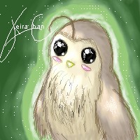
|
keira-chan
(Sep 15, 2003)
Its going to be my icon... a fluffy chubby owl... >.>... I like it, it's cute.. to me at least ^_^; Anywho... C&C welcomed *wink wink nudge nudge*
raenboe (Sep 15, 2003)
Awww! I wub it! So kawaii!
amuy (Sep 16, 2003)
aww it looks like a Californian quail or a bob white!!! they're so coot. I had 12 but then some got eaten ;( anywhoot coot quail/owly thing!! it roxors!
cherikit-chan (Sep 24, 2003)
*heavenly light shines on picture while angelic songs in the backround play* it's so beautiful. * a tear streams down cherikit-chan's cheek*and....cute... |
| ||||||||||||||||||||||
| Misc. Boards/Sprites | |||||||||||||||||||||||
|
xvolcomx
(Sep 15, 2003)
Icon
method3 (Sep 15, 2003)
"Beware, runner crossing."Reminds me of something you might see in a nike commercial or something.
xvolcomx (edited Sep 15, 2003)
haha, its actually from a band. My friends brother turned me on to them. Thier a trash band.edit: um...I mean thrash band. oops
concannon (Sep 15, 2003)
Bwahah, very neat. Dig the neon-ness.It's more like "Beware, speed-skaters." At least, that's what it looks like to me. XD |

| ||||||||||||||||||||||
| Public Boards/Advanced | |||||||||||||||||||||||
|
furyofroy
(Sep 13, 2003)
Finished. See the caption for entry two to see what I think of this. >_<
concannon (Sep 18, 2003)
*massages forehead in annoyance*Look. In no way was I bashing Roy, insulting his work, etc, etc. I agree, he's fantastic for his age, and per usual, most of his drawb by hand works are better than his oekaki. However, it IS possible to attain smoother lines in Shi-Painter, and I was just pointing it out. The point is, he's trying to work his way up to Ian's level, and he's well on his way there. However, if he gains no constructive criticism....what's he going to base his improvement on? Also. I know what it's like to compare yourself to people who are ridiculously skilled; I, myself, stupidly compare myself to people such as Cara Jane Mitten, Aido Rakaen, Ursula Vernon, Jessica Hickman, Roux (Hilary See Penna), Lurid, Holly Ramirez, Amelia Stoner, and so forth. And because of constant viewing of their work, improvement can be achieved. I've drawn both a piece in Amelia Stoner's style, and one in Cara Mitten's. And for the last note: If you don't like being attacked for what you say, say what you originally planned to say more politely the next time. Then something like this *waves hand around* may be avoided.
TheLIVR (Sep 18, 2003)
I know what I did was definately not constructive criticism, and maybe not the most polite as it did. However, it is needed. Grounding statements like those can really help people refocus, so they don't delude themselves into a constant "oh my god, I suck, why can't I draw as well as amazingly-godly-artist-guy?" One of the things I hate the most of my artist friends is there constant self-loathing. I've found that they need perspective. Not the drawn type, the mental one. To keep a level head, they need to keep their eyes on the reality of things. If Roy happened to actually be able to create a work that matched one of Ian McConville's weekly cartoons, you know what it would mean? That Roy is a better artist than Ian McConville, and was able to produce top quality merchandise with inappropriate tools.
nyao (Sep 30, 2003)
wow... that's so cool... i luv this style, and the cute furries. ^^
rogue__wolf (Jan 15, 2004)
awww cute fuzzies!!!! |

| ||||||||||||||||||||||
| Misc. Boards/Sprites | |||||||||||||||||||||||
|
Dan_the_Kat
(Sep 14, 2003)
I thought I was about to lose this "sprite" I made.... Like it, hate it, it shouldn't matter to me.
concannon (Sep 14, 2003)
Aw, that's so adorable. *huggles it* The shadow is great. The lone flower looks a little out of place, though...maybe add a couple more?
Gothic_Otaku (Sep 14, 2003)
Is one of the sleeves supposed to be part blue?
marcello (edited Sep 14, 2003)
you might want to set a zoom %, so it's easier to seeedit: nifty |

| ||||||||||||||||||||||
| Public Boards/Beginner | |||||||||||||||||||||||
|
Marienkind
(Sep 14, 2003)
'cause it's fun.
marcello (Sep 15, 2003)
Actually, don't memo a mod, just post it on the message board.
panda_panda (Sep 15, 2003)
ooooooooooooo O_o riiiiight....
method3 (Sep 16, 2003)
Memo a mod and die. No really. It's like the ring... only worse.About the picture, I'm just saying it looks like a hole in the mouth, simply because the coloring around that area doesn't imply that the mouth is complete. In other words, seems like Marienkind went over with the skin tone and put a dot over the black line... and didn't add pink in the mouth back over to make the edge continuous and smooth. Not that it looks wrong, but at first glance that's what i thought.
nyao (Sep 29, 2003)
prettie.. i luv her smile and the bubblie background. ^_^ |

| ||||||||||||||||||||||
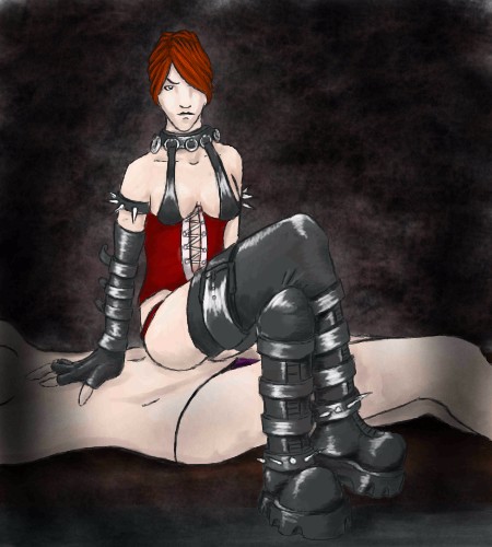
| Public Boards/Intermediate | |||||||||||||||||||||||
|
mazi
(Sep 13, 2003)
fgdsfgdsfaaah fak.. i forgot to color the thing in the boots and the buckle and signing it and ive hit ye good olde limit. pah.
Hakkai (Sep 13, 2003)
-prods the boots and semi-nekkid person underneath- o_O; I can definately say this is a sort of picture that I've never seen before. Took me by surprise... in a 'whoosh' kinda way.
mazi (Sep 13, 2003)
was there an updraft with that woosh? lmao did you lift from the chair a bit?wooosh
Hakkai (Sep 14, 2003)
'Whoosh' as in I was tilting my chair back and almost fell backwards kinda 'whoosh'. XDTook me by surprise in a good way. >_o;
concannon (Sep 15, 2003)
Mm, sexy. I love the boots, and the shading on the boots. The hand seems off, though, and the head is waaay too small. Your palm should cover your face. That hand could cover her whole head. But the boots make up for it. ~_~ |
| ||||||||||||||||||||||
| |||||||||||||||||||||||
| 2draw.net © 2002-2026 2draw.net team/Cellosoft - copyright details - 2.11sec (sql: 38q/1.55sec) |