| |||||||||||||||||||||
| Public Boards/Intermediate | |||||||||||||||||||||
|
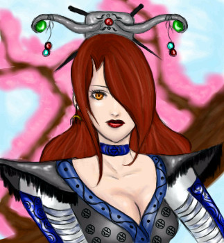
Mage Character thing...
nekodesu
(Apr 3, 2006)
Le timer lies. I was working on this on and off...woot for the pink crap :P
Shoebox (Apr 4, 2006)
Lovely lineart. I like the choker :) Reminds me of Silkroad, for some reason. This'll be great when it's done.
Sweetcell (May 28, 2006)
I remember this, I was waiting for you to finish. Very nicely done. Love her hair.
davincipoppalag (May 28, 2006)
Very well done neko..pretty
ginny_91 (May 29, 2006)
this is awesome I wish I could color or even just draw like you! |
| ||||||||||||||||||||
| Public Boards/Beginner | |||||||||||||||||||||
|
7 comments
– latest 4:
Shoebox (Apr 4, 2006)
Thanks guys.I really need to work on drawing without the lines, so, yeah. Really nice of all of you, I appreciate it :)
DoOp (Apr 4, 2006)
awwwww that's pretty ^_^ great job on it =3 i like the tree mostest =D
SanzoGirl (Apr 4, 2006)
Wow! O_OOkay, this is on the wrong board. This is Intermidiate/Advanced quality.
Shoebox (Apr 4, 2006)
Yeah, that tree is the first that actually looks like a tree and not a blob of green on a lump of brownAnd thank you too Sanzo. Usually though I don't use the intermediate board unless I use the extra space. Which may never happen since the beginner board got more pixels to play with. |

| ||||||||||||||||||||
|
tandrew971
(Mar 1, 2006)
2nd attempt
davincipoppalag (Mar 1, 2006)
It looks like things are where they should be, but it's awfully blurred. Sharpen up some things and it will be much better. This might help, too http://cellosoft.com/2draw/wiki/index.php/Lascaux_Sketch
tandrew971 (edited Jan 20, 2008)
.
comd (edited Apr 4, 2006)
Very nice, but perhaps it could benefit from just a few hard edges like davincipoppalag suggested? When all the edges are uniformly blurry and obscure, it sort of draws the eyes away from the picture since nothing's in focus, and so there's nothing to really draw the eye into the canvas. It's like there's no foreground subject in the picture. It could just be a few selective places like the upper edges of the eye lid or the corners of the mouth or the cast shadow of the nose: just something to pop things out a bit and pull the eyes inward. The thumbnail doesn't suffer from that so much since, at the scale, it looks like there are actual hard edges in the picture, but up close it looks more obscure than the thumbnail which is generally the reverse of what one might expect. Perhaps if the pictures are meant to be obscure up close, it could be done with some sort of texture or some painterly brush strokes. That makes it so there are new things to discover up close where the overall picture sort of dissolves into this interesting array of shapes and patterns and textures, but a digital blur/soft effect on an entire picture can destroy the clarity of it. Anyway, I hope you don't mind our suggestion: I wouldn't bother if I didn't already like the picture. |

| ||||||||||||||||||||
|
~unwritten_law_girl~
(Apr 4, 2006)
blah. |

| ||||||||||||||||||||
|
pandabarrie
(Apr 3, 2006)
just some guy looking up. really nothing special. i'll finish this later. there's homework to be done
comd (Apr 4, 2006)
Got some nice shadows blocked in. He looks very solid already.ehh...his face is a bit funny looking.
|

| ||||||||||||||||||||
|
gerbear
(Apr 3, 2006)
New here. Would welcome advice on the hair. Used the blender and set the opacity low, but it still looks really fake.I reworked the hair and it looks more natural now I think. I didn't realize you could go back into a "finished" drawing.
tandrew971 (Apr 20, 2006)
i really like that about this site..being able to go and fix something even after its finished. the hair looks great (as does the rest)
Meno (Mar 7, 2008)
Whaddaya talkin' 'bout? I like the hair .... like golden strands of wheat.
QTgillie (Jun 23, 2009)
i think how the hair is finalized is fabulous. |

| ||||||||||||||||||||
|
chan2005
(Apr 4, 2006)
iLiKELiNES
chan2005 (Apr 4, 2006)
hehe, ah it was vaguely copied from a magazine. guesstimating is the name of the game tho :)
Zack (Apr 4, 2006)
Really cool work, with good use of line weights. It looks so clean. I also like the background choice and how faint some things are.
xiang (Apr 4, 2006)
I hate you in the jealous way. D:I loves how it's all lines and its simpleness.
LisaAnne (Apr 6, 2006)
I like lines too... the gradation in the background is a nice touch. You have a good grasp on perspective. I struggle with it sometimes (in my real work -stuff not on here) I dig it. I also like how you have little details in a lighter shade. |

| ||||||||||||||||||||
| Public Boards/Intermediate | |||||||||||||||||||||
|
kejoco
(Apr 2, 2006)
I lost the ref so i guess its done
comd (Apr 4, 2006)
Wow, looks amazingly realistic already. Can't wait to see the finished version.
staci (edited Apr 7, 2006)
what..when..nice work!does look guyish, but i think its the nose. edit: okok see...version one is much more feminine..i think when you cleaned up the side of the face you changed the jaw and cheekbones, giving her a more masculine look.
JK-Arts (Jun 9, 2006)
this makes me wanna do a portrait too. |

| ||||||||||||||||||||
| Public Boards/Advanced | |||||||||||||||||||||
|
huirimeir
(Aug 15, 2005)
. |

| ||||||||||||||||||||
|
Artiste
(Apr 1, 2006)
...
Naz (Apr 12, 2006)
One word: wow. It's absolutely amazing. Awesome. I love the lips and.. well just about everything XD
Roxana1890 (Jun 21, 2008)
extremely great likeness.
saidenlalinda (Sep 30, 2010)
the colours used are phenomenal..the lips and eyes..I have tried to pain this woman's face along with others, but hers the most and I have yet to ger all her facial feature correct...so I enjoy looking at this..the only thing I would stay to tune up some..would be the hair , needs a little definition..but that is me of course, you are your own artist and for you this maybe finished. But this is phenomenal! pardon my mispellings.
madscientist111 (Sep 30, 2010)
Beautiful draw! Very well done! |

| ||||||||||||||||||||
| |||||||||||||||||||||
| 2draw.net © 2002-2025 2draw.net team/Cellosoft - copyright details - 0.96sec (sql: 39q/0.32sec) |