| ||||||||||||
| Public Boards/Intermediate | ||||||||||||
|
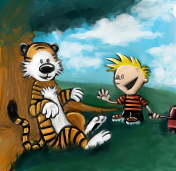
vapor
(Apr 17, 2006)
from the 'calvin and hobbes' comics. |
| |||||||||||
|
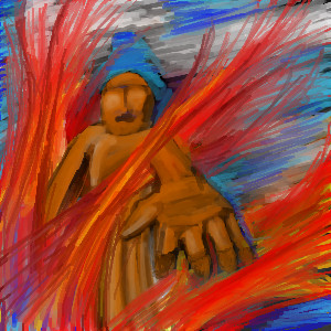
Renuar
(Aug 22, 2005)
...
Renuar (Sep 12, 2005)
wow, thank you all for the comments. Here's the trick, use the 'Pen' tool, set to minimum, and make good use of the 'soft' tool :]
p3ndragon (Sep 12, 2005)
I love you.I love this style even more.
absolutindigo (Sep 12, 2005)
Beautiful , it looks like a "Cirque du Soleil" poster
comd (edited Mar 19, 2006)
I second HunterKiller's remarks. This is gorgeous. |

| |||||||||||
| Public Boards/Beginner | ||||||||||||
|
sketcher2005
(Nov 22, 2005)
sry i know this aint good....
Qwerty_Wittle_Fawah (Nov 22, 2005)
Well its a hell of a lot better than a lot of things that run through here...kitty25 is right! great picture I love the colors
absolutindigo (Nov 22, 2005)
its very nice , the color are very warm.
narutofan (Nov 22, 2005)
u most be crazy this is awsome
DeadlyBlondeArcher (Nov 22, 2005)
I think it's really cool, in an abstract sort of way. |
| |||||||||||
|
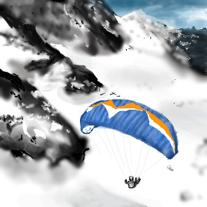
Mal
(Sep 19, 2005)
Paragliding in France
absolutindigo (Sep 19, 2005)
I like a lot , its very real
GOODBYE (Sep 19, 2005)
oo cool~
davincipoppalag (Sep 19, 2005)
Another nice one Mal...good depth and details
Mal (Sep 20, 2005)
Thanks everyone |
| |||||||||||
|
marcello
(Aug 16, 2005)
that's what I'm talking about
davincipoppalag (Aug 16, 2005)
Forehead tattoo? lol
KH44N (Aug 16, 2005)
This is really nice. Good job!
SimplyX (Aug 17, 2005)
I can "seee" it. Nice lettering.
IkariIreuL (Aug 23, 2005)
More dangerous are the good games, that cuteness ;_; |

| |||||||||||
|
pencilhero
(Aug 17, 2005)
O_o
renire (Aug 17, 2005)
This only took you 19mins? its amazing! And when i first saw it, i thought the same as nightmare ^_^
canadian_dragon (Aug 18, 2005)
IT'S A WERE-CHEWBACCA! AHHH!!! *runs in pentagons*
pencilhero (edited Aug 18, 2005)
loool i have draw this thing in other oekaki boards and they told me the same thing XD
laurael (Aug 18, 2005)
Awesome. Do more please. |

| |||||||||||
|
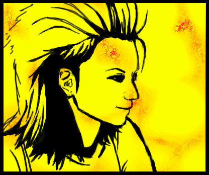
vigilante
(Aug 2, 2005)
oh well, it doesn't look like her that much, but i think it's not that bad. "_-_"
Xodiak (Aug 6, 2005)
Her silhouette is sexy... >;)|XOD|
absolutindigo (Aug 17, 2005)
I love kill bill , its absolutly aweosome
Gigandas (edited Aug 17, 2005)
I think the fact that the bg is yellow, helps it say 'Uma Thurman from Kill Bill.' It almost looks like it'll animate itself within a couple seconds to slice us all :P. Nice silhouette :).
vigilante (Aug 17, 2005)
='D her legs should be taller. thankies. |

| |||||||||||
| Public Boards/Intermediate | ||||||||||||
|
hideyourface
(Aug 13, 2005)
alll about the music.
hideyourface (edited Aug 13, 2005)
his >_>he was a japanese rock guitarist/singer in the 90s. he died a few years back.
davincipoppalag (Aug 13, 2005)
Yea..this one is better.. The colors and the linework are great
sincity (Aug 13, 2005)
It does have the 80's hair thing going on there. OH the flashbacks. :}
Maiko (Aug 13, 2005)
PInk SPIDAHhhh rawr XD Too bad he died :\haha he kinda reminds me of Kuja in this pic >_>; |
| |||||||||||
| Public Boards/Beginner | ||||||||||||
|
oikitsumaru
(Jul 8, 2005)
Just wanted to do something fun, cute and simple. XD And what anime artist can claim she loves anime without drawing CCS's Kero neh?
HunterKiller_ (Jul 10, 2005)
Oh whoa, i thought pinklynx came back. Nice Kero.
Akechi456 (Jul 11, 2005)
oo its kero..been awhile since ive seen him...i can see what XOD means by flyin teddy.rip off his tail clean up the blood an uve got a teddy bear with wings..and a bloddy white carpet..but thats alright..
Truearashi (Jul 11, 2005)
that's so kawaii ^_^ great wings
SanzoGirl (Jul 29, 2005)
Aww, so kawaii! :D |

| |||||||||||
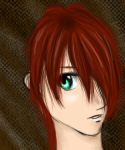
|
nekodesu
(Jul 20, 2005)
lalala
absolutindigo (Jul 21, 2005)
Wow , hair is very nice!
fleeting_memory (Jul 21, 2005)
haha as everyone has already said: Very very nice hair but the neck does seem a little thick for the narrowness of the face.
nekodesu (Jul 21, 2005)
Thanks for the comments everyone =DI was going for the spikeyish, poofy hair but I guess it didn't go too well and now that I look at it, the neck does seem a bit too thick. Well, more reasons it's in beginners.
MoonlitShadow (Jul 21, 2005)
>>; If he wasn't missing the back of his head, his neck wouldn't look so thick.. =x It looks as if the ear is where his head ends, you should draw more hair which extends behind the ear, so he doesn't have such a.. 'conehead' look.. Other than missing the back of his head, this picture is awesome! =O The hair looks so cool, so realistic, I want to reach out and pet it.. *w* |
| |||||||||||
| ||||||||||||
| 2draw.net © 2002-2024 2draw.net team/Cellosoft - copyright details - 0.17sec (sql: 36q/0.07sec) |
But anyway looks real awesome so far :D