| |||||||||||||||||||||||
| Public Boards/Beginner | |||||||||||||||||||||||
|
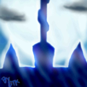
Top of the Devil's Tower
GreatTeacherKuri
(Mar 7, 2005)
A small oekaki of the top of the Devil Tower from Devil May Cry 3, without rain. The same tower that Dante and Vergil fight ontop of. *Shrug*
Shanghai (Mar 7, 2005)
I like the lighting and the way it looks like rays of light washing over the front of the tower, but I think that maybe the two clouds seem out of place since they're much more muted and much greyer than any of the other colors here. |
| ||||||||||||||||||||||
|
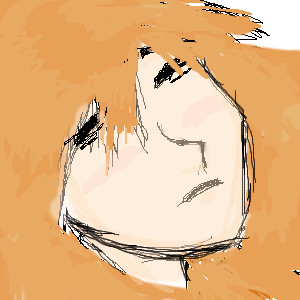
chemical
(Mar 7, 2005)
This is my first uh...what do you call it?
Shanghai (Mar 7, 2005)
Interesting use of oranges, a color normally thought of as the most active and exciting color, to draw someone sleeping. It's like they're laying in the sun. |
| ||||||||||||||||||||||
|
vamp2
(Mar 7, 2005)
I getting the hang of this color stuff...=)
CodeDonny (Mar 7, 2005)
didnt know there was a comic. i thought it was just some thing some people made into a movue
vamp2 (Mar 7, 2005)
Yes theres a comic and I'm going to make one..=)
TaCO (Mar 7, 2005)
HellBoy is a much better comic than a movie.
Chaosz (Mar 7, 2005)
Very nice drawing ^^. and you still making that picture for me to color for you? If you are memo me and tell me when lol! Thx :D |

| ||||||||||||||||||||||
| Public Boards/Intermediate | |||||||||||||||||||||||
|
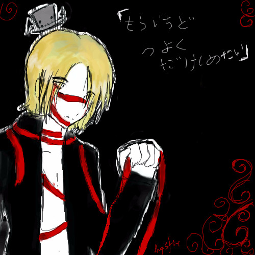
Augustine
(Mar 7, 2005)
A picture for a friend of mine. It was actually supposed to just be a head shot sketch for a new hairstyle for his character. But it turned out as this. >_>;;
Shanghai (edited Mar 7, 2005)
Well I have no idea what the title says. I could find out if I wanted but I'm too lazy for that. So really, although like you said this was made for a friend, it seems like a bit of a problem to me that your audience, the rest of the site and guests, probably has a hard time even knowing what this is about. It'd be nice if you could have mentioned it in the description. As for the image itself I think it looks pretty good overall. I like the way the red designs are standing out against the background too. His hand looks a bit off, though it's hard to tell exactly in what way since I can get my hand in almost that same pose. Might just be the lack of shading there that causes the bottom of his palm to flatten out instead of being more rounded. |
| ||||||||||||||||||||||
| Public Boards/Beginner | |||||||||||||||||||||||
|
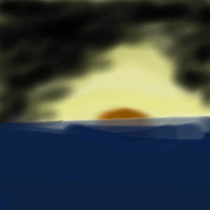
Larkin
(Mar 7, 2005)
My First drawing on this site and it is unfinished
sxk (Mar 7, 2005)
hey nice start. cant wait to see it when its done nice use of colors
emmamommalag (Mar 7, 2005)
Yes, looking good so far.
Shanghai (edited Mar 7, 2005)
As was mentioned it is a nice use of colors. I think that maybe you could add a bit more deep blue to the clouds though instead of having them just grey and black. If you notice the red-orange of the setting sun is really what pulls this together and makes it work. Try putting your thumb over the sun here and notice just how flat things become without it, but when you see the picture with that sun it becomes much more dynamic. I think that however you decide to finish this you should definately protect that sun right there because it's adding a lot of visual interest here. |
| ||||||||||||||||||||||
|
Cheese_is_good
(Mar 7, 2005)
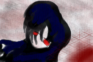
OoI like the redness that's supposed to be blood in the little corner. I also ike the background. The timer is screwy again tho. ^^
Shanghai (Mar 7, 2005)
The shade of red you used works well with the greys and blues here and the soft texture of the background is a very nice touch, but as I've said before to someone else here I think blood tends to be far overused in art posted online and it does very quickly lose its effect. I think compositionally too it'd look better if the only red was in the eyes since the red of the corner is pulling my attention too far from the main subject area here. You have a great "in the moment" effect going on. It really looks like a snapshot of time as some unseen event was really happening. |
| ||||||||||||||||||||||
|
Malrus-A-GoGo
(Mar 6, 2005)
me and Joey
Shanghai (Mar 6, 2005)
I'm not sure if you plan on doing anything else besides finishing the two characters, but I thought I'd point out that there seems to be some disharmony between your use of soft shading in the sky and a bit in the grass and your use of sharp, pure black lines on the characters and the horizon. I think it may be better if you stuck more with one or the other in this case.I look retarted in this pic, it was hard 2 draw small, gimme a break
vamp2 (Mar 7, 2005)
Yes the fact that you had to draw it small. But you can draw pictures smaller than that but your new so until you get use to the tabblet and things. I think your'll come together and draw some crazy art work. I would also like to saywhen you draw feet don't make them sguare.
yuohoo (edited Mar 10, 2005)
Uhhhh......is somthing wrong Malrus-A-GoGo? I think you should calm down,ok!...ok....don't yell you broke me mental ear drums..ow my poor sensative elf ears...man...I happy...not any more.....*pats Malrus-A-GoGO* now...DON'T SCREAM!...and I might make Joey go bye bye.....AHHHHH!!!!!!!!!!!! !!!!!!!!!!!!!EVERYONE MAY SCR!EAM!!!!!!!!!!!!! |

| ||||||||||||||||||||||
| Misc. Boards/Sprites | |||||||||||||||||||||||
|
two-na
(Mar 7, 2005)
mntnpxldpth100x90hppyngrykll
Shanghai (Mar 8, 2005)
Looks a lot like the mountains we have here. Actually in a way, and you may or may not like this, it reminds me of the mountains Bob Ross would make because of the way you textured the snow onto it. |

| ||||||||||||||||||||||
| Public Boards/Beginner | |||||||||||||||||||||||
|
vamp2
(Mar 6, 2005)
I liked drawing this.
Shanghai (Mar 7, 2005)
It's good that the gun was drawn so large since it helps the idea he's a kid. The background is also cool how it's simple but it compliments the character well.
vamp2 (Mar 7, 2005)
Thanx you, I wanted to draw a hellboy kid to show his middle years of age...
TaCO (Mar 7, 2005)
Great pic!!!!You should color all your pics!!!!!!!
vamp2 (Mar 7, 2005)
I'm going to start coloring all of my pic's.....Thanxs. |

| ||||||||||||||||||||||
| Misc. Boards/Sprites | |||||||||||||||||||||||
|
Arisu-chan
(Mar 7, 2005)
i want too have a cute avatar =3 isit it cute X3
two-na (Mar 7, 2005)
ct wddl fx mks gd jckt
Shanghai (Mar 7, 2005)
Although it is cute, and being a fox makes it automatically extra cute, I can't readily tell what it is when it's shrunk down to the avatar size which is just under one quarter the size you drew it at. I think if I hadn't seen the full size first it would have been a little harder to identify it as an avatar. I'd suggest that if you make another one at any point here that it'd be a good idea to zoom out enough when drawing for a moment that it looks about the avatar size, and maybe fill up more of the canvas with the character. I like the soft colors and blending you used. |

| ||||||||||||||||||||||
| |||||||||||||||||||||||
| 2draw.net © 2002-2026 2draw.net team/Cellosoft - copyright details - 1.18sec (sql: 38q/0.69sec) |