| ||||||||||||||||||||||
| Public Boards/Intermediate | ||||||||||||||||||||||
|
frootcake
(Jan 2, 2006)
curiosity killed the catthink i'll add a thickish black line round it to fin, comments appreciated. |

| |||||||||||||||||||||
| Specialty Boards/Elite Bastards | ||||||||||||||||||||||
|
Axil62
(Jan 2, 2006)
wanted to do this all in one shot but I'm being sequestered... |

| |||||||||||||||||||||
| Public Boards/Beginner | ||||||||||||||||||||||
|
Felistorm
(Jan 3, 2006)
Okay um yeah. Not so great. I can start out looking good but then it kinda gets sucky and I either over work it or mess it up entirely.
Opium (Jan 3, 2006)
oooh! this is a great start felistorm! I love the detail around the eye! I would put more shadow on the bridge of her nose, near her eyes to sink those eyes down and give it some definition. So purty! Those lips are lucious |

| |||||||||||||||||||||
| Public Boards/Intermediate | ||||||||||||||||||||||
|
Deino
(Jan 2, 2006)
Original sculpture by Edgar DegasThis drawing, the first of mine signed with "06" has varios purposes: 1.- Experiment with quick and spontaneous traces, like... impressionism :) 2.- See how well can I do without any previous sketch 3.-Practice the human figure (Yes, she is a little desproportionate... read above) 4.- Tell everyone... Hapy New Year! 2006 YAY!!!!
Rosemary (Jan 3, 2006)
yayy a degas study..i had a 3 month project at art college last year completly based on his work...really lovely drawing :)
Deino (Jan 3, 2006)
Thaks for the comments! ^^Frootcake, I still need to to the wallpaper drawing... sorry, I'm just to forgetful :( And about the squarey background, I just changed the canvas texutre a little bit. :D
Kloxboy (Jan 3, 2006)
It looks like a bronze sculpture. Pretty coolness, nice effect.
terracotta (Jan 3, 2006)
That hauty posture you captured is perfect. I'm not seeing anything out of proportion, I think it just looks that way because we can't see all of her right foot. |

| |||||||||||||||||||||
|
alwaysLearning
(Dec 7, 2004)
This started out to be practise just doing an eye and eye area, but sort of grew into a larger view. I'm practising the details of drawing faces, and this is one of my first from-scratch attempts to do so in colour, using oekaki. Yes, I know he (she?) is pale. Please let me know if the skin tones are so light that the shading isn't showing.I fully expect to come back and finish this, but family responsibilities have been interrupting so much I thought I'd better do a safety save (and yes, that means that the timer is off, by quite a bit).
davincipoppalag (Dec 7, 2004)
I'm just glad to see you back a.l. Well, I'm trying to get a bit more anatomical accuracy, depth of concept, and visual interest going on in this picture... ...but I still can't tell if I got the skin colour too light or not. Regardless, I think my next edit will probably be my last.
Yes, that is intended to be a blade centered between his/her eyes -- I haven't decided for certain if it's an arrow, or a spear, but I'm leaning toward arrow. Speaking of which, I'm hoping to address the perspective problems next time. It may not be much of a picture, but I'm pretty happy with the eye, overall. Any useful suggestions for improving it (especially the eyelashes, which don't look right, and I'm not sure why) will be gratefully welcomed. Here's to hoping to come around more often, and hoping that the intervening months spent working on sharpening my artistic skills are actually showing results. :)
Artiste (Jan 2, 2006)
Well, Im new here so I feel a little weird giving advice, but it seems pretty obvious to me that you need to 'let go' a little in your painting. There is a tendency in beginner painters to noodle with a painting for too long. Loosen your strokes a little, and dont be afraid to f-up the peice. Its not the sistine chapel. The eyelashes dont feel right because I think youve messed with them too much, and now they look perfectly symmetrical. If you look at a photo of a person's face you will see that eyelashes dont actually look like little hairs, they look very often like a dark area, and if youre looking up close, you wont see every hair, but rather a few hairs here and there. Your modeling is good... and the color part of eyeball is very nicely done.
Opium (edited Jan 2, 2006)
you've definetly got a great start! I agree with artiste, the eyelashes need some more work. the eyelashes on the top lid, you shouldn't see till about the end of the iris, then it should gradually be little lashes, and the ones on the end on the right, should be defined...you could even show a few eyelashes on the left side too, but those are very short and not as dramatic. the bottom should be very faint. and is that an eyebrow ring? I'd get some references of them and just look at them, where they're placed, and how their shadows look. It's a good piece so far! and I like the pale skin :) It fits. Keep working at it! It might help to get a mirror and use yourself kind of as a reference |

| |||||||||||||||||||||
|
Jessor
(Jan 1, 2006)
I dunno... proportion practice. c+c plz :)
davincipoppalag (Jan 2, 2006)
Good action in this..you can almost feel the punch..
TOL-CREW (Jan 2, 2006)
you got knocked the $%^* out!
Opium (edited Jan 2, 2006)
you got it down, definetly! I like the way you did the head, it gives it alot of action. the only criticism I have is maybe have some shading on the left arm to draw it back more, like right where the elbow fold is...and are the nipples up too high? I think they might be more down and slightly askew outwards...but I could be wrong :) nice picture though! |

| |||||||||||||||||||||
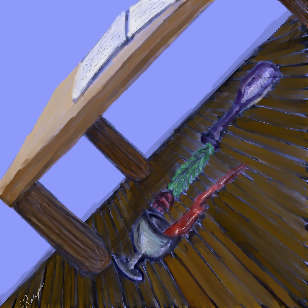
|
Felistorm
(Dec 31, 2005)
Semi abstract. :p I was trying a different erm...point of view.
laurael (Jan 1, 2006)
Hah...this is different! Makes me want to keep tiltin' my head!
SneakyWalter (Jan 1, 2006)
When I tilted my head, my neck ed...Well drawn for this point of view.
frootcake (Jan 2, 2006)
shouldn't the liquid be going the other way ? i like the floor boards
NemesisT (Jan 2, 2006)
Very different indeed :) The liquid can go either was as it's not the actual floor that is tilted just the perspective, as I see it :P |
| |||||||||||||||||||||
| Public Boards/Advanced | ||||||||||||||||||||||
|
LordHannu
(Dec 23, 2005)
some random monster i made. was fun painting it.I tried to move the picture down to the center but insteed it came somekind of shade. as you can see. and i couldnt continue painting anymore =.( just needed a nametag. enjoy
davincipoppalag (Dec 23, 2005)
And..he lives in Dallas..
ShikamaruBegley (Dec 23, 2005)
Erm, looks like a sign from the covenant in the Game "Halo"
Opium (Dec 23, 2005)
Very chromish. And poppa, you're right! It reminded me of the predator also when I first saw it. You know, with the mask still on, predator is damn hot lol and reason #32934 I'm not dating right now...... :)
Minty_hippo (Jan 2, 2006)
woaa holy f---.....I sh-- myself when I looked at this O.oIt does look like the preditor O.o *hides under box* |

| |||||||||||||||||||||
|
Aswell
(Jan 1, 2006)
This is a dwarf crocodile on the hunt. Here's the ref. And even though this isn't exactly like the ref pic, I like it better that way.. I mean, what's art if you just copy an image? Art should be an interpretation of your subject. I'm all for artistic liberties.
Opium (Jan 1, 2006)
Great job! and GREAT study to do! I love these animals, and their eyes are what make them so freakin adorable. Their babies even have those huge eyes and small snouts. This is a way cool idea for scales *makes mental note* Great job and welcome to 2draw~from a little mouse :D
Qwerty_Wittle_Fawah (Jan 1, 2006)
how cute is that wittle croc? but definately dangerous :-) Awesome job
Gemmy619 (Jan 1, 2006)
oh wow this is great, i love how u did the skin :)
xiau (Jan 1, 2006)
I absolutely adore the way you drew the eyes <3 You're amazing.Welcome to 2Draw! |

| |||||||||||||||||||||
|
frootcake
(Dec 25, 2005)
this should be easy to do" turns out its harder than it looks, and im not really in the mood for details 2day.
Opium (Dec 30, 2005)
hey! great job! you have inspired me never to do shiny stuff though hehe but your patience paid off! you did a very realistic picture, that's for sure
HunterKiller_ (Dec 30, 2005)
I saw the thumbnail and i had to come look. It's so shinny! Great work.
Kloxboy (Jan 1, 2006)
Ha ha very funny. Nice drawing, very shinny indeed.
laurael (Jan 1, 2006)
Like everyone else said..nice shiny! |

| |||||||||||||||||||||
| ||||||||||||||||||||||
| 2draw.net © 2002-2026 2draw.net team/Cellosoft - copyright details - 1.78sec (sql: 38q/0.72sec) |
drawn in 18 min