| |||||||||||||||||||||
| Public Boards/Beginner | |||||||||||||||||||||
|
Gigandas
(Feb 15, 2004)
A simple practice of lineart^^;;..... |

| ||||||||||||||||||||
|
MachinaFalllal
(Feb 10, 2004)
Fear da chibi.
dixielandcutie (Feb 10, 2004)
hehe very cute...OOoooOO different colored eyes. cool bg. maybe some more general shading? nice job!
Gothic_Otaku (Feb 10, 2004)
It look powerpuff. It's really cute--but the mouth sorta doesn't fit in.
Neko (Feb 11, 2004)
Maybe if the mouth was drawn with a thicker line, it would fit in perfectly.Yup, the new Yuna is interesting... the shading seems a bit simple
rikurules (Feb 28, 2004)
I like the idea... first thing i thought was the mouth looks like a cat mouth... i dont know why... and the second thing i thought is it looks like a powerpuff girl... and then... i thought of playing ffx-2 |

| ||||||||||||||||||||
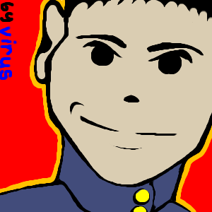
|
Virus
(Feb 24, 2004)
I can draw! hooray for low mouse speeds!
Krystiana (Feb 24, 2004)
Very nifty. I really like this style. Sometimes it's a nice refresh to see solid colors - it makes pictures very bright and it gives me a big smile. ^__^
dixielandcutie (Feb 24, 2004)
hehe, cute. i love the sharp color contrast!
Neko (Feb 24, 2004)
Now if he was saying something, like "Obey Mao Zedong's will!" I'd be doing it right away. This is like those old commie propaganda posters brought through 80s to the present. You shouldn't had to sign it, though. Now the blue/black text somehow disturbes the otherwise solid background.
davincipoppalag (Feb 24, 2004)
I like this too.. good lines and you did alot with a minimum of them.. I agree.. the signature takes away.. |
| ||||||||||||||||||||
| Public Boards/Intermediate | |||||||||||||||||||||
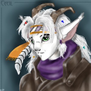
|
Alinnia
(Feb 19, 2004)
Alinnia (Feb 19, 2004)
LMAO. ... See? XD
Neko (Feb 21, 2004)
That's gorgeus! Nice idea putting him as goat, since you don't see them every day.
dixielandcutie (Feb 22, 2004)
hehe, cool. awesome detail. lovin the hair...cool bg too |
| ||||||||||||||||||||
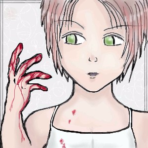
|
Fluffysheep
(Feb 20, 2004)
Head too big...me lazy...will finish later X(
Fluffysheep (Feb 21, 2004)
Yeah, I know the position of her arm is odd, I remarked that once I posted it finished... -_- Do you know if there's a way to edit it anyway ? Thanks for the comment :)
marcello (Feb 21, 2004)
you just edit the same way you always edit.
Fluffysheep (edited Feb 21, 2004)
oh, really ? ...I feel stupid not to have try this out... >>Edit : It says I cannot revise this entry because I've reached 200kb entry space limit on this board :/ You're the moderator right ? Can I have a little more space ? pleaase :) Ok, I fixed the arm, but...I dunno...is it alright ? I can't really tell...
BTW, thanx Marcello for the extra space ^_^ |
| ||||||||||||||||||||
|
Alinnia
(Feb 12, 2004)
ToraNeko (Feb 13, 2004)
I agree with Neko, the eye brows and hair tuffs look like they were glued on, not ther naturally.I like the eyes n.n Very nice how it looks human, yet Cat like at the same time. The Shading Is superb, good job on the very defined Cheek bone, how you painted the colors is great to, I love it! n.n Saikyo!!
Alinnia (Feb 13, 2004)
Well, due to popular opinion, I wanna go back into the image to work on it... you know.. to see if I could change the hair.. but.. I've reached the size limit. >>.<< ... Actually... I've kinda... went up and over the size limit >^.^<;;; Hehhehhh... I'd /like/ to soften up that hair... buuut... *whimper* You know... (Though, if an admin could give me extra space, that'd be so extra-super-nice-of-them >n.n<) ... Darn. Well, I'll keep it in mind for next time >o.o<;
PinkuEspeon (Feb 18, 2004)
Uh... me agrees with ToraNeko and Neko. o_o
Alinnia (Feb 18, 2004)
*wants to revise it* >x.x< *whimper* |
| ||||||||||||||||||||
| Public Boards/Beginner | |||||||||||||||||||||
|
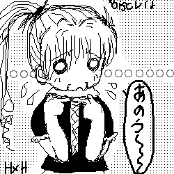
ZaKi_nii-san
(Feb 13, 2004)
drawin yet another picture, but of Biscuit Krugar this time. >.> she's like my fav. character of hunterxhunter. Good manga. >.>
Neko (Feb 13, 2004)
Don't see HxH-fanart that often. Looks like her, though that "hamster-lip" is a bit shaky, managing to look more like "fish-lip". Looks like a pixelated version of the actual manga, so it's good.Methinks those large, white dots would look better, if not so close to each other. :o
ZaKi_nii-san (Feb 15, 2004)
>.> alrite, thanks 4 the tip
Lark (Feb 16, 2004)
WAH!! KAWAIIIIII!!!! ..hmm... why are most of your pics black and white? oh well. its veryy cute.
ZaKi_nii-san (Feb 17, 2004)
cuz i dont really like coloring that much. >.>;; |
| ||||||||||||||||||||
| Public Boards/Intermediate | |||||||||||||||||||||
|
Dainamo
(Feb 1, 2004)
So I attempted some random monster thing...I'm sure this should be in the beginners board or something.
Deformed (Feb 2, 2004)
i think the bluring makes it look awsome!!!!
Toan (Feb 2, 2004)
ooooh...neato. ::nods:: That's pretty well done.
Neko (Feb 3, 2004)
Woot, the action. :o He (it?) really looks like his exemplar.
Pkingsora (Feb 16, 2004)
O . O that is mad..lots of akusion going on in this picture..well done! |

| ||||||||||||||||||||
| Public Boards/Beginner | |||||||||||||||||||||
|
ZaKi_nii-san
(Feb 13, 2004)
was bored, and just messed around a little, trying to improve my drawings and stuff.
lp_phaery (Feb 13, 2004)
I thnk this is GORGEOUS!=)
Neko (Feb 13, 2004)
It's always great to see cat-like girls without any real cat-features. ^.^ She's cute and the concept's very cool. I like the way you've positioned her in the image.Maybe her hair could've used some shading, like you've done with the neck? A few dark dots or lines would've given it more balance, since it seems kinda flat now. |
| ||||||||||||||||||||
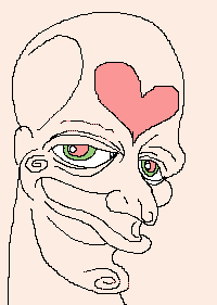
|
Kloxboy
(Feb 13, 2004)
big head freak love stuff |
| ||||||||||||||||||||
| |||||||||||||||||||||
| 2draw.net © 2002-2025 2draw.net team/Cellosoft - copyright details - 1.06sec (sql: 37q/0.28sec) |
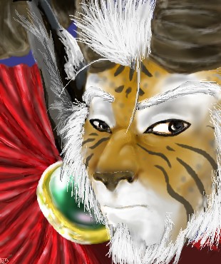
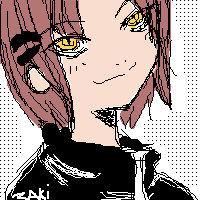
You've found very balancing colours for this one. EXCELLENT work with the hilighting!