| ||||||||||||||||||||||
| Public Boards/Intermediate | ||||||||||||||||||||||
|
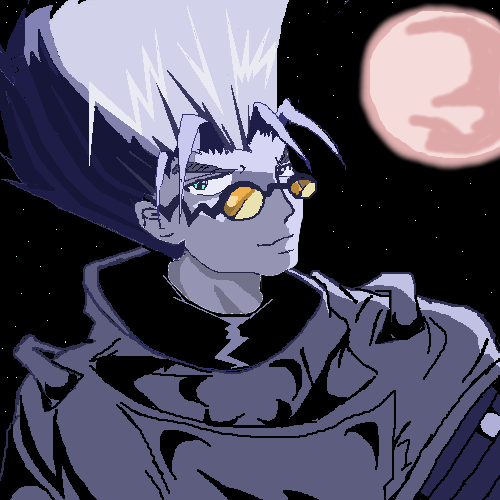
101_Torchic_101
(Jul 6, 2004)
Woah..This Looks Cool 0.0 I Love This Pic! ^^ I Love How I Drew This! |
| |||||||||||||||||||||
| Public Boards/Beginner | ||||||||||||||||||||||
|
Bumble_Beez
(Jul 6, 2004)
This is just the shadow of a cat in the door way, any suggestions on the shading or details?WHY IS IT ALWAYS MY DRAWINGS THAT DON'T SHOW UP?!?!
damnskippytakn-a-break (edited Sep 11, 2004)
I love this! I think his eyes are fine I get it, his eyes are glowing! Great job!
ILoveKenshin (Jul 6, 2004)
Aww, it's Annie when she's plotting her evil plan, when she's all hyper, and tries to attack everything that moves! xD Well, to anyone that doesn't know me, Annie (Annabelle) is my cat. Heh. She's a cute little psycho. ^^-Hana-chan
Knockoff (Jul 6, 2004)
Hey! This is pretty cool. Its like... A different kind of silhouette :).This looks pretty good, nice yellow eyes.
mazi (Jul 7, 2004)
well its not happening to the rest of us, so it could possibly be something obscure with your java or browser. though i doubt it? sometimes that happens. im not really sure why. make sure your drawing is completely submitted before you do anything. and if youre really worried about it, take a screen cap (hit print screen on your keyboard and paste into an image program) |

| |||||||||||||||||||||
| Public Boards/Intermediate | ||||||||||||||||||||||
|
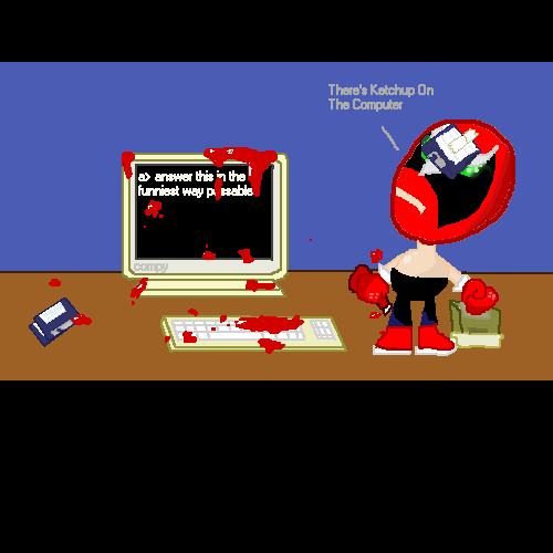
101_Torchic_101
(Jul 5, 2004)
I'm A Squeeky Guy! I Got Squeeky Pants! Watch Me Do My Squeeky Pants Dance! SQUEE SQUAA SQUEE SQUAA!LOL!!
davincipoppalag (Jul 6, 2004)
Maybe he had alot of work and had to ketchup?
ILoveKenshin (Jul 6, 2004)
I personally don't think this should be in intermediate. The lineart is kind of wiggly in places, not that that's horrible, but overrall, I just don't think it's that great... I do like how the ketchup is dripping off of the computer screen.-Hana-chan
audie (Jul 6, 2004)
Wooo! strong bad!
saucy (edited Jul 6, 2004)
Sweet. Strong bad rocks. |
| |||||||||||||||||||||
| Public Boards/Beginner | ||||||||||||||||||||||
|
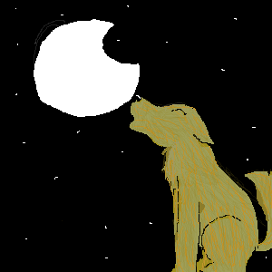
Bumble_Beez
(Jul 2, 2004)
Well, this is my first time here, and this is my first picture, it's kinda bad, I know. It'd be great if people could give me some tips
ILoveKenshin (Jul 2, 2004)
Yay! You registered! ^^ Welcome to the site! I like how the moon is half, but more than half. The wolf's fur is nice, but I think it should be shaded. Hmm... Maybe the moon could have a little more detail, but overall, this picture's so cute! ^^-Hana-chan
MD_Anonymous (Jul 2, 2004)
I agree with ILK, you also might want to do some more detail with the stairs, like give the area around them a lighter shading because they produce light. Nice job. ^^Ehh... I think it looks worse now... Oh well -sigh-
emmamommalag (Jul 6, 2004)
The moon should be a very, very pale greenish yellow, rather than white. I like the wolf and its pose. |
| |||||||||||||||||||||
| Public Boards/Intermediate | ||||||||||||||||||||||
|
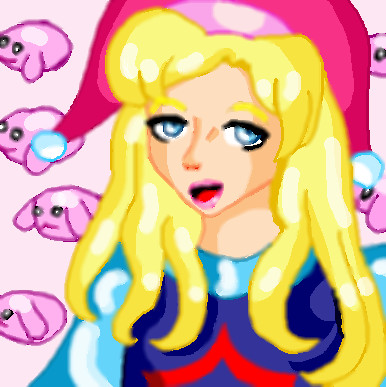
Angel-Meiru
(Jul 5, 2004)
I love Seiken Densetsu 3 and I think Charlotte (Carlie or Carla in other versions), the Sprite girl IMO, is a mandatory character. She can heal, cast elemental spells on weapons and/or summon creatures of the light or dark.
emmamommalag (Jul 5, 2004)
Looks like she's saying "Duh." I like it, though.. nice bright colors.
Kenshin (Jul 5, 2004)
Hmm.. I personally think it should be in beginner.. The lineart is OK.. The shading isn't that great... The shinyness is really thick and doesn't blend in. And it looks like you blurred most of the picture...Yooko-chan
ILoveKenshin (Jul 5, 2004)
I agree with Yooko-chan. It should be in beginner. The shine marks are huge, and as she said, they don't blend in. I know not everyone uses this technique, but I personally suggest using black for outlining, if you're doing this kind of picture.-Hana-chan
Angel-Meiru (Jul 6, 2004)
Oh really? Hmmmmm, I'll probably do that or uses darker colours alongside it as well next time. |
| |||||||||||||||||||||
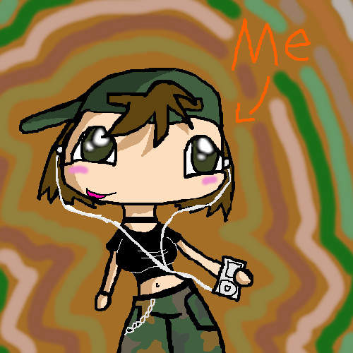
|
101_Torchic_101
(Jul 5, 2004)
Eh..It Doesn't Look That Good -_-
Kenshin (edited Jul 5, 2004)
Cute, but you need to fix it up a bit and give it a background or it can get deleted or bumped... You could make fingers, you could smooth out the lineart, make the coloring a little better, make it better proportioned and maybe add some more details.Yooko-chan It Looks Way Cooler Now^^!
Okay, I Added Some Sorta Army Background Wave-Ish Thing ^^ Cool
ILoveKenshin (Jul 5, 2004)
I think this should be in beginner... It's cute and all, and I like the outfit, and the background's cool, but I just don't think it matches up to intermediate standards, even though it's cute in its own way...-Hana-chan |
| |||||||||||||||||||||
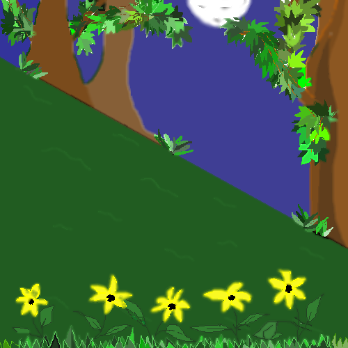
|
LEELEE
(Jun 30, 2004)
:)
Gigge (Jun 30, 2004)
What cheerful little yellow flowers. I like the way the moon is peeking into the forest.
DMV (Jun 30, 2004)
This is an excellent BG for the Sock Bunny lol!
ILoveKenshin (Jul 1, 2004)
Sorry, but I think this should be in beginner... I like the leaves, though! ^^;;-Hana-chan
LEELEE (Jul 3, 2004)
Ilovekenshin, I agree with you. It's not the best. I just thought, due to being very new to this site that there maybe diff. tools on the other boards and I just started to draw and that's why it was enetered in intermediate. I know it should be in beginner. Thank you all for saying you like the leaves though. They took forever to do! |
| |||||||||||||||||||||
| Public Boards/Beginner | ||||||||||||||||||||||
|
Bumble_Beez
(Jul 2, 2004)
this is just a cat chasing a mouse, It's not very detailed or shaded.
ILoveKenshin (Jul 2, 2004)
Aww, that's cute! ^^ Nice start to the shading, though, on the mouse... I think it might need whiskers, though. ^^;;-Hana-chan
Gigge (Jul 2, 2004)
hehe, that mouse is in trouble! Yeah, whiskers would be a nice addition.Added whiskers...
I just blurred my shading x_X
|
| |||||||||||||||||||||
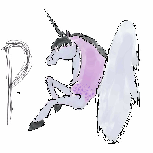
|
yellow_mello_99
(Jul 1, 2004)
dsafaWell umm.. the shoulder is a little funny but i think it will do n-n; I hope its ok!
ILoveKenshin (Jul 1, 2004)
It's pretty! ^^ Although... the unicorn is my school mascot... bleh. BUT, this pretty. ^^ I like your use of colors, they go together very nicely. n.n-Hana-chan
MD_Anonymous (Jul 2, 2004)
I especially like the eye. You might want to do more shading to give it more depth and maybe more detail on the feathers of the wing.... but other than that very nice job! ^^
Bumble_Beez (edited Jul 2, 2004)
It's really nice, it looks like water colors ^_^ (that's a good thing O_O)But why is there a 'P'? Edit: Nevermind, I just noticed it said Peg O_O Sorry, little idiot here |
| |||||||||||||||||||||
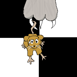
|
101_Torchic_101
(Jul 1, 2004)
^^ Yay! It's Ed!
ILoveKenshin (edited Jul 1, 2004)
Hmmm... Dude, is Ed a boy or a girl...?! I know it's a boy's name, but TOO BAD! xD Well, about your picture. I think that the lines could be a little less wiggly, and it needs some more shading...-Hana-chan
Kenshin (Jul 2, 2004)
Yes, I agree. They could be straighter and smoother.. And I was wondering the same question: Is Ed a boy or a girl? He/she has a girl's voice...Yooko-chan I Just Made It A Little Better This Time
mukumuku (Jul 2, 2004)
edward wong hau pepilu triverusky the fourth ish a girl...dont feel bad tho, even ed's father person cant remember that! XD*mo-fafa* |

| |||||||||||||||||||||
| ||||||||||||||||||||||
| 2draw.net © 2002-2026 2draw.net team/Cellosoft - copyright details - 1.00sec (sql: 39q/0.53sec) |
-Hana-chan
--edit-- 0_0 it won't let me add black around his hair to make it a little smaller! IT WON'T LET ME EDIT THE PICTURE!!
drawn in 21 min