| |||||||||||||||||||||||
| Misc. Boards/Sprites | |||||||||||||||||||||||
|
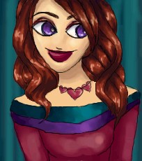
Mafuyu
(Oct 27, 2003)
My icon n.n Comments, if you please. |

| ||||||||||||||||||||||
| Information/News | |||||||||||||||||||||||
 |
marcello (Oct 22, 2003)
While it's nice to have new people around, it's not nice when they spam the site, and hundreds of images have to be deleted. Because of this surge of new users, many of which are posting crap, bandwidth for this month is gonna put 2draw in the red. So, please, stop. Or donate. But still stop.
37 comments
|
||||||||||||||||||||||
| Public Boards/Beginner | |||||||||||||||||||||||
|
juliamandapanda
(Oct 30, 2003)
ta-dah
strangeoid (Oct 30, 2003)
Yesh, boodiefull hair!jagged lines
!! yep/
Harmanye (edited Nov 2, 2003)
I love your style. I know you pretty much draw the same thing, but it doesn't annoy me so much as it might. I love the colours in this one too, very rich and warm. And she must be a fortune to Pantene ProV ^_^. And hey! Lineart. Veerry cool. Keep it up. How 'bout some 300X300 pictures; I bet you could come up with some amazing dresses. |
| ||||||||||||||||||||||
|
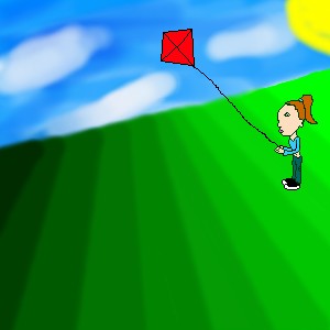
khotz
(Nov 2, 2003)
I still need to color her, add a kite, and a lot...
Harmanye (edited Nov 2, 2003)
A suggestion. It is better to finish your unfinished piece (and in the future, perhaps; pieces) before starting new ones. Other than that, the shading on the hill is too dark from shade to shade, let the colours sort of leak into eachother; I don't mean blur it more, I'm not fond of the blur too, I mean to pick at least one colour to go in between the colours you have (try selecting a colour where the shades merge). Her head is too big as well, perhaps you wanted to have it big for more detail, but it would be more aesthetic if she were proportionate (And remember to darken up the lineart, it will be easier to colour that way). The clouds are very nice though, I often have trouble doing clouds, one bit of advice about them though; I don't think that they should slope with the hill, but that's the only thing odd I can find about them. Just trying to be helpful, so you can't complain that no one tells you how to be better ~_^. (P.S. Giving the girl a bit of a shadow would be cool too.) *Shrugs* Anyway, I'm not trying to be harsh, I know your unfinished, but I always think that if one starts out with a strange picture, they'll end up with a bad one. Just trying to prevent that, but do your own thing. OH and be sure to finish your picture with your next edit, because you're close to the KB limit.
ebilkitti (Nov 2, 2003)
I agree with Harmanye on many things except I think you need some source of light, or rays of light to give it a better touch, but it's your piece so... go with itWell... finished, I guess.. I like the sky, but the grass and girl look a bit... bleh...
|
| ||||||||||||||||||||||
| Public Boards/Advanced | |||||||||||||||||||||||
|
concannon
(Oct 30, 2003)
Done. Unless you all are gonna be ridiculously nit-picky.Take a few hours off the timer for lapses when I've wandered away from the computer.
rydicanubis (Oct 30, 2003)
looks to me like a linx with the head of a wolf...hm... and a piece of advice? the whole thigh area is way to big, maybe make it slimmer so it joins the body further back, instead of near the middle? looks good though! :)
Harmanye (Nov 1, 2003)
I think the thigh looks fine, with the doggy, uh, thing, being poised like that, arched back and so forth.With the back thing, it remind me of a cat, when it's mad. Are you doing the whole picture in greyed tones or is the doggy-cat-wolf the only thing grayish? Or are you going to lay colour over it in a new layer? Or whatever. I'll stop rambling before -I- don't even understand me.
Turtlebuster (Nov 2, 2003)
oh, isn't he deer!? I think he looks more like a racoon than anything else.
mazi (Nov 7, 2003)
lmao poor VV. it looks awesome. i think theyre just trying to get all tough love like me.. ^^;very nice fur btw. doing that stuff is a pain. |

| ||||||||||||||||||||||
| Public Boards/Beginner | |||||||||||||||||||||||
|
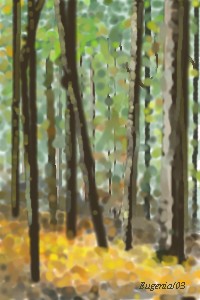
eugeniaperez1010
(Oct 29, 2003)
It's a deep forest
ladylime (Oct 29, 2003)
i love it! the colors blend so perfectly
Harmanye (Oct 29, 2003)
You seem to be pretty good at this style. I saw your other picture and it was wonderful to. I love this one though, it looks like the belt of trees thats in my backyard, the colours are very fall-ish and like LadyLime said, they blend so well.Keep up the good work ^_^
eugeniaperez1010 (Oct 29, 2003)
Thank you for your comments!!!!! =)
Lord_of_the_Bugs (Oct 29, 2003)
Nice technique yuya ;). It looks realistic. c u |
| ||||||||||||||||||||||
|
nuts
(Oct 28, 2003)
no comments....
nyao (Oct 29, 2003)
woa.... neat style dude
Harmanye (edited Oct 29, 2003)
Very realistic. I know it is not so prominent in some peoples eyes, but the pink blob (As an edit, I believe they are tear duct openings) in the corner of the eye should be a bit more, shall we say, 'there'.Otherwise very very nice. Perhaps a nose? Well, whatever. Good job. ^_^
HurricaneJeo (Oct 29, 2003)
Hmm.. Awsome pic nuts, but just where are the eyelashes? (Of course don't mind me, it might just be the resolution of the board you used.) Other than that it's super niffty. |

| ||||||||||||||||||||||
|
rydicanubis
(Oct 29, 2003)
these eyes have seen more than you can know....
Gorelord (Oct 29, 2003)
WTF are you doing in begginers?...Sho shoo...go to intermidiate...go go...go now...(Translation: COOL BEANS, now gooooo! Soon you'll be in Advanced....no time at all to waist!)
Marienkind (Oct 29, 2003)
(clears throat) she's been in intermediate. and advanced. and showcase. :D
rydicanubis (Oct 29, 2003)
hehe, thanksharmaye, um, i really wasn't thinking 'anteater' when i drew this, but well, to each their own i guess... um, as for neck, for me it was more like he was looking down at you, like his neck was arched up above him... that's just how it was in my head. and yeah, a darker background might have been better, but i prolly won't revise so meh... as to how i did it? i have fallen in love with the pen tool in shi... very real-life pencil-like... give it a try... and yeah, the spikes are sortof bones/horns, something, i dunno gorelord, once in a while, actually alot lately, i just don't feel like taking the time and effort required on some of the higher boards, so i just do something here... yeah...
furyofroy (Oct 29, 2003)
The scratchy crosshatch shading is expertly done! |

| ||||||||||||||||||||||
|
Elwing
(Oct 25, 2003)
Finaly, my first art (I hope you can see the pic this time ^_^)Its an elf, Its not very pretty, but I have not much time left right now... I spend a lot time on the eye, the rest is not very nice, but hey! I've made something ^_^
Harmanye (Oct 25, 2003)
It is nice for a first, and the eyelights are pretty, but I suggest spending more time on everyhting instead of focusing on one item alone.The necklace is very nice too, but you should prabably fill in the white in the hair and skin, and clean up your lines a bit. You're using layers, right? The blush is pretty cool and halftones are always neat. ^_^ |

| ||||||||||||||||||||||
|
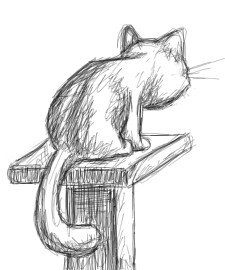
rydicanubis
(Oct 25, 2003)
kitty on a pedestal...
Harmanye (Oct 25, 2003)
Cute. Reminds me of the cat my Grandmother used to have. Only- Skinnier. Grandma's cat was sorta plump.I like the penciled look this has, the pedestal looks out of perspective, But that could be just me.
concannon (Oct 25, 2003)
Nice job; I like the perspective, and the idea. But the cat's head is too big. In all seriousness, if a cat had a skull that big, it wouldn't be able to lift its head.Just for future reference. o_o
rydicanubis (Oct 25, 2003)
hehe, thanksand yeah i know the head is too big, it was supposed to be all cute and fluffy and cartoonish when i started, then it turned more realistic but i was too lazy to change things, oh well... |
| ||||||||||||||||||||||
| |||||||||||||||||||||||
| 2draw.net © 2002-2026 2draw.net team/Cellosoft - copyright details - 0.88sec (sql: 39q/0.35sec) |
She looks happy, or uh, something *shrugs*
Anyway, that little black line on her face (Uh not the nose, the other black line); either is hair stuck to her lipgloss or your mouse slipped or soemthing. You use a mouse right? I've got a optical mouse, far superiour to ball mice, it's not wireless either, and is much more sensitive than a wireless mouse, best of both worlds. I love my mousey. Anyhow where was I? Ai yes; my cruel, cold-hearted critique. Unfortunately I've lost my cruel, cold-hearted flow.
Is this is your icon, why isn't it your icon? Eh?
(Maybe a bit clearner lineart, lascaux sketch has that antialias thing, very useful, just check the antiailias checkbox)