| |||||||||||||||||||||
| Public Boards/Intermediate | |||||||||||||||||||||
|
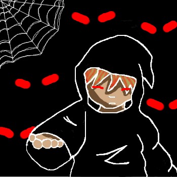
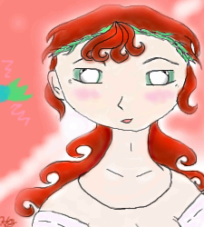
Gothic_Otaku
(Dec 7, 2003)
I worked really hard on this pic and perhaps the most careful and unrushed picture I've drawn. I'm prety pleased with it, overall. |
| ||||||||||||||||||||
| Public Boards/Beginner | |||||||||||||||||||||
|
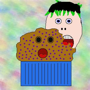
Wyatt_Matthew_Halliwell
(Dec 7, 2003)
Its a muffin...Its...ME!!!!!
Missy509 (Dec 7, 2003)
lol!
Edward (Dec 7, 2003)
Muffin-kin!!!!!! so cute *gobbles* *pats Wyatt_Matthew_Halliwell's head* very cute for a first time :P
Knockoff (Dec 8, 2003)
Lol nice. *Chokes no muffin*
Harmanye (Dec 8, 2003)
blueberries? Icky! Oh, is that why he's/it's/your shocked?This puts a whole new twist on 'Do you know the Muffin Man?'. However, shading would be nice, and perhaps a more relating background? |
| ||||||||||||||||||||
|
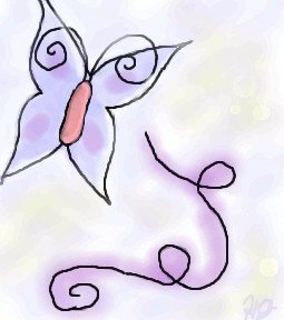
HJ
(Dec 7, 2003)
Just messing around, trying to test the technique Mazi said.
Harmanye (Dec 7, 2003)
Oh cool, this is neat! I love the swirly things, and that butterfly is spiffy, I can definetly say you are getting better ^_^ Since I am who I am I must say smoother (as in less jagged) lines would be nice, but I quite understand that it is difficult sometimes. Are you a mouser or a tablet-user (Tabby)? Either way qualities vary and it can be hard to get flowy lines.
HJ (edited Dec 7, 2003)
I use a mouse, but I am asking my parents for a Wacom Tablet for Christmas.. Possibly a Graphire or Intuos. Thanks for your comments! Yah, I hope I am getting better! I drew PowerPuff girls for the first months I started doing oekaki (I was at PowerPuffOnline). I started this oekaki-business in June. But I have 'branched out' to anime & a little bit of furries. My Next Goal: Scenery! Or maybe not..
mazi (Dec 8, 2003)
i reccomend the graphire. thats what i use.. i dont really see a need for the really expensive ones. i only have a graphire2 4x6. it was $99 at the time, and well worth it. the only diff with the "better" tablets is more pressure sensitivity, or a bigger space.. i dont even really use the pressure sensitivity.
marcello (Dec 8, 2003)
I recommend getting a 6x8, and not a 4x5, no matter which line you get. 4x5 just isn't worth it. Now, graphire3 has 4x5 for $100, and 6x8 for $200. Whereas intuos is $300 for a 6x8. The advantage with an intuos is you'll have a much more robust tablet, (plus you can get platinum, while the graphire 3 design sucks and the colors aren't great). So it's really a question of if you're willing to spend $100 more for a more powerful tablet. A side-by-side comparison. (I should mention I find the menu strip useless, the tilt can only be used in expensive programs like photoshop (7 and later), or painter (7 and later as well, I believe, 8 supports it). I'm working on a new applet that'll support tilt as well, though. I really like the intuos2 mouse, but I haven't used a graphire3 mouse to compare (The tablet mouse has completely replaced my optical). Since they have 6x8 in graphire as well now, that's not really a reason to go with intuos2 (one of the main reasons I went with it). Grip pen... that's probably also meaningless, it's nice, but dunno if it's worth it. |
| ||||||||||||||||||||
| Main Forums/2draw.net | |||||||||||||||||||||
 |
Edward (edited Dec 7, 2003)
My question of the day...TODAY is: Marcello, Why in the world do you have a place for tutorials if you have no tutorials to begin with. This seems odd to me and may seem odd to others like me who think empty pages are usless and take up the space that you where complaining was being taken up by spammers just a month ago. For those of you who did not know that there where tutorials they are here Edward
5 comments
|
||||||||||||||||||||
| Public Boards/Intermediate | |||||||||||||||||||||
|
rydicanubis
(Dec 7, 2003)
sketch of a ... well, non-human ... hand...
rydicanubis (Dec 7, 2003)
thankshm... looking at it, i like the way the thumb turned out, but i don't like the fingers... they're too short, haven't quite got the perspective... oh well, that's what practice is for right...?
Childlike_Vampire (edited Dec 7, 2003)
Yeah dude, I really like that. The shading looks liquidy smooth even tho it's not, with the lines n stuff, and I don't think the fingers are too short...course I don't know how you intended them to be. lol.->Well, you said it wasn't a human hand...it's quite obviously not human...it minds me kinna of this pic by V.V., the top hand there. It looks good man.
rydicanubis (Dec 7, 2003)
yeah, it's just, if you put your own hand in that position, you can see the digits are too short...looks too much like a paw, not enough like a hand...
Harmanye (edited Dec 7, 2003)
Well, since it's un-skinly brown-green and only has three fingers, how our own hands look don't really enter into it. I love the picture either way though, the shadow on the surface is fantastic. |

| ||||||||||||||||||||
|
dragonart
(Dec 6, 2003)
Kitty witty isent she kuwaii (ceut)!
Edward (Dec 7, 2003)
it still looks cute ^^ it would be nice if is were not blurry though
strangeoid (Dec 7, 2003)
Yah, it would be better if the image was a tid sharper. Definitely cute though *owns 6 cats*
dragonart (Dec 7, 2003)
I love cats (even thoe i fond out that i am alerget ~.~) i will triy to do a kitty that isent bluery. ^__^
bluesky (Dec 7, 2003)
awww... kitty cat! it's really cute! the only thing that really bugs me is the blurriness... otherwise, that's pretty good! |

| ||||||||||||||||||||
|
Krystiana
(Dec 7, 2003)
Still working on it - applet started acting up, so I'm saving it. ^_^ |
| ||||||||||||||||||||
| Public Boards/Beginner | |||||||||||||||||||||
|
Yakiko
(Dec 7, 2003)
I didn't even want this to turn out the way it did... Yes, this is my first Oekaki! I draw alot better than this on paper... so yeah. I guess it's some kind of guy that has blue hair and a big ego... I dunno, that's what he looks like to me XD
Edward (Dec 7, 2003)
^^ thats pretty good for a first Oekaki ^^ the highlights on the sunglasses are kewl but the back sholder could be a little less fuzzy. Very good for a fist time ^^ |

| ||||||||||||||||||||
|
supermonkey
(Dec 7, 2003)
Another something for a friend. |

| ||||||||||||||||||||
|
HJ
(Dec 6, 2003)
It is sad that my pictures usually look better when they aren't colored. =/ How do you guys get your smooth, liquidy coloring? Is it your mad skillz, or a secret button..? o.o;;
Edward (Dec 6, 2003)
I think your shading looks good! the only thing i think that makes this picture look a lil odd is the eyes have no pupils and have the white on the inside instead of the outside Oo....
mazi (Dec 7, 2003)
i dunno about everyone else but i use pen for lineart, and then pen on the next layer down to get the base colors and then the watercolor 2 tool to shade. using lots of the dropper (i think its ctrl.. or right-click.. or something..) helps blend colors. and in advanced mode (check your settings) you can right click on the color bars and get h/s/b instead of insane color bars.
HJ (Dec 7, 2003)
Okie, I think I get what you're saying, Mazi. Thanks for the critique, Edward! :) Yah, I draw my eyes pretty funky, heh. |
| ||||||||||||||||||||
| |||||||||||||||||||||
| 2draw.net © 2002-2026 2draw.net team/Cellosoft - copyright details - 1.48sec (sql: 37q/0.41sec) |
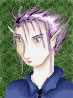
Now all it needs to do is buy a black horse and shriek...
But anyhow, very cool, white lineart is spiffy.