| |||||||||||||||||||||||
|
Typo
(Aug 18, 2003)
^_____^ |

| ||||||||||||||||||||||
|
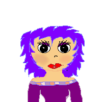
Ryoko_HomsBaby
(Aug 18, 2003)
I don't know what I was thinking when I drew this picture, but here it is . Enjoy. |
| ||||||||||||||||||||||
|
graywolf
(Aug 18, 2003)
Um.... I dunno... Do you likes? Must eat cookie dough.
Ameraq (edited Aug 18, 2003)
oooh, pretty.. *stares* |
| ||||||||||||||||||||||
|
8 comments
– latest 4:
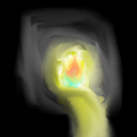
Merulotte (edited Aug 18, 2003)
I think by different directions he could also mean.. Different angles... Like a 3/4 View, or a Side View. You just draw them facing different directions with no angular measurement adjustments... Oh well.I have another idea why it's so blurry. JPG compression. Red is killed by JPG Compression.
xvolcomx (edited Aug 18, 2003)
This is cool. I like the horns. I would have added more to the body though, but tis your pic.Thats all good Knockoff, you keep practicing what you want. *beedy wittle eyes*
RIKG (edited Aug 18, 2003)
Yes Blury. But very cool idea and the horns are awsome.
STAR_WARRIOR (edited Aug 18, 2003)
Awsome fire. Neat devil. |

| ||||||||||||||||||||||
|
nearly_goth
(Aug 17, 2003)
Go my lil fishy:D....again plz can u comment!!!
Turtlebuster (edited Aug 18, 2003)
um... the white reflection in it's eye looks more like an odd growth?other than that, it doesn't look bad. you're really not going to improve by drawing simple images like this. you have to push yourself EDIT: that's my point. if you're only good at one thing, you're not going to become a better artist by only doing that one thing over and over again. try using a photo reference and making a landscape as accurate as possible. trust me, it will work wonders, so long as you don't quit halfway.
nearly_goth (edited Aug 17, 2003)
bu tim only good at simpl eimages.and yea i need to fix up the eye abit:S
AmericanIdolUSA1 (edited Aug 18, 2003)
HEY! Nice fishy, it looks so cute. Here fishy fishy......Hey it aint moving LOL |

| ||||||||||||||||||||||
|
nyao
(Aug 17, 2003)
just had an empty mind... and saw the amazing drawing of ahhock83 at oekakicentral... so i wanted to draw like that... well... turned out bad... not at all like his pic... http://www.oekakicentral.com/jewelrybox/pictures/102.jpg
Merulotte (edited Aug 18, 2003)
Don't be so hard on yourself. I go to OekakiCentral, and when I saw your picture (this one) it instantly reminded me of the front-page image I saw of it!If you just keep practicing, you can exceed beyond anyone. It just takes time. ^_^ It's really nice, though. You did well.
Aunvi (edited Aug 18, 2003)
Ummm the link takes you to a stupidly drawn art theif dude.
Merulotte (edited Aug 18, 2003)
Aunvi: Try copying and pasting the link... OekakiCentral has a direct linking dislike..
dragon_girl (edited Aug 18, 2003)
I love that drawing its to good to be true |

| ||||||||||||||||||||||
|
nearly_goth
(Aug 17, 2003)
YAY!!! this is 2 celebrate tht...im ova my gothic fantasie stage :D AND my extremly hot crush asked me out:D:D:D:D:D...plz comment
Turtlebuster (edited Aug 17, 2003)
i like this -- it looks pretty classy. I certainly hope you haven't grown out of your 'goth' stage and into an infatuated 'girl in love' phase.
nearly_goth (edited Aug 17, 2003)
IM NORMAL:D:D:D
Ryoko_HomsBaby (edited Aug 18, 2003)
sounds like me, except I haven't left the gothic fantasies behind quite yet. Just in case. He's hard to get. I love the way the hearts are neat, but hazy. You could never be sure about love. |

| ||||||||||||||||||||||
|
mikemmaan17
(Aug 17, 2003)
HEHE!!!! i thtink he looks funny
icybluecub (edited Aug 17, 2003)
haha. he's sexy. mike.. i'm cheating on you with this sexy man.. arrrr! *bites' dude's ear* lol. good job.. haha. head's a bit squished though. lol. nice. *hugs!!!** huh. he's so sexy he's rated 13+? hehe |

| ||||||||||||||||||||||
|
AnimalRights
(Aug 17, 2003)
Wheee!
taori (edited Aug 17, 2003)
Reminds me of that fat girl from The Oblongs...I hate that show. But your picture's good. Freaky but good.
Marienkind (edited Aug 17, 2003)
doodle is cute. very nice brown color scheme.
mikemmaan17 (edited Aug 17, 2003)
NOW! thats a shibby picture!!!
Zazoriffic (edited Aug 17, 2003)
Oh...fat...no no no, big boned? maybe he's just fat....muahaha, what the? ish he calling me a loser? -pouts- teehee, very nice! I like the line art and the shading, oh yes |

| ||||||||||||||||||||||
|
Ameraq
(Aug 17, 2003)
ah yes, the demonyishness of it all. heheheh.
Knockoff (edited Aug 17, 2003)
OOoo Very nice! Great job ameraq!
Zazoriffic (edited Aug 17, 2003)
Oh, purty and shiny-ness...I wuv your piccehs, hehe
mikemmaan17 (edited Aug 17, 2003)
Nice pict. i like it. |

| ||||||||||||||||||||||
| |||||||||||||||||||||||
| 2draw.net © 2002-2025 2draw.net team/Cellosoft - copyright details - 9.27sec (sql: 33q/9.21sec) |
=3