| |||||||||||||||||||||||
|
reenaleena
(Jan 20, 2004)
well, first drawing using a tablet or 2draw...not sure if i like it? |

| ||||||||||||||||||||||
|
LightBen
(Jan 22, 2004)
Instead of drawing a human character, I tested a furry.I dunno if it's good so tell me about it (I need to know how to draw a furry for a game I'll make ... someday).
Maiko (Jan 22, 2004)
he's cute, but you might wanna make his nose a bit smaller and the fur on his chest is kinda weird >>;but nice
marcello (Jan 22, 2004)
haha.I agree about the chest fur, not that you shouldn't put any, but the lines don't have the same quality as everything else. Ok I arranged the fur on his chest, it should be better now :)
staci (Jan 23, 2004)
yeah i find the whole furry thing freaky, personally..but his chest fur does look better |

| ||||||||||||||||||||||
|
dixielandcutie
(Jan 22, 2004)
haha, ok, this newest bit of bruising brought to you by...lol. um, ok, tried to takes some of your suggestions...am i getting the general idea? what do i need to improve?...okay, well, while you think on that, im gonna keep on bruisin...*tries to look intimidating* haha. thanks.
DeadlyBlondeArcher (edited Jan 22, 2004)
Glad to see you are practicing! Great idea for getting the hang of shading, highlighting and blending. I think you are on the right track. His chin looks the best of everything so far. Try exaggerating the lights and darks a little, blending with the same graduating color values in between the two. And dont let anybody scare you off! Youre doing fine! :)Oh yeah, I have a small off the comp. "homework" assignment for you to do. Take some objects from around the house - relatively simple ones - books, fruit from the fridge, stuff like that, and arrange them on a table under and to one side of a lamp, where the light source casts definite shadows. Just sit there and LOOK AT THEM. Mentally note where the shadows and highlights are. The next day, get a sketch pad and a pencil, crayola, whatever floats your boat, and roughly sketch it, concentrating on the darks, lights, and values of color in between. This will help you more than anything, I think. Just one more thing - keep in mind that faces are extremely difficult to do, even for experienced artists. For your next drawing, try doing a still life of simple, inanimate objects.
dixielandcutie (edited Jan 22, 2004)
haha...homework *groan* lol, jk. thanks, i will definitely do that! thanks again for all your help!! youre awesome! (oops..just realized im outta space on this one...dunno if theyll let me go on anyway...oh well.) |
| ||||||||||||||||||||||
|
DMV
(Jan 22, 2004)
the power of prayer is awsome!
marcello (Jan 22, 2004)
not to mention the power of some of the latest super computers. or even google.
davincipoppalag (Mar 8, 2004)
This is wonderful! I dont know how I missed seeing this one either... you have some great stuff in here!
emmamommalag (May 31, 2004)
Wow, this is beautiful, too. |
| ||||||||||||||||||||||
|
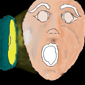
Serchul
(Jan 21, 2004)
Evil mewtant!Done
strangeoid (Jan 22, 2004)
He is a cute evil mutant. I want him. I shall control a legion of evil mutants, all of them under my control!! Muahahaha! *shuts up*
Porcelain (Jan 23, 2004)
Rofl -- great concept, Serchul. Couldn't stop smiling. This is a gorgeous picture -- lovely shading as well.
Stubs (Apr 4, 2004)
How did you do that sand? I like how his drool looks like toxic waste |
| ||||||||||||||||||||||
|
brushes4
(Jan 21, 2004)
lots of work left...cant seem to get her face in...maybe shes too small? maybe im just no good? ah well perserverence comands results! ok so im happy witht he wings and over all i like her, but the face thing is driving me nuts. i would appreciate any advice on how to improve her. i would like to se her perfect lol. |
| ||||||||||||||||||||||
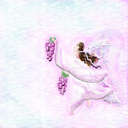
|
Sererena
(Jan 21, 2004)
Just a little sketchy of Serynn, a character for my upcoming webcomic. It will be here eventuslly: http://www.myralice.com
Look (Jan 28, 2004)
It looks like a pencil sketch. So neat! I like the simple monotone. And she's so good looking.
Thear (Jun 13, 2004)
now this is what sketch shoud look like! gj!
Urei-sama (Aug 24, 2004)
sexy, looks good
Animegirl250 (May 5, 2005)
Looks like its on old paper. |

| ||||||||||||||||||||||
|
ky
(Jan 21, 2004)
A. What's that in his hand?B. It's a tipper. A. ...... A tipper. B. Yeah. A. With glowing ends? B. ... It's a magical glowing tipper... when you play it spurts sparks out the end. Oh, but it doesn't ruin your bodhran, oh no. Just some... special effects. A. ... I see......... Hey, can I-- B. No. Just an experiment with light. Stop it, goddammit.
RabidMalikFanGirl (Jan 21, 2004)
*pulls fork back out of your head* Glowy ^^*tries to light ends of random things on fire* *lights end of flute on fire*
strangeoid (Jan 22, 2004)
RMFG.... you have a flammable flute? lol. Very fun picture, ky. |

| ||||||||||||||||||||||
|
dixielandcutie
(Jan 21, 2004)
*stamps foot* ok. im trying to fix this ongoing shading problem i seem to have. but dangit *stamps foot again* its not working. this is what i have so far...can anyone point out something i am doing wrong...right? *help*
DeadlyBlondeArcher (Jan 21, 2004)
HAHA. No foot stomping. I just put comments on your other pics, go read those and then come back to this one. Now, you have already made some progress. You have a light source (an obvious one) and you made some highlights hitting her hair. Youve got the idea. Except since it's coming from behind her we cant do much with that. If we pretend its coming more from the left, you can add some highlights to the left side of the picture (her right side) try highlighting that side of her face, arm and her dress, graduating the color value to lighter the closer it is to the light source. Just keep working at it! : )
staci (Jan 22, 2004)
i agree with archer..good idea..light source..improvement...etc. pehaps you should start off with some inanimate objects. or just faces...and make your canvas bigger so you arent trying to squeeeeeeze all this detail in.
Childlike_Vampire (Jan 22, 2004)
This seems really obvious, but the most "smack your forehead duh" kind of good advice that helped me with shading was to "make your darks darker and your lights lighter". The higher the contrast between the light and the dark, the more 3d a picture looks. ^^
DeadlyBlondeArcher (Jan 22, 2004)
Yes, Dixie! Both of the above great advice! Read and heed... :) |

| ||||||||||||||||||||||
|
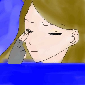
godjilla
(Jan 21, 2004)
sorry, i messed up and thats why everything is blue at the bottom |
| ||||||||||||||||||||||
| |||||||||||||||||||||||
| 2draw.net © 2002-2025 2draw.net team/Cellosoft - copyright details - 4.75sec (sql: 37q/4.71sec) |
heh heh.
Whey!
We HAVE to do a collab!
But....if you want critisism...The hands are a bit less detailed...they look like spanners.
Are you liking Lascaux?