| |||||||||||||||||||||||
|
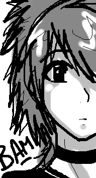
Dude
SHANIQUA
(Mar 7, 2006)
this dude looks like this guy in my classes at school i dont like him or anything i just drew a guy and it looked like him
MelissaMissy (Mar 11, 2006)
wuahahahahahahh meh u should try a bigger pic next time |

| ||||||||||||||||||||||
|
~unwritten_law_girl~
(Mar 7, 2006)
dont ask.
SHANIQUA (Mar 7, 2006)
i love it! |
| ||||||||||||||||||||||
|
Jodylicious
(Mar 7, 2006)
whee~
Pseudonymous (Mar 7, 2006)
I like the softness and the way you shaded. And the colors you used.
Punky (Mar 7, 2006)
I love the smoothness and the softness. The pastel colors work well together. :)Good job.
DoOp (Mar 7, 2006)
having fun?^^ Hehe, GREAT job on the shading and the clour choice! ^^ hehe it's so pretty :)
MelissaMissy (Mar 11, 2006)
she's a beauty! |

| ||||||||||||||||||||||
|
Gouf
(Mar 7, 2006)
Practicing Yellow and trying to match flesh tones. The hair is just there for the sake of being there (hence so messy).Feed back wouldn't go a miss.
MelissaMissy (Mar 11, 2006)
poor little sausage! |

| ||||||||||||||||||||||
|
stupidinvader
(Mar 7, 2006)
first try on this program. its pretty hard, not like normal drawing at all. fun though.
davincipoppalag (Mar 7, 2006)
Yea, it's different. This is pretty good for a first try, too. This might help with learning the applet http://cellosoft.com/2draw/wiki/index.php/Lascaux_Sketch
stupidinvader (Mar 8, 2006)
thanks man. dyou use a mouse or do you use a drawing pad thing? is one easyer than another? (i used a mouse on this and found it pretty hard to controll)
open (Mar 21, 2006)
Woh, thats a cool first picture, especialy as you used a mouse, whats it of? your mum? |
| ||||||||||||||||||||||
|
poshnbecks
(Mar 7, 2006)
2nd attempt
mm4833 (Mar 7, 2006)
:) little twinkle yaaaaaaaayyyyyyyyy |

| ||||||||||||||||||||||
|
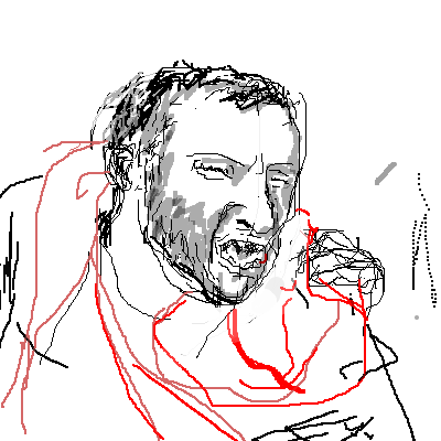
shroomroom
(Mar 7, 2006)
you are
Pffffftttttteeeery (Mar 7, 2006)
dats right bittzle butt.
JESSI (Mar 8, 2006)
richard looks sad :( aww i like his scarf he looks like he has a cold |

| ||||||||||||||||||||||
|
Jodylicious
(Mar 7, 2006)
Just a quickie. |

| ||||||||||||||||||||||
|
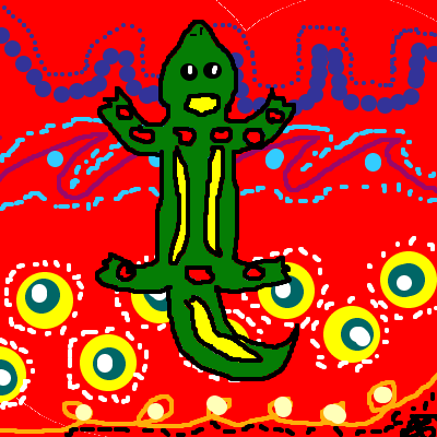
Tai_Chi
(Mar 7, 2006)
I just decided to do some Aboriginal Art. And no, it didn't take me 10 mins, the progam went weird and I had to carry on with it, it actually took me around about 3 hours. What do you think of it? |
| ||||||||||||||||||||||
|
mm4833
(Feb 27, 2006)
holiday rocky cliff. loosely based on ref. Dont really know how to do water so this will have to do
MelissaMissy (Mar 11, 2006)
looks nice |

| ||||||||||||||||||||||
| |||||||||||||||||||||||
| 2draw.net © 2002-2026 2draw.net team/Cellosoft - copyright details - 5.93sec (sql: 34q/5.86sec) |