| |||||||||||||||||||||||
|
origamisunglasses
(Jun 22, 2007)
not done. |
| ||||||||||||||||||||||
|
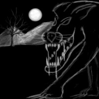
Wraith
(Jun 11, 2007)
I don't know.. I just let my mind go wild on this one. At first I was trying to draw a funny Mushroom Character, but that was not working out, so I just started doodling this instead.
Wraith (Jun 12, 2007)
Thanks man!Yup... 3:30 am when I started messing with this one again.. Weird time to be drawing.
Eh just a doodle. Creature of the night? Wolf? Who knows.
davincipoppalag (Jun 22, 2007)
Love the drool hehe |
| ||||||||||||||||||||||
|
ionicmistress
(Jun 22, 2007)
doodle. |
| ||||||||||||||||||||||
|
RabidSquirrel
(Jun 22, 2007)
Hello! :D |
| ||||||||||||||||||||||
|
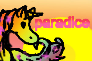
quas
(Jun 22, 2007)
I got bored so I drew this its not that good but it'll do
Sweetcell (Jun 22, 2007)
Paradise is spelled with an S honey.This needs some work. Please go back and fix the lining. It's very sketchy. Using the erasure on med/low and slowly shaving and trimming down the lines makes them smoother and cleaner. Clean up the color bleeding out of the lining. A highlight in the eye would make it sparkle. And fix the word by replacing the C with an S. If your bored you don't have to send, you can save this on your personal files instead. Try putting more effort into your pieces. You'll learn more and get better. |
| ||||||||||||||||||||||
|
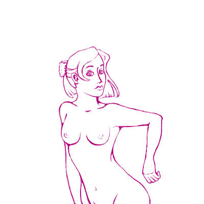
deathking
(Jun 22, 2007)
I cannot draw anatomy for my life XD
enjoydotcom (Jun 22, 2007)
Those were great tips Sweet, it is fun to flicker between v1 and v2. I don't know why I'm obsessed with the variable linewidth, but did you use pressuresensitivity on the size of the pen, or did you first draw and then erase parts of the lines to make it thinner? I ask because it makes a drawing come so much more to live when it doesn't have all the same thickness of lines and when I do it using pressure sensitive I rarely get it, it mostly goes from being thin to a big blob.
Wraith (edited Jun 23, 2007)
This looks like something off of Disney. Great draw! Also, she looks as if she just passed gas, and wants to keep the smell away from her. ( When switched from version 1 and 2 to make it animated )
deathking (Jun 23, 2007)
I used soft like at width 2, and soft erase at width 3. I don't like the way pressure sensitivity comes out, it's either too big or too small.
thenightmaregypsy (Jun 23, 2007)
....>.>*is jealous* Good job, and it does look disney-ish. I wish I could draw neat lines...ugh, I suck at that! XD all my teachers got mad at me for my sketches because there were virtually no neat lines. But good job, I'm still jealous! |
| ||||||||||||||||||||||
|
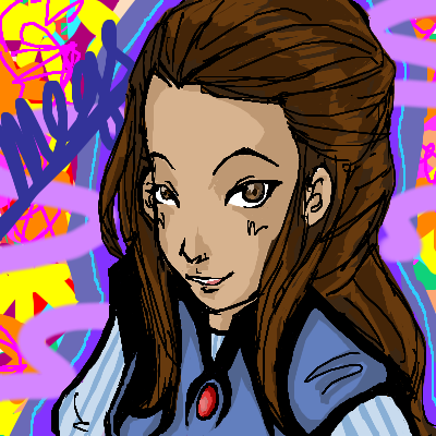
tokyomewmew
(Jun 22, 2007)
From Shrek ever after!
deathking (Jun 22, 2007)
Its really cute but try to use a smaller brush so the image is a little cleaner and the airbrush tool is for light touch ups and to get that soft effect, also try to find a better light source cause theres so many omnipresent light sources here just to make things shiny. |

| ||||||||||||||||||||||
|
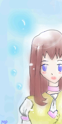
Ignis
(Jun 21, 2007)
Finished!
Maiko (Jun 21, 2007)
oooh, very nicely done :]
Punky (Jun 21, 2007)
Her expression is super. c:
Sweetcell (Jun 22, 2007)
I'm not a fan of the background, it looks like you got a little lazy, but the girl is awesome, the lineart and coloring, nicely shaded too (must learn solid shading)
Ignis (Jun 22, 2007)
Thanks for all your comments..I admit that my background skills are below par..the background in this picture is supposed to represent this girl's mind..scattered and imaginative..though judging by your comment I have failed to represent that..must..improve..again, thank you. |
| ||||||||||||||||||||||
|
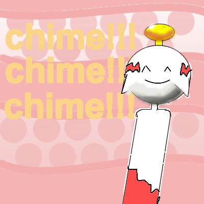
quas
(Jun 22, 2007)
I loooooooooooooooooooooove pokemone :) :) :) :) :) :) :) :) :) :) :) :)
Fiesta (Jun 22, 2007)
Pokemon is awesome.. and this chimecho is too. :3- goes back to playing pokemon ranger - ^o^;
Sweetcell (Jun 22, 2007)
Avoid the fill tool, it leaves behind white marks that's hard to fill in. Use layers to color, and go back and clean up the colors bleeding out, it makes it look unfinished and messy. You might want to work on your lineart as well. Not bad, fairly cute. Next time spend more time and you'll get better and better results as you improve. Welcome. |
| ||||||||||||||||||||||
|
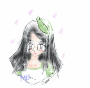
origamisunglasses
(Jun 22, 2007)
This is just a rough plan. Of my gaia avatar. I might start the real 'project' if you can call it that.. tommorow.or some time in the near future. But for now. this is what i have, to start with.
Sweetcell (Jun 22, 2007)
Ok, I noticed you go way overboard with the blur tool, that tool should be used sparingly. The colors look bleached out and the linearts too sketchy. I do like this but the blurring ruined it. Try being bolder with color, using the airbrush for lining, and use the blur tool sparringly. Welcome.
origamisunglasses (Jun 22, 2007)
i dont use the blur tool. i just color it using air brush :/ |
| ||||||||||||||||||||||
| |||||||||||||||||||||||
| 2draw.net © 2002-2025 2draw.net team/Cellosoft - copyright details - 3.16sec (sql: 35q/3.12sec) |
do you know any tutorials i can do?
i get confused a lot using layers it drive me crazy.
drawn in 24 min
ugh.still working on it.
ill try that. :3