| |||||||||||||||||||||||
|
origamisunglasses
(Jun 22, 2007)
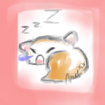
sleeping. D= |
| ||||||||||||||||||||||
|
quas
(Jun 22, 2007)
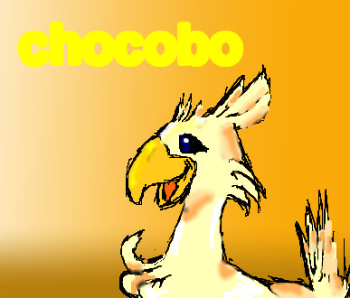
this is a chocobo from final fantasy it took me ages pleeeeeeeeeeeeeeeeaaaaaaaassssssssssssssssee like please it took me a long time shading and this is my first drawing on 2draw so it took me a long time figuring out how to do stuff :)
davincipoppalag (Jun 22, 2007)
This might help some..http://cellosoft.com/2draw/wiki/index.php/Lascaux_Sketch welcome to 2draw
Fiesta (Jun 22, 2007)
I just bought that game for my DS... this is very cute. :)
Kayami (Jun 22, 2007)
^w^ i like it, cute
Wraith (Jun 23, 2007)
LOL! This is cool drawing! Very simular to the recent cartoons I drew. Same type background, and shading. :D |
| ||||||||||||||||||||||
|
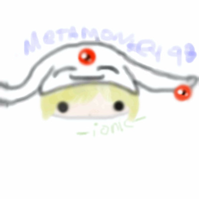
ionicmistress
(Jun 21, 2007)
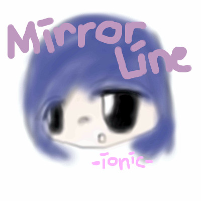
avi art yet again.
Sweetcell (Jun 22, 2007)
The chin needs to be rounder and bigger, the lining needs to be darker (I can barely see it) The coloring is too light, try a darker shade. Her eyes are too large, make them a little smaller and smooth the lines with the soft erasure. The words are a distraction over her head, try putting them below her, and use the font (letter) tool. It'll look much better. And try some shading and highlights in her hair, this would look so much better. You have more than enough space, please go back and work a little more on this icon. You'll see a world of difference. This isn't critique, just artistic tips. Welcome |
| ||||||||||||||||||||||
|
ionicmistress
(Jun 21, 2007)
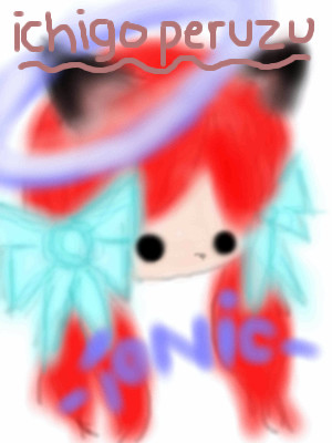
aviart.
Sweetcell (Jun 22, 2007)
Do you use the blur tool? If you do, please don't. It can ruined a picture if not used properly. Again, make her chin bigger and rounder and darken the lineart (especially around the bows, I can barely see them) Highlights in the eyes would make them sparkle, ink her ears to make them stand out, fix the color bleeding from the bows and hair (are you using layers?) Find out where the light source is coming from and put highlights where the light would hit and shading where it wouldn't (in this case I'm guessing the light is coming from the right) Make your lettering better and make your signature smaller, it's taking away from the picture, I look at that before I look at the girl, and make her skin darker. If you spend more time on your pieces you'd see better improvement. |
| ||||||||||||||||||||||
|
ionicmistress
(Jun 21, 2007)
avi art.
Sweetcell (Jun 22, 2007)
I'm not going to repeat myself. Look at your other two pictures for suggestions to improve this picture. They're not bad really, just needs more work.And maybe think about something other than a white background to make them stand out more. |
| ||||||||||||||||||||||
|
Lark
(Jun 21, 2007)
Curses. I can't draw Edgeworth. And I can't draw people facing right. D:<Lamest background in the world. And Nick misplaced his attorney's badge.
Lore_V_of_BlackHat (Jun 22, 2007)
Yeah that one too.......>:DI almost forgot about that one, so hilarious.....:D ..........Logging of Lore.V.............
mai_shadzi (Jul 15, 2007)
lmao. sexy people!
Sweetcell (Jul 16, 2007)
I never commented on this. I don't know who they are but I love your style and coloring Lark. This is no exception. The hands on their hips are off but that's a difficult angle to draw. |

| ||||||||||||||||||||||
|
8 comments
– latest 4:
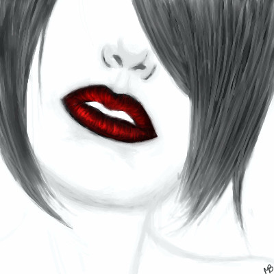
enjoydotcom (edited Jun 22, 2007)
This is great, love the contrast of the black/white and red.Chaotic, you should check out this one of Mocha as well, I like the hair on that one too.
Mocha_Bean (edited Jun 22, 2007)
Wow, thanks all of you!! *glomps all of you*Chaotic: I use the watercolor tool and different shades of gray..also I used the pressure sensitivity tool to make the strands taper.
Chaotic (Jun 23, 2007)
i've been wanting to draw hair like that but never figured out how. thanks Mocha!!! :)and you too for the other example enjoy :) |
| ||||||||||||||||||||||
|
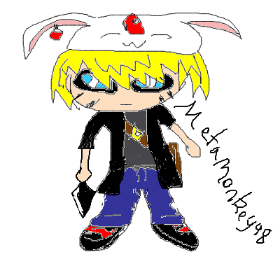
metamonkey
(Jun 21, 2007)
none
Sweetcell (Jun 22, 2007)
DO NOT use the fill tool. It's the devil's curse. Use layers (on the left of the screen) Your lineart needs some work, it's too sketchy. Try using the air brush to make thick lines then come back with the erasure on med/low to shave down the lines. It'll be cleaner. There's more to fix but I'd be writing an entire itinerary. Keep working and improving, and do spend more than 16 minutes on your pieces. The results show. Go back and clean this up, it'll look so much better. Welcome. |
| ||||||||||||||||||||||
|
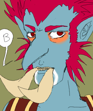
Trip-Machine
(Jun 21, 2007)
My old character on there, PeePeeBubble.I made a new troll, she's a hunter and her name is Emee. That is all.
Nocturnal_Romance (Jun 21, 2007)
Oooh, i love that game ^___^I have a level 70 and stuff :3 ohohohooo |
| ||||||||||||||||||||||
|
penpen
(Jun 21, 2007)
In a sketchy mood |
| ||||||||||||||||||||||
| |||||||||||||||||||||||
| 2draw.net © 2002-2025 2draw.net team/Cellosoft - copyright details - 3.09sec (sql: 32q/3.05sec) |
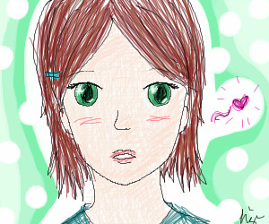
Seriously, try for more opaque in parts of your pic, otherwise it's going to look out of focus as your picture seem to be.
and thank you =)