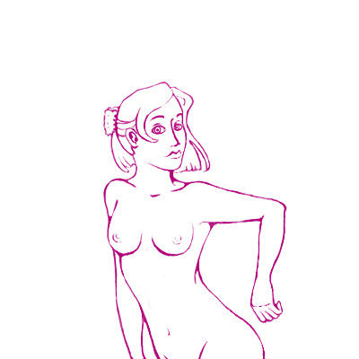
The forearm is a little off, it should be rounder by the elbow and thinner at the wrist and a tad longer (but not much) and the hand could use some work, and shoulder (her left) needs to be rounder also, and at the moment she has the torso of a young male. It's too even in width, even if she were fatter it would still be curvy, just thin out the waist, and to make the head better connected to the neck sometimes a trick I use is erasing some of the lines of the jaw near the neck, as it is right now it looks like someone elses head glued on.
These are just suggestion DK, hope they help, but I can see great improvement from when you were first here. I love watching people improve. It's like a little worm slowly coming out of it's cocoon turning into a be-autiful butterfly. :)
Hells yeah thats more better.....:D
Sorry I wasn't there to see the first version but for what I see you have improved alot since you came here I'm glad......8D
Can wait to see more improvement from you my friend, keep it up, maybe one day we could do a collab soon ok my friend......:D
You to Sweetcell soon you need to make one with me to.....>:D
..................Logging of Lore.V......................
Those were great tips Sweet, it is fun to flicker between v1 and v2. I don't know why I'm obsessed with the variable linewidth, but did you use pressuresensitivity on the size of the pen, or did you first draw and then erase parts of the lines to make it thinner? I ask because it makes a drawing come so much more to live when it doesn't have all the same thickness of lines and when I do it using pressure sensitive I rarely get it, it mostly goes from being thin to a big blob.
This looks like something off of Disney. Great draw! Also, she looks as if she just passed gas, and wants to keep the smell away from her. ( When switched from version 1 and 2 to make it animated )
....>.>
*is jealous*
Good job, and it does look disney-ish. I wish I could draw neat lines...ugh, I suck at that! XD all my teachers got mad at me for my sketches because there were virtually no neat lines. But good job, I'm still jealous!
post comment
You need to be logged in to post a comment. If you don't have an account, sign up now!
drawn in 49 min
These are just suggestion DK, hope they help, but I can see great improvement from when you were first here. I love watching people improve. It's like a little worm slowly coming out of it's cocoon turning into a be-autiful butterfly. :)
drawn in 21 min
I'm curious to know what she's doing. Leaning against something maybeperhaps?
Sorry I wasn't there to see the first version but for what I see you have improved alot since you came here I'm glad......8D
Can wait to see more improvement from you my friend, keep it up, maybe one day we could do a collab soon ok my friend......:D
You to Sweetcell soon you need to make one with me to.....>:D
..................Logging of Lore.V......................
*is jealous*
Good job, and it does look disney-ish. I wish I could draw neat lines...ugh, I suck at that! XD all my teachers got mad at me for my sketches because there were virtually no neat lines. But good job, I'm still jealous!