| |||||||||||||||||||||||
|
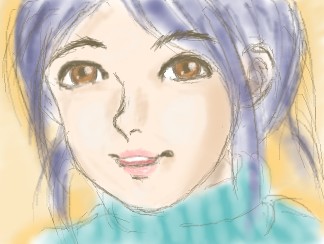
Smile for me.
KOSAKIN
(Jan 11, 2004)
Since the tool which draws a picture with a wonderful bulletin board was highly efficient, it was surprised
snow_child (Jan 11, 2004)
oh its beautiful! i love it
strangeoid (Jan 11, 2004)
Yes, the sketchy outline flows marvelously with the fluid coloring! I lurve eet! *claps* |
| ||||||||||||||||||||||
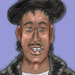
|
ponpoko
(Jan 11, 2004)
Clap your hands everybody, if you've got what it takes'cause I'm Kurtis Blow and I want you to know that these are the breaks
Neko (Jan 11, 2004)
Holy. I feel all warm and fuzzy inside. OUT OF RESPECT. |
| ||||||||||||||||||||||
|
jazzysinger
(Jan 10, 2004)
lets see, i think this one sucks, but whatever. I hope the rating is high enough. it is only at 13+ because you can't really see anything. my original plan for this was to have clothes on her. but then i colored in the skin and decided to make her naked. meh?!? ps i don't like her face. |
This is hidden because it is rated 18+. Edit your privacy settings to make it visible.
| ||||||||||||||||||||||
|
Zappo
(Jan 10, 2004)
My own original work......XD Just kidding I copied it off of ItSuKi! as a joke....and i was bored |
| ||||||||||||||||||||||
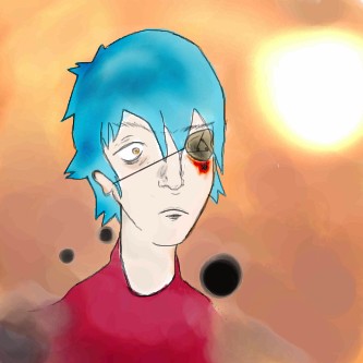
|
ky
(Jan 10, 2004)
13+ for blood.um, for zappo? because his style kicks ass lookit that shitty background
Zappo (Jan 11, 2004)
yay a pic for me....! Hmmm...... We should collab! memo me and Ill have my poeple call your people...........
mazi (Jan 11, 2004)
nice. looks like he was so bored he stabbed his eye out. love the expression, though i think id be a little more upset over losing an eye. but hey.
ky (Jan 11, 2004)
Enh, you know, he's screwed up. He couldn't care less. |

| ||||||||||||||||||||||
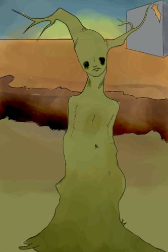
|
Zappo
(Jan 10, 2004)
Was watching blue submariene no6
woke_^_still_dreaming (Jan 10, 2004)
Very Dali, I like it
mazi (Jan 11, 2004)
the eyes are awesome, though the color is a bit blotchy?his expression rocks. very awesome.
Myhirome (Jan 13, 2004)
Woke still dreaming is right. It is very Salvidor Dali-ish! I like it. It makes me think. |
| ||||||||||||||||||||||
|
Zappo
(Jan 10, 2004)
playnig with watercolor number 2. fun fun gah! Edit :i messed up a bunch and didnt even see it! Fixing!
woke_^_still_dreaming (Jan 10, 2004)
I like it
Childlike_Vampire (Jan 12, 2004)
Wow, I love this...I love the profile and the blue/black smudgeyness, its very cool. *sits and looks for a bit*
safescene (Jan 13, 2004)
I love this.
Daymeon_StormRider (Jan 14, 2004)
Hnh lovin it, I liked the first version better though, the thingy that he/she was looking at caught my better than the current one...still lovin how the smudgey-ness on the eyes looks like running eyeshadow...you rule! |

| ||||||||||||||||||||||
|
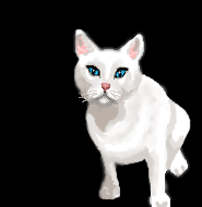
SuzieSuze
(Dec 7, 2003)
It's my evil cat, I will finish this later..
Krystiana (Dec 7, 2003)
Appearances can be deceiving. Often the cutest ones are the most evil of them all. Very nice, although the backside is nice a smooth and looks like fur, but other parts of the outline are kind of pixelated. Great so far!! ^_^
marcello (Dec 8, 2003)
hardly looks cute, definitely looks evil.ok I think I am finished
Fin_beast (Jan 10, 2004)
Na....My cat is a beast! It looks so cool! It's ginger and It's the best cat in the world! it's has a phat ass scar on its ear! |
| ||||||||||||||||||||||
|
Fin_beast
(Jan 8, 2004)
Furyofroy fan art!^_^ Sorry guys......I had a sudden urge to draw porn. I worked pretty hard on this tho. Hope you like it! lol! So so so so close to my dad seeing it!
furyofroy (Jan 10, 2004)
*Feels warm fuzzy feeling in heart* Aww. Thank you Fin. It's fantastic! I really appreciate this. ;)
Xodiak (Jan 10, 2004)
She is very pretty, I feel very erect! Xod will masturbate to your drawing! >:D|XOD|
Neko (Jan 10, 2004)
Ooh, nice. First time with the adult stuff? I'm impressed.Other than the tail it's excellent. I can see why it's erect but it still kinda pokes in the eye violently.
ponpoko (Jan 11, 2004)
Methinks 'tis a tail boner, Neko m'lad. |
This is hidden because it is rated 18+. Edit your privacy settings to make it visible.
| ||||||||||||||||||||||
|
Axil62
(Jan 10, 2004)
Refrence from a pic on some web site about Neil Young
ambermac (Jan 13, 2004)
howdy dan. nice grape-flavored musician. ever been to san geramino? his hometown is a short drive away from me. dig.
safescene (Jan 13, 2004)
This is magnificent. The style is SO wonderful even if it's not original...the blues and purples rock my world
Axil62 (Jan 14, 2004)
Thank you.
shell (Mar 1, 2011)
7 years ago, wow |

| ||||||||||||||||||||||
| |||||||||||||||||||||||
| 2draw.net © 2002-2026 2draw.net team/Cellosoft - copyright details - 5.88sec (sql: 32q/5.82sec) |