| |||||||||||||||||||||||
|
Pkingsora
(Feb 8, 2004)
Not finished..heh..meh comp is acting up..but it will be done soon.. |
| ||||||||||||||||||||||
|
staci
(Feb 10, 2004)
This is mo betta.
Childlike_Vampire (Feb 10, 2004)
I'm liking this very very, minds me of the view across a field in the morning in the country...one of the only reasons I might actually miss the country...beautiful piece.
staci (Feb 11, 2004)
thanks yous guys. : )
DeadlyBlondeArcher (Feb 11, 2004)
I like this alotskly. Kinda reminds me of some desolate places in New Mexico. Watched the animation, 2 - that's neato!
fleeting_memory (Mar 2, 2004)
*gapes* blinks*gapes again* It looks like one of those times when you look up in the sky and you go "Wow that is so beautiful I wish I could take a picture of it" Me likey |

| ||||||||||||||||||||||
|
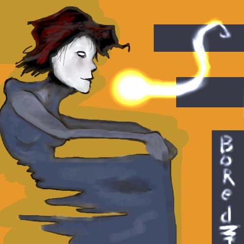
Zappo
(Feb 10, 2004)
Hope ya like
sal (Feb 10, 2004)
very nice zappo.... cool face
concannon (Feb 11, 2004)
I really really like this...not sure why. It might be the contrast between the white/grey face and the darker body....and then the blue contrasting with the really bright background. I'd like it even more if it didn't say 'bored'.Lovely job, though. |
| ||||||||||||||||||||||
|
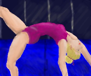
dixielandcutie
(Feb 9, 2004)
hi sorry this isnt hidden...but something is funky with her body shape i think....any suggestions?? *and btw the timer's way off, haha, bout a half hour short...*did more stuff...anything need work in particular...still very far from done...
ok, needs more work...anysuggestions in general?
ok, just a few last minute things...not really sure what else to do, so im gonna leave it at that unless someone has a suggestion.
DeadlyBlondeArcher (Feb 11, 2004)
I think you did a veeree nice job on this one. :) |
| ||||||||||||||||||||||
|
Axil62
(Feb 3, 2004)
Study of a study of a Stone Roberts study.
dixielandcutie (edited Feb 3, 2004)
hehe, awww...thats gonna be adorable! lookin good so far! (oh, and btw...i am constantly amazed at the versatility you have...almost every one of your pictures has a totally different look/theme/style....wow...youre awesome!)
Axil62 (Feb 3, 2004)
Thanks dixielandcutie!
shell (Mar 1, 2011)
I've never done such a study, aren't I ignorant? |

| ||||||||||||||||||||||
|
thug
(Feb 10, 2004)
Did any one ever actually buy these?
pix (Feb 11, 2004)
okay... running the risk of showing my age as well, I also used to see the package of them to be sold in the supermarket... I never had it, because I was a kid and could not afford it, but I did fantasize a lot and was quite curious about it... would they really grow up and become what the drawing was promising? well, now I see it was better this way... great drawing Thug
marcello (Feb 11, 2004)
I'm 18 and I saw those in some science museum shop when I was a kid, so ya.
pix (Feb 11, 2004)
see? museum... gee
Ty854 (edited Aug 12, 2004)
I did, when i was 6 or 7. They were at target. One time i got really bored and counted every one. There were 47 little specs floatin around in there. then i got REALLY bored and named them all. Then i got a playstation and flushed them down the toilet. :) |
| ||||||||||||||||||||||
|
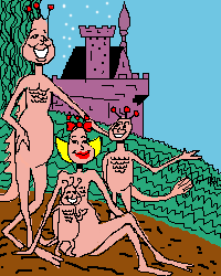
laurael
(Feb 9, 2004)
A pic I came across that I couldn't resist...too cute. Altered it just a bit.
laurael (edited Mar 28, 2004)
Uh...who's mad? I'm not mad... I 'did' laugh at your comment about the five heads...! Hilarious...
Childlike_Vampire (Feb 12, 2004)
lol Well, I suppose mad wasn't the right word. No worries, lol. And this is still a great pic. They look so soft!
laurael (Feb 13, 2004)
No worries here either. Love your pics btw...wonderful talent.
Alicia (Feb 17, 2004)
This is so neat. the creatures look more like baby chip munks.I see some as I walk to work , they like to hang around some thickets on the side of the railroad .One day, I looked under a bush after hearing leaves russle. This time a rat was looking up at me. I didn't think it was cute! |

| ||||||||||||||||||||||
|
Axil62
(Feb 9, 2004)
That was then this is now.
Kloxboy (Feb 9, 2004)
Is this like some kind of flashback? Cool...reminds me of more lysergical days.
DeadlyBlondeArcher (Feb 9, 2004)
All you got was the time? Man, were you missing out! LOL
Axil62 (Feb 9, 2004)
Boy don't I know it missy.
shell (Mar 1, 2011)
selfportrait? |

| ||||||||||||||||||||||
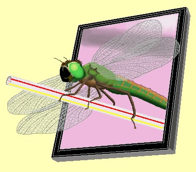
|
thug
(Feb 9, 2004)
dragonflies rule!
Axil62 (Feb 9, 2004)
Great dragon.
Soshell (Feb 10, 2004)
i love this too. the detail in the wings is awesome.. and the straw...i dont get it really...is this surrealism? reminds me of it:) and yes dragonflies do rule!
DeadlyBlondeArcher (Feb 10, 2004)
Wow, I love everything about this one. If it were huge on canvas I'd buy it. Love the straw, the dragonfly, the colors, everything. You are so creative.
davincipoppalag (Feb 24, 2004)
How did I miss seeing this one! Excellent detail on the wings and everything.. very original! |
| ||||||||||||||||||||||
|
DieChan
(Jan 29, 2004)
There, Marcello, I finished it. I colored it based on the screen cap of one of my Anime Music Vids.
RabidMalikFanGirl (Feb 9, 2004)
Awesome!!! Kinda looks like one of those cels that you can find... erm... some places... TO EBAY!
strangeoid (Feb 9, 2004)
Great job! Looks like it came straight out of the anime... except for the slight wavy-ness of the shadow line along the nose. Other than that, it ocks my socks right into the other room.
dixielandcutie (Feb 9, 2004)
nice job! the eyes are very awesome
PurpleLlamasRcoming (Feb 11, 2004)
kenshin! ooo....i like kenshin. :D |

| ||||||||||||||||||||||
| |||||||||||||||||||||||
| 2draw.net © 2002-2025 2draw.net team/Cellosoft - copyright details - 4.10sec (sql: 36q/4.06sec) |
drawn in 16 min
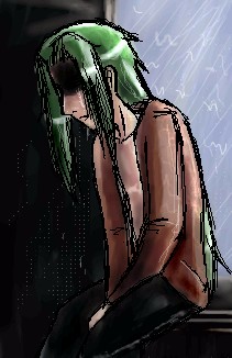
It's dark and emotional like.