| |||||||||||||||||||||||
|
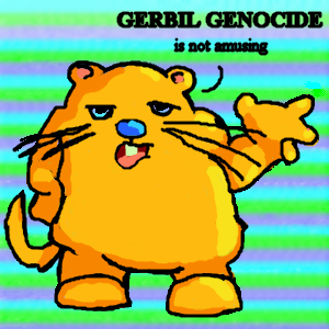
_Neko_Kasaki_
(Jul 19, 2003)
It's _Neko_Sama_, just drawing a picture for my sis, gotta go! |
| ||||||||||||||||||||||
|
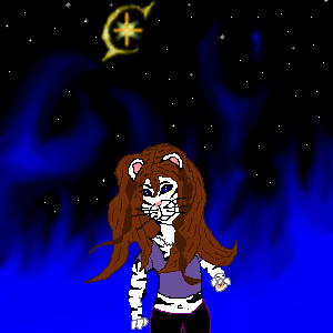
icybluecub
(Jul 19, 2003)
This is my alter ego. although it looks cool, i wish i could draw it better... mybe i'll get the hang of it someday. My fav. animal is a white tiger so... walla! c & c plz. edit: that star is my symbol.
Xodiak (edited Jul 20, 2003)
Very sexy animal self! Lovely! <:D|XOD|
pyrobarbie (edited Jul 20, 2003)
sissyfers..thats it we definately have to cloaberate b/c u kick ass when it comes to bg's! *stares at the blueness of it all* @ @ oOOOooo..very cool kitty-you. luv ya sis ^ ^ |
| ||||||||||||||||||||||
|
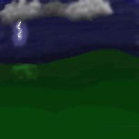
Kazukie
(May 11, 2003)
Unfinished..
Teej (edited May 11, 2003)
The tones of green don't meld well, and I'm pretty sure you weren't trying to create hills.
Kazukie (edited May 11, 2003)
I was trying to create hills and I said it's unfinished. I also have a color problem with my moniter that I've mentioned hundreds of times.. -_____-;;
Tesia-chan (edited May 12, 2003)
PRETTY!
ArchMageZeratuL (edited Jul 20, 2003)
This is physically innacurate... you can't have half a lightning like that. ;) |
| ||||||||||||||||||||||
|
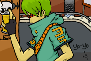
Hakkai
(Jul 19, 2003)
Finished! Woooosh!Beat is so much better than Yo-yo... More Complex, but oh so better. n___n; MY Beat!
Hotaru-chan (edited Jul 19, 2003)
they're all from practically the same game......(you know, beat, yo-yo, what ever zappo's drawing, etc.....) it's kind of freaky........ (o_O); but it's a cool game....................=3
GEM (edited Jul 19, 2003)
tight...that's a cool game.
chocochiko (edited Jul 19, 2003)
Love it.
Genjo_Sanzo (edited Jul 20, 2003)
awesome. |

| ||||||||||||||||||||||
|
concannon
(Jul 19, 2003)
I blame Rydicanubis and all her Chika pictures. Yeah. >_>
quintessence (edited Jul 19, 2003)
So damn neat-looking. *dies* *drifts back in* Pretty, fluffy, lurve ears for some reason. *resumes being dead*
GEM (edited Jul 19, 2003)
cool....I like his nose
rydicanubis (edited Jul 19, 2003)
very nize, very nize!
Genjo_Sanzo (edited Jul 20, 2003)
it's so...cute. I could hug it....almost. |

| ||||||||||||||||||||||
|
Zinc
(Jul 19, 2003)
I just had to draw him again. o.o I'm satisfied now.
Xodiak (edited Jul 20, 2003)
Haha! Green hair is nice! Awesome comic style! >:)|XOD|
Genjo_Sanzo (edited Jul 20, 2003)
wow....great. Great. GREAT. |
| ||||||||||||||||||||||
|
_Neko_Sama_
(Jul 19, 2003)
This is my cartoon called Knuks. This anime cartoon turns 2 years old in August of 2003. I will be drawing other characters like Pinkia, a pink Hawiian cat, Genie, a coyote, and much much more. Please comment.
Turtlebuster (edited Jul 19, 2003)
I am confused as hell. great character though...*swares at monitor*
_Neko_Sama_ (edited Jul 20, 2003)
HERO.My Knuks character is a speed type, age: 14, species: a cross between a white tiger and another unknown creature. Knuks can encouter the fastest speeds of the world, and to stop his evil foe, White Claws, well, you'll see, I'll do every characters definitions. THIS CHARACTER IS A HERO, NOT A DARK. |

| ||||||||||||||||||||||
|
Fin_beast
(Jul 18, 2003)
girls....*sigh*
concannon (edited Jul 18, 2003)
I'd give you sympathy, but since I'm a girl mehself, I figure you don't want it. So I'll give you critique instead! =^__^= Well, and a cookie. *gives a cookie*I dunno what's going on with the eye (I assume it's an eye), but the red around it, that's actually on the purple, would look a bit better if blended. If it's glowing; then just blend it, but if it's crying, then clean up the lines. I like the highlights and shadow, by the way.
Fin_beast (edited Jul 18, 2003)
thx. im pissed at the mo , ive just given her a poem and and ive just talked 2 my giel freidns and she said that she wass upset and she didnt meant 2 hurt me.......wheat the fuk is that about.......she dosent this hshes goin to hurt me?............*siey* its my mind.......Fin x x
rosalyn (edited Jul 18, 2003)
*tears* I know the feeling.... Yep....*scooches twards fin*Foret her, Seroiusly. Some people are just too mean...*pats fin's head* It'll be alright... I hopes you feel better. <:{
forgotten-memory (edited Jul 20, 2003)
Yes, I'll keep my sarcasm to myself and say I like the color scheme. oh yeah, and er...I'm sorry about the girl....*shrugs* |

| ||||||||||||||||||||||
|
Turtlebuster
(Jul 18, 2003)
not A trip, THE trip.
Turtlebuster (edited Jul 19, 2003)
it's not really odd... i don't know what's so fonfusing about it :P I took a trip. i hope you get it now. :|
Knockoff (edited Jul 19, 2003)
Woow I took "the trip" long time ago. XD Nice picture.
mazi (edited Jul 20, 2003)
well hey i dont speak in tongues so i have no idea what you guys are talking about but hey.. lolawesome pic though.. looks really abstracty..
Turtlebuster (edited Jul 20, 2003)
hey mazi, read any book written in the 60's or early 70's and chances are you'll get it ;) |

| ||||||||||||||||||||||
|
concannon
(Jul 19, 2003)
And so...he/she/it mopes. I seem to live to draw androgynous furries. -_- This took so long because I made the same boo boo I made on the 'tiger-ish' picture...I put the final lineart on the same layer as the rough sketch. x___X[Yes, the nails are painted pink. ^____^]
Knockoff (edited Jul 19, 2003)
Yes the hair is very good. And I like the background. Great job.!
icybluecub (edited Jul 19, 2003)
*drools* oh.....wow! I love that! *huggles* it will get better! does she have a name? *wanted to draw a pic of self as white tiger... cant draw furries like this!!!* wowies! *bows*
mazi (edited Jul 20, 2003)
good job, your good at furries. hmm.. id think it was a guy but maybe thats just me..and i always do that... and curse myself and the computer over and over again
Xodiak (edited Jul 20, 2003)
This animal person looks so cute. Makes Xod want to mate with her/him/it >:)|XOD| |

| ||||||||||||||||||||||
| |||||||||||||||||||||||
| 2draw.net © 2002-2026 2draw.net team/Cellosoft - copyright details - 5.09sec (sql: 33q/5.02sec) |
|XOD|
this is a really cool pic. i like the background too. its different