|
| |||||||||||||||||||||||
|
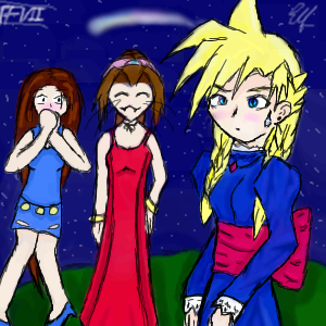
RabidMalikFanGirl
(Feb 8, 2004)
Poor Cloud ^^ This was one of the funniest part of the game... Bwahaha... This is basic shading practice... |
| ||||||||||||||||||||||
|
4 comments
– latest 4:
rosalyn (Feb 7, 2004)
Toung! I have seen this every where! Great job! * bow* Rock on!
marcello (Feb 7, 2004)
rolling stones...
BlackLaertes (Feb 8, 2004)
Wow, Ari-chan, that's great! I absolutly *love* the backround ^_^ You'll have to teach me how to do that someday... |

| ||||||||||||||||||||||
|
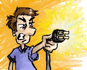
craptastic_spaztic
(Feb 6, 2004)
No reference used. Weird idea for concept. Idea of using an electrical plug as a weapon. Yeah...I know. |
| ||||||||||||||||||||||
|
DinoFlorist
(Feb 6, 2004)
He's courting the Bumblebee Princess. He cannot resist the essence of honey.
sal (Feb 6, 2004)
cool bear... the colourin on the bear and tie is great....
DeadlyBlondeArcher (Feb 7, 2004)
I love him. Now you have to draw the Bumblebee Princess, please. I am waiting for the next page of the story! *frowns, folds arms, stomps foot and pouts* Next Page! Princess! hurry!
Look (Feb 7, 2004)
I like the texture, it looks like a clay bear. Very soft.
DinoFlorist (Feb 7, 2004)
actually the bumblebee princess has already been drawn. It was a collaboration with Icats, so look there. Though, it doesn't really tell the story... |

| ||||||||||||||||||||||
|
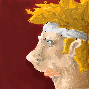
DinoFlorist
(Feb 6, 2004)
This is a character I made for this RPG/story/comic book. Her parents were space mutant aliens and living in that environment drove her to play tennis for meager wages in Southern Mississippi. Then she got old and couldn't play tennis anymore. But the headband remained as a shining beacon of her success!
DeadlyBlondeArcher (Feb 7, 2004)
That cracks me up, dino. ;D |
| ||||||||||||||||||||||
|
Edward
(Feb 7, 2004)
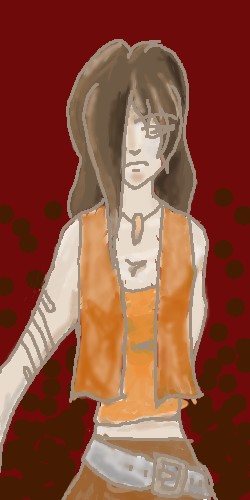
working on it.... |
| ||||||||||||||||||||||
|
The_Chosen
(Feb 6, 2004)
evry one`s favorite donut scarfing doofus *huggels*
keira-chan (Feb 6, 2004)
Yeah for Vash! This is really well done, I can't draw characters from anime shows to save my life!! Unless their the little cute creatures, like Makona, and Ryo-oki >_>;;... Heh ^-^! But I love this, the shading is nice =D
DinoFlorist (Feb 6, 2004)
I always thought that the '3' in the 'and' (of love and peace) sign went the other direction.
marcello (Feb 7, 2004)
You don't mean &, do you? but I think I agree. Looks good, but the donuts could use some work, do you have no shame!?
The_Chosen (Feb 7, 2004)
lol yea i make my & sines bakwards ^^. lol i may touch up the donuts now that u mention it |

| ||||||||||||||||||||||
|
DieChan
(Feb 6, 2004)
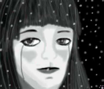
My first attemot at realism... and didn't do very well with it... She looks fat.. Oh well, guess it'll have to do.Eeh... I fixed it. Hope it looks a little better. Still sticking to anime form now on unless I draw from reference.
DinoFlorist (Feb 6, 2004)
hey there's fat people out there! It looks real if yuo think about it that way.
marcello (Feb 7, 2004)
The fatness is not a problem, I think to make it realistic you need to add a little more clarity, as it is rather blurry. Try going in with the pen tool and adding finer lines. Although it is not clear if you intended this or not, it looks like she/he is wearing either a mask or just makeup similar to used in japanese theater (which would make it a him?)... |
| ||||||||||||||||||||||
|
ArchMageZeratuL
(Feb 3, 2003)
As they climb the stairs to the dreaded passage of Cirith Ungol, they can't help but panicking when they see the winged terror over the citadel of Minas Morgul. Meanwhile, Orodruin can be heard as it rages many miles to the northeast.
ArchMageZeratuL (edited Feb 3, 2003)
I felt that problem too. It seemed right it the applet... hehe...
roguefrequency (edited Feb 13, 2003)
I really like the lava, smoke, and the moon.
Ari (edited Feb 19, 2003)
AWESOME!!! *claps* another Tolkien fan!!! *is obsessed with Tolkein*
Knockoff (Feb 7, 2004)
Very nice, I love the moon and the clouds.And the shiny thing. |

| ||||||||||||||||||||||
|
sal
(Feb 6, 2004)
.....
Edward (Feb 7, 2004)
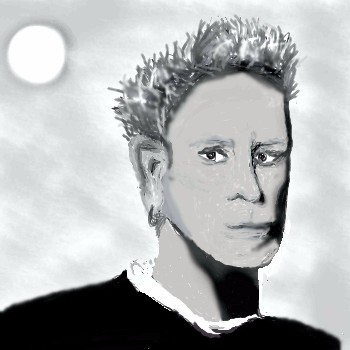
i think there should be more shadow in the chin area but otherwise it looks fairly good a little choppy but good.. |
| ||||||||||||||||||||||
| |||||||||||||||||||||||
| 2draw.net © 2002-2026 2draw.net team/Cellosoft - copyright details - 6.31sec (sql: 35q/6.26sec) |

drawn in 12 min
"Little did they know that the cute little meteor would be plummeting towards the planet in a few short days..."