| |||||||||||||||||||||||
|
p3ndragon
(Aug 29, 2005)
RAWRRRR!!!11 >:((( |

| ||||||||||||||||||||||
|
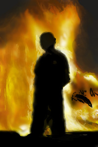
Mal
(Sep 15, 2005)
a scene from Northern Ireland
davincipoppalag (Sep 15, 2005)
Such a shame.. all that trouble ... in the name of religion...
lycene (Sep 15, 2005)
My great-grandparents were burned out of their village by Protestants. Not really important, but an interesting little tidbit on the subject. I love the fire; it's really well done and I love the contrast between the brightness and the detail of the fire against the empty black of the figure and background. |
| ||||||||||||||||||||||
|
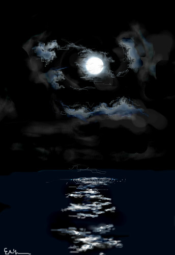
starmarked
(Jul 22, 2005)
Um...I am all out of comments...all black was fun :]
lycene (Sep 14, 2005)
This is beautiful; I especially love the clouds.
LasRever (Sep 15, 2005)
Wow this is neat. I loooove the dark colors, and the clouds. Great work!
starmarked (Sep 15, 2005)
Thanks everyone!
p3ndragon (Sep 15, 2005)
Wow, those clouds right next to the moon look very wispy and realistic. Beautiful. |
| ||||||||||||||||||||||
|
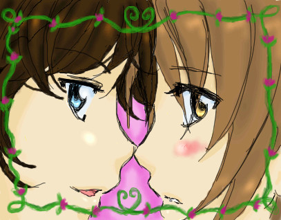
minikuineko
(Aug 10, 2005)
i'll finish this in a bit, i'm being tragically kicked off the computer...ok.. i think i'm gonna leave as is.... for some odd reason i think there's so much more i could do with ><;;;;
GeeGee (Aug 12, 2005)
aw, that's so cute ^__^
oikitsumaru (Aug 12, 2005)
love the little frame and sketchy lineart. awsome!
xlilcutie2x (Sep 15, 2005)
weee It So Cute!! |
| ||||||||||||||||||||||
|
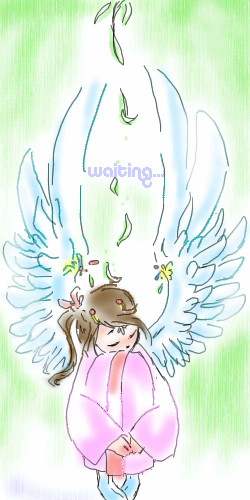
porifra
(Sep 13, 2005)
I wanted to say waiting in Korean, but the letters showed up as big blocks so it's in english...
DivineStar (Sep 14, 2005)
Awww....that looks so sweet :D
Namori (Sep 15, 2005)
wah...I love the wings! |
| ||||||||||||||||||||||
|
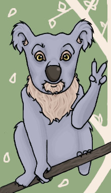
xswirvex
(Sep 10, 2005)
..he's a Koala
Caddris (Sep 13, 2005)
Hello, Frank. I like the coloring on this one.
FLYING_SQUIRREL (Sep 14, 2005)
peace
davincipoppalag (Sep 15, 2005)
Hi frank,how's your cousin Koka.. |
| ||||||||||||||||||||||
|
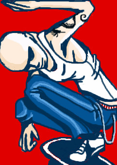
Kraisa
(Sep 15, 2005)
dunno...really...I been busy lately...thought I would stop by and do some doodlin' and this is what popped out of my head...( watched some mountain dew x games thing the other day...that crap is amazing!!! I was sad though the only guy I knew of hurt himself in the motorcross part...The Cowboy guy who rides a KTM...annnnnyyyyways...) No references just my head...I think I need to work on hands...but I am getting better at the cell shading idea I think...be back again when I can..
davincipoppalag (Sep 15, 2005)
Interesting picure. I like the bold outlines |
| ||||||||||||||||||||||
|
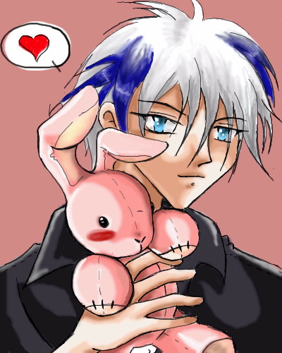
totori
(Sep 14, 2005)
This is for one of my close e-buddies. ^.^ I hope she likes it. *huggles bunny* This is my first time drawing a bunny in about ... 5 years? Gosh... I'm old. >.< *faints* okay.... once again sorry for the sloppy style. I'm running on 3 hours of sleep for the past 3 days. >.< This all because I'm moving!!! *rant/rave* anyways. I may redraw this again just to see what It would look like when I'm bright eyed and bushy tailed.
Enjoy
anarie (Sep 14, 2005)
Squeeee. SexAAY. XD YOu know I think all your boys are sexy. Even if this was for someone else. Psh. He's damn fine. XDAnywhooo... It's cute! Sure it's a bit messy but it's cute and charming (and sexy) so I don't care. Hurry up and move so that you can draw more. XD
Caddris (Sep 14, 2005)
Awwwww! Bunny! I really like the shading and his hair.Now go get some sleep. ;D |
| ||||||||||||||||||||||
|
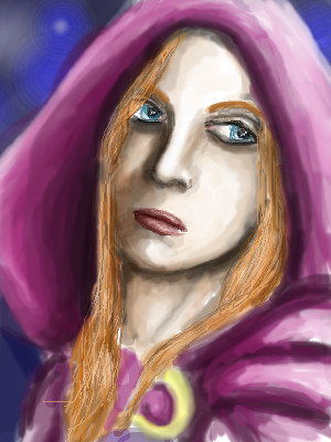
thesolarwinds
(Sep 14, 2005)
i know.. the time limit.. but this isn't done and I have to go to class... will finish it later.. hopefull it won't look so watercolor-ish when i'm done.. just laying in colors for now.
davincipoppalag (Sep 14, 2005)
It's a good start.. I kind of like the watercolory feel.erm... i think some things ar etoo dark.. while others too light.. i dunno.. it needs a ton of work before i'll be happy withh this one.
erm....
erm... i guess its finished....
|
| ||||||||||||||||||||||
|
hideyourface
(Aug 24, 2005)
trying to do smooth lineart.
anarie (Aug 25, 2005)
Gah. You're calligraphy is so good. @_@ Nice work. <3
hideyourface (Aug 25, 2005)
rofl, calligraphy is easy when you draw it that small. I really just kind of scibbled it. but thanks.
LasRever (Sep 14, 2005)
Oo hot Gaara! (literally ha!) He makes me happy in the pants. Good job on the love kanji! (er whatever you call it) |

| ||||||||||||||||||||||
| |||||||||||||||||||||||
| 2draw.net © 2002-2026 2draw.net team/Cellosoft - copyright details - 7.23sec (sql: 40q/7.10sec) |
drawn in 21 min
This is a very pleasing image.