| |||||||||||||||||||||||
|
IkariIreuL
(Sep 12, 2005)
12/09/2005 @7:14 amI think I´m going to stop posting in here nobody comment my pics in here ... |

| ||||||||||||||||||||||
|
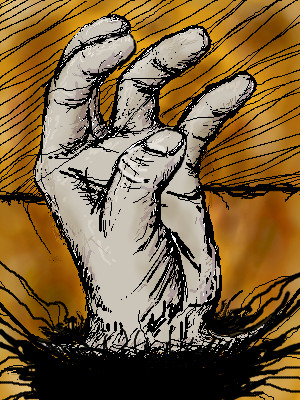
Zer0
(Sep 17, 2005)
The old hand trick.. |
| ||||||||||||||||||||||
|
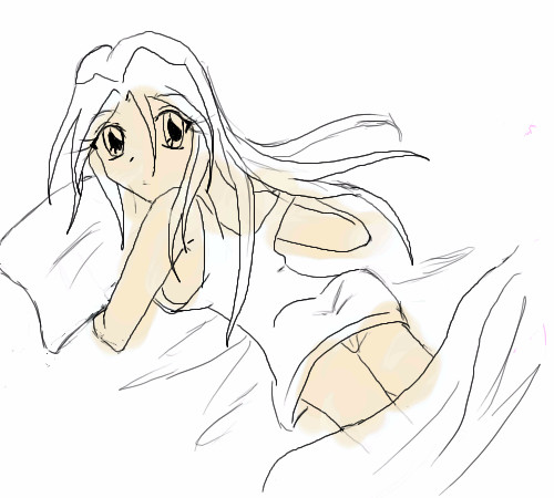
MischievousYoukai
(Sep 18, 2005)
I was bored.
xlilcutie2x (Sep 19, 2005)
o.oewww a butt no jk
p3ndragon (Sep 19, 2005)
^LOL!x.x; I'm going way too slow..with this...and I think its the wrong color...for skin =\
|
| ||||||||||||||||||||||
|
LisaAnne
(Aug 31, 2005)
"A journey of a thousand miles, begins with a single step." -Lao TzuAn independent person can be threatening to some. Is it the shoes we walk in or the thickness of our skin... I certainly do not know, but everyone's got a story. I just moved to Columbus, Ohio...and so I start walking a new path. My computer is having all sorts of issues...
Gave my brother an "art lesson"...and he was asking me all about acrylics, so I got distracted. Not satisfied...but done enough.
Messed around for a while with the shadow being realistic and going up against the "wall", but I decided against it. Timer is a little off, none the less its still not as skillful as it should be for the time spent...sigh...Learning.
davincipoppalag (Sep 18, 2005)
Lots of people in Columbus.. I would recommend shoes for walking around there.. I think this is pretty good.. maybe a bit darker darks and a few highlights to add some substance? ?Still pretty good
LisaAnne (Sep 19, 2005)
Thanks I appreciate it. I know I do need to fix alot on it...but I got bored and frustrated with it...particularily the left foot. Perhaps I'll come back to it later. |

| ||||||||||||||||||||||
|
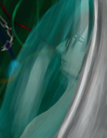
nekodesu
(Sep 15, 2005)
Started a research about it and it's very interesting...preserving a body by freezing and later reviving it (which can happen in near future). heh inspired me to draw this eventhough it didn't come out the way I wanted it. ....blah
Caddris (Sep 18, 2005)
Yeah. The human body has an expiration date though. After a certain amount of time in cryostasis there's no hope in bringing the person back to a normal functional state. The freezing process is hard on tissues. If the person is frozen too slowly ice crystals form and damage cell walls . . . sort of like freezer burn for organs. ^__^ Cool picture though. I like the green glass and the peaceful, sleeping look on his face.
Desolate (Sep 19, 2005)
yep... Caddris is right... After that whole freezing thing happens and you thaw out the body it turns to mush. There are only 2 things frozen in such a way at the moment. The maker of a company (Alcor Foundation) that does it for $120,000 has frozen the owner/founders brother and his dog... Check out Penn & Tellers Buller$#!+ on HBO or buy it on dvd to watch the episode called Death Inc. where this is mentioned... or not... Still a great pic, great use of color. |
| ||||||||||||||||||||||
|
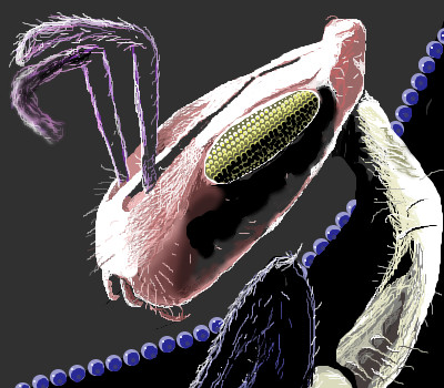
thug
(Sep 16, 2005)
black bug's blood, black bug's blood, black bug's blood....
SneakyWalter (Sep 16, 2005)
Your attention to detail is apparent. An awesome picture, and a relieving break from too much anime (For me anyway).Don't let the bedbugs bite...
Anna (Sep 16, 2005)
I love when you draw ^_^ Good stuff, thug!
Caddris (Sep 16, 2005)
Heh. It looks like a picture from a scanning electron microscope. Nice detail.
starmarked (Sep 19, 2005)
Nice job thug! I think his eye (at least I think it is his eye) looks like an ear of corn :3 |
| ||||||||||||||||||||||
|
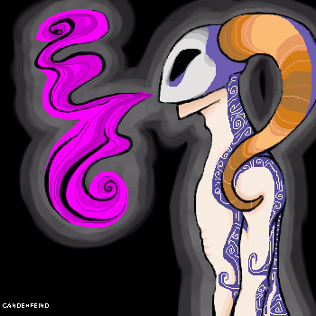
candehfeind
(Sep 18, 2005)
Vent image... dreading French homework...I'll try and finish this sometime tomorrow...
nekodesu (Sep 18, 2005)
Whoa...nice swirly lines o_o looks very intersting so far.still not finished, but I'm getting there -_-`
And done... :D
|
| ||||||||||||||||||||||
|
Phil
(Sep 15, 2005)
:)
davincipoppalag (Sep 17, 2005)
You need to go out and get ya some Phil,,,ya keep drawing boobs lol
Polly486 (Sep 17, 2005)
Nice,,, like the little hair near the ear,,,and the shades,, again... :P the wings is beautiful..... the whole picture is very very nice babe... and the colours,, :p i love purple.....
Anna (Sep 17, 2005)
lol. I'm surprised she doesn't have a corset.
Phil (Sep 18, 2005)
lol anna :) |
This is hidden because it is rated 18+. Edit your privacy settings to make it visible.
| ||||||||||||||||||||||
|
Kit
(Sep 17, 2005)
I love Michael Jacksons Little Susie. Go ahead, burn me at the stake, its a good song. :D~Kit Oh yeah, this can be moved to beginners...I can't figure out how to... I just started using 2draw again, so I need to relearn everything. ^^;; |
| ||||||||||||||||||||||
|
~unwritten_law_girl~
(Sep 17, 2005)
wheee
Phil (Sep 17, 2005)
and when she dont look ... it bite her finger off ^_^ps nice faded bg effect
hideyourface (Sep 18, 2005)
the shading is a bit weird, like how theres no wrinkles, but the jagged shading on the shirt, and the jagged shading on the arm too.
Chaotic (Sep 18, 2005)
I like your lineart on this...but I kind of agree with hideyourface. The shading on the dog is good because it implies the texture of the dog's fur. However, unless the human's skin is as textured as the dog's fur, I suggest that you fix the shading on the girl just a tad. But, the overall BG and pic is great!! Sorry for sounding like that....art teacher says stuff like that all the time to me because sometimes you see strokes when I shade. Just trying to help a fellow artist out.
~unwritten_law_girl~ (Sep 18, 2005)
thanx >.< |

| ||||||||||||||||||||||
| |||||||||||||||||||||||
| 2draw.net © 2002-2025 2draw.net team/Cellosoft - copyright details - 5.28sec (sql: 43q/5.19sec) |
most people are in school right now so they do their art and go
on the beginners board people look and comment a little more though
you will see when school is out for a break or for summer more people will comment
If you are planning to become a mod ask cello not me.