| |||||||||||||||||||||||
|
Indian Sunset
Miss_DJ
(Mar 19, 2006)
As I awoke this evening with the smell of wood smoke clingingLike a gentle cobweb hanging upon a painted tepee Oh I went to see my chieftain with my warlance and my woman For he told us that the yellow moon would very soon be leaving This I can’t believe I said, I can’t believe our warlord’s dead Oh he would not leave the chosen ones to the buzzards and the soldiers guns Oh great father of the Iroquois ever since I was young I’ve read the writing of the smoke and breast fed on the sound of drums I’ve learned to hurl the tomahawk and ride a painted pony wild To run the gauntlet of the sioux, to make a chieftain’s daughter mine And now you ask that I should watch The red man’s race be slowly crushed What kind of words are these to hear From yellow dog whom white man fears I take only what is mine lord, my pony, my squaw, and my child I can’t stay to see you die along with my tribe’s pride I go to search for the yellow moon and the fathers of our sons Where the red sun sinks in the hills of gold and the healing waters run Trampling down the prairie rose leaving hoof tracks in the sand Those who wish to follow me I welcome with my hands I heard from passing renegades geronimo was dead He’d been laying down his weapons when they filled him full of lead Now there seems no reason why I should carry on In this land that once was my land I can’t find a home It’s lonely and it’s quiet and the horse soldiers are coming And I think it’s time I strung my bow and ceased my senseless running For soon I’ll find the yellow moon along with my loved ones Where the buffalos graze in clover fields without the sound of guns And the red sun sinks at last into the hills of gold And peace to this young warrior comes with a bullet hole (Bernie Taupin/Elton john)
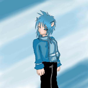
Opium (Mar 21, 2006)
I looooooooove the colors!
davincipoppalag (Mar 21, 2006)
This one's really good Donna! I like how you finished up and refined it.
Miss_DJ (Mar 21, 2006)
THANKS!! so glad you like this!
ak.to.v.his.di (May 16, 2006)
i like the colors, and this is an interesting way to depict my people.... i've not seen something like this before |

| ||||||||||||||||||||||
|
kristine
(Apr 15, 2006)
._.
gerbear (Apr 24, 2006)
This is extraordinary. Loose yet life like! A fantastic piece of art!!
Gemmy619 (Apr 25, 2006)
This is gorgeous, the water reflection is really good not to mention the tiger, great draw :)
Airin (Apr 25, 2006)
a visually enticing treat for tired eyes =)
ak.to.v.his.di (May 16, 2006)
that is really good! |

| ||||||||||||||||||||||
|
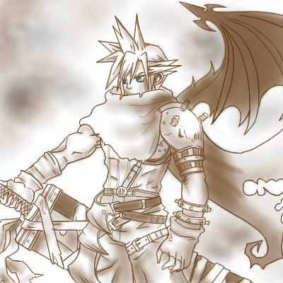
kuramaandhiei
(Apr 27, 2006)
its just a head
Heartsdomain (Apr 27, 2006)
keep up the work..he looks hot lol!
kuramaandhiei (Apr 28, 2006)
thanks alot^_^
kristine (May 15, 2006)
You could have done a lot more with the canvas space you chose. You're getting better though. |

| ||||||||||||||||||||||
|
monkey_says
(May 14, 2006)
listening to Curse of Curves by Cute Is What We Aim For. awesome song. anywho. voila. just stretching, I guess, after the long haul of getting my portfolio submission done.
woah_pockster (May 15, 2006)
great doodle =]
patienceisoverrated (May 15, 2006)
I like the ear sticking out of the hair. |

| ||||||||||||||||||||||
|
kuramaandhiei
(May 15, 2006)
well... |
| ||||||||||||||||||||||
|
monkey_says
(May 15, 2006)
today I developed my photos from the Junior-Senior Banquet (like senior prom, but for snobby private schools).... and I really wanted to try using the pics as reference photos. Eyes, lips, hair, cleavage (there was a lot of that), whatever. Just practicing. trying to wean myself off of using line so much. XD |

| ||||||||||||||||||||||
|
101_Torchic_101
(Apr 29, 2006)
(>_<) I drew Cloud for my boyfriend..(>_>) Jeez, he's a bigger fan than you'd think, lol...And, yeah, I used a reference..but, I didn't draw the claws..(>_>) Tyler thinks the claws look stupid, lol..hmmm..I don't know if I should color this or not...Ref : http://www.squareuniverse.net/downloads/wallpaper_winampskins/kh/kh-art007.jpeg EDIT : I suck at hands.
Sasuke-fan-Sapphire (Apr 30, 2006)
amazing! this is very well done! your improving alot in your art^^
gerbear (Apr 30, 2006)
This is very well done. Good art takes time. :)
Zeal (May 6, 2006)
Freaking Amazing :3
metroid_prime_hunter (edited May 15, 2006)
Nice pic babe <3 Tyler... im out |
| ||||||||||||||||||||||
|
shults
(Feb 16, 2006)
A baby-deliverr apprentice.
shults (Mar 6, 2006)
truth is, I HATE the reflection. (mom's).didn't know how to do it, and didn't finish it, cause of the hope for some help or a miracle. mm.. now it's better. think.
Miss_DJ (May 15, 2006)
very nice!
Sweetcell (May 15, 2006)
Those babies are cute and the simplistic style of the water is wonderful. You did a good job on the reflection. |

| ||||||||||||||||||||||
|
1 comment
– latest 1:
kayla (May 15, 2006)
It's actually kind of cute. O.O |
| ||||||||||||||||||||||
|
TaCO
(May 14, 2006)
Just lots of practice.move it down. |

| ||||||||||||||||||||||
| |||||||||||||||||||||||
| 2draw.net © 2002-2026 2draw.net team/Cellosoft - copyright details - 5.62sec (sql: 33q/5.55sec) |