| |||||||||||||||||||||||
|
nobody
(May 2, 2006)
heh... ref: http://www.deviantart.com/deviation/15358528/this could be frightening. ;) |

| ||||||||||||||||||||||
|
chan2005
(Apr 29, 2006)
attempt at a realistic portrait.. tis taking awhile and mucho space
chan2005 (May 5, 2006)
Thanks for all the comments. ya damn straight he's an awesome actor.. screw Gandalf.. Gods and Monsters anyone? i canny seem to find the comment where Artiste reveals her (it is a her isnt it?) tricks of the trade.. something about lines bein used almost exclusively, keeping opacity down (around 100 or so).. being able to control exactly where u wanna draw.. just give it a go. Everyone should try usin lines! :D its mouse compatible which was the main advantage for me
staci (May 5, 2006)
im so helpful!
Sweetcell (May 5, 2006)
Thank you staci, I remember that one. I'll have to try line art, I always sketch everything out.
Tsukiko (May 29, 2006)
aaaawww!! so sweet :P i love this! very goooood job! |

| ||||||||||||||||||||||
|
staci
(May 1, 2006)
aye jai jai jai
kristine (May 2, 2006)
i always wondered how you get the applet to match the background so perfectly. I really love this, its so simple yet effective.
Knockoff (May 3, 2006)
Oooh, looks excelent so far Staci. Keep it up :)
kizpov (May 6, 2006)
maybe i'm dumb, but when i first glanced at it, i thought johnny cash.
im_sorry_6669 (Jun 14, 2006)
The guitar looks awesome! Good job. |

| ||||||||||||||||||||||
|
Ceido
(Jan 26, 2006)
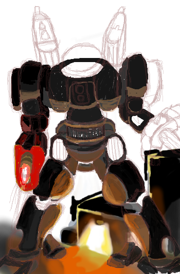
Thought i'd try and draw some sort of mech.No references used, which is probably why it went humanoidy. EDIT // Will anyone finish this one off? I'm getting frustrated with it.
davincipoppalag (Apr 29, 2006)
Ask Zack , this is a good start and he's great at these things, fin.
DarkCloak (Apr 29, 2006)
When I get fustrated with a picture because it doesn't look/feel right... I start adding explosions, destroying the bits that I'm getting fustrated with. You should try that, it would make for a sweet action scene.
Noremac (Apr 29, 2006)
HAHAH that's a rad idea.
Punky (Apr 30, 2006)
I'm loving the lighting so far. :)I really want to see his finished. |
| ||||||||||||||||||||||
|
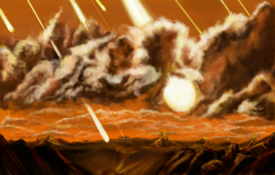
15 comments
– latest 4:
Sweetcell (Apr 29, 2006)
Thank you everyone, poppa, maybe now you need that deserved break... Have a Kit Kat.Oh Matt, you and your silly stories, there's a meteor coming, apples can only be eaten inside out. You silly you.
gerbear (Apr 30, 2006)
WOW! Super impressive!
NOVEMBER93 (Jul 18, 2006)
that's amazing! the colors choices are fantastic
Monochrome-Tears (Aug 20, 2006)
The idea is really cool, and colors fit reallly well together, but still stands out from each other enough so that we can see everything clearly. It's so hard to pick colors like that (for me, at least) |
| ||||||||||||||||||||||
|
Hiro_Kara
(Apr 27, 2006)
I could kick myself for starting out in beginner (never used this program before) cause I was stuck with that tiny canvas size... Oh well. Wow, this is my first piece since I turned 17 on the 10th... Anyway, I've got this annoyingly dark moniter, so if it's coming off really light..well..thats why.. its actually darker >_> Yeah I know..artist's moniters should be in top condition but what the hey... Mouse and no references. For more art visit http://seabird.deviantart.com. Do Not Use.
woah_pockster (edited Apr 28, 2006)
great first draw! =] and happy birthday as well x]this is beautiful, the clouds really bring out her expression<3
fleeting_memory (Apr 28, 2006)
the title reminds me of the name of a book-I really like the shape of your roses, you did them very well.
Sweetcell (Apr 28, 2006)
This is really nice, the use of grey tones only to hae the roses pop out. The detail is wonderful.
Miss_DJ (Apr 28, 2006)
hi neighbor (I live in Oregon)...very nice art! I love the whole b/w and red choice you made in this. The water is super and the flowers are so lovely, they look edible. You capture a lot of emotion in her face. Welcome to 2draw. |

| ||||||||||||||||||||||
|
patienceisoverrated
(Apr 23, 2006)
Entry for a logo/character design contest. I wanted to try something on a bigger canvas, so I did, and I was never really intending to post it, but I put so much time into it I can't bring myself to delete it, so.... if this offends please move it down.
concannon (Apr 28, 2006)
GREAT colors. Very impressive.
Knockoff (May 3, 2006)
This style seems so familiar.... hmmm.. >___>I absolutly love this though. The pants rock. I wish I could draw pants half as good as you :[ The coloring is great too!
patienceisoverrated (May 3, 2006)
Thanks y'all :)Knockoff: If you can remember what it reminds you of, I'd love to see.
marcello (May 3, 2006)
maybe quintessence? |

| ||||||||||||||||||||||
|
18 comments
– latest 4:
kristine (May 5, 2006)
I really love this. I dont know why, but its just addictive to stare at.
Sweetcell (edited Sep 22, 2006)
hi1022 maybe your thinking of the up-dated animation of treasure island, only it was called treasure planet, I think.
O_O (Jul 27, 2006)
Yup,same as them. Reminds me of that movie treasure planet. @______@ I like it. o: A lot. O____o <33333
Cordelia_Pink (Sep 7, 2006)
Niiice! You guys actually went to Neverland on that ship, didya? |

| ||||||||||||||||||||||
|
Opium
(Apr 25, 2006)
.
Roytje (Apr 30, 2006)
Why is she quitting 2draw?
kristine (Apr 30, 2006)
Theres a forums post about it
shining_star_sam (Jul 26, 2006)
HEYYYYYYYYYYYYY <33333 great drawing hunni bun! i've been gone for four months cos my pc went bung. just lettin u know i'm back and leavin ya a comment. luff ya loads!
iamawalnutt (Sep 29, 2006)
what is it?? its just all white.... |

| ||||||||||||||||||||||
|
Artiste
(Apr 25, 2006)
.
Artiste (edited Apr 26, 2006)
Thanks everybody!Frootcake: I could try out shi. I'll do my next painting in that. I'm a children's book illustrator, and my agency needed a painting of a 5 yr. old girl, shoulders up for an ad. And I procrastinated too much and the deadline was yesterday! I figured I could do a quick painting here. So, I needed it to shrink down to 300dpi for print (that's why its so huge). All your comments are reassuring, because I was afraid this wouldnt cut it.... looking at it now I can see that the hair kinda sucks, but oh well.
LisaAnne (Apr 26, 2006)
Great style, and cute subject.
Renuar (Apr 26, 2006)
what a great picture. it cuts.
shell (Apr 2, 2010)
awesome |

| ||||||||||||||||||||||
| |||||||||||||||||||||||
| 2draw.net © 2002-2026 2draw.net team/Cellosoft - copyright details - 1.37sec (sql: 35q/1.32sec) |
drawn in 28 min