| |||||||||||||||||||||||
|
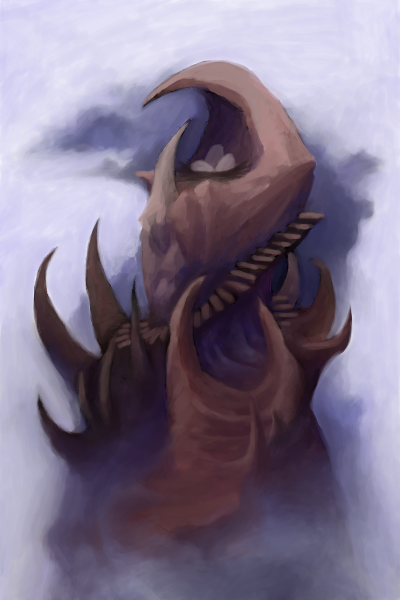
Mount Doom
Shanghai
(May 5, 2006)
This is a chaotic place, where blueprints are illegal and using dayschedulers is punishable with random words drawn from hats.really though, I had no plan on what to make and this whole thing, along with the place description, is all stream of thought. Didn't stop drawing/typing to think about what I was doing for more than 3-4 seconds at any time. -it ended up being a dragon's nest. Also, I have got to think of a better title. >_>
davincipoppalag (May 6, 2006)
I keep seeing lobster claws when I first look at this. Very mystical and creative.
Deino (May 7, 2006)
Yay! You finaly finished it! It looks awesome x) Your colouring is gorgeous.
Zack (May 7, 2006)
This kind of reminds me of Frazetta. Very nice blue shadows.
solve (May 7, 2006)
Youre another one on here who has not only the creativity to think up something like this, but the ability to produce it on a canvas. Truely a wonderful thing. Your arts always (ALWAYS) a charm to see for me. |
| ||||||||||||||||||||||
|
tappie_chan
(Nov 26, 2003)
trying a bit of a different style.
Krystiana (Dec 2, 2003)
Very cool. It looks like watercolor and ink (for some reason, still one of my favorite things to use off oekaki boards). ^__^ I really like the shapes in the background. ^^;;
angelbate (Dec 20, 2003)
pretty eyes, like the shiny look. and good on the dirt on his face, usually it looks out of place.
finalfairy383 (Jul 1, 2005)
It tottally reminds me of ghost in the shell nice eyes really hot
NOVEMBER93 (May 6, 2006)
it's very perty! i like ie alot...great coloring job...since the eyes are what i always notice first, i say the eyes are totally awesome! |

| ||||||||||||||||||||||
|
nobody
(May 2, 2006)
heh... ref: http://www.deviantart.com/deviation/15358528/this could be frightening. ;) |

| ||||||||||||||||||||||
|
davincipoppalag
(Apr 19, 2005)
Ewwww ...shuddder....
Queen_Asheer5600 (Oct 1, 2005)
Ah the Black Widow, one of the true beauties of the spider kingdom (Aside from the Yellow, Black and White orb webs I have here) yet one of the most deadly. I am a true fan of spiders, mainly because they are very interesting. Just never bring a Brown Recluse or Wolf Spider near me *shudders* I will freak out then >_<Wonderful work :D keep up the great work *claps*
ShePaintsWithBlood (Oct 22, 2005)
What an amazing beautiful creature. She is absolutely stunning. Lovely job and this is a view of her underside even which is perfect. The limb structure is very real. I have quite a few about and in the house so I get a chance to admire them often and must say this is very real.
davincipoppalag (Oct 22, 2005)
You have them in the house and admire them??? I would be 300 miles away if I had those! hehehe Thanks..
Sweetcell (edited May 5, 2006)
Just came to your gallery to find this piece. She's absolutely beautiful, I really have no trouble with spiders. If ones in the tub I make sure and scoop it out and place it safely back on the ground. (I know I know I'm nuts) And one time I spent hours watching a spider make it's way across one side of my fence to the other on this long spider line. It was mezmerising to watch. If I could I'd have a Turantula as a pet. (but my cats would eat it.) I am so in love with that hourglass. They are the beauties of the spider world. (though not the most dangerous.) One of my favorite of yours Poppa.Oh, forgot to mention those are amazing webs. |

| ||||||||||||||||||||||
|
Deino
(Apr 18, 2006)
Magic reference:http://www.deviantart.com/view/32029668/ :D EDIT! Let's play something: Identify the songs! >:)
Deino (Apr 23, 2006)
Thanks Deadly! *jumps of joy*
comd (Apr 23, 2006)
Fantastic realism - that's awesome.
tandrew971 (May 5, 2006)
i really like the reflection in the sunglasses, and the face is great
Deino (May 5, 2006)
Thanks Comd and Tandrew :) |

| ||||||||||||||||||||||
|
Trying out a collaboration with Cloxboy. I don't know if I can keep up with his skill level, as he's one of my idols on this board. It's a great honor to be working with him.
15 comments
– latest 4:
comd (edited Apr 28, 2006)
Ah okay - sorry, I wasn't sure if I was supposed to fill it in with something or not. Also Marcello showed me what Zoraw was - I wasn't sure if he was supposed to have organic parts or not, but now I know what he's supposed to look like. :)
Ty854 (Apr 28, 2006)
Jeff Soto! I love his robots. Does he have a website? Anyways, cool looking collab so far. I'll be waiting for the finish. :)
Kloxboy (Apr 29, 2006)
Here ya go Ty: http://www.jeffsoto.com/
frootcake (May 4, 2006)
this is nuts |

| ||||||||||||||||||||||
|
patienceisoverrated
(Apr 23, 2006)
Entry for a logo/character design contest. I wanted to try something on a bigger canvas, so I did, and I was never really intending to post it, but I put so much time into it I can't bring myself to delete it, so.... if this offends please move it down.
concannon (Apr 28, 2006)
GREAT colors. Very impressive.
Knockoff (May 3, 2006)
This style seems so familiar.... hmmm.. >___>I absolutly love this though. The pants rock. I wish I could draw pants half as good as you :[ The coloring is great too!
patienceisoverrated (May 3, 2006)
Thanks y'all :)Knockoff: If you can remember what it reminds you of, I'd love to see.
marcello (May 3, 2006)
maybe quintessence? |

| ||||||||||||||||||||||
|
davincipoppalag
(Mar 15, 2006)
It's Red?
davincipoppalag (Mar 20, 2006)
Thanks, C.K. glad you like birds better than spiders!
shining_star_sam (Mar 20, 2006)
awww that's great... so cute ^_^
laurael (Apr 22, 2006)
Very, very perty! I love cardinals...one of my favorite birds. Lol at cindy's comment.
tandrew971 (May 2, 2006)
i love cardinals, this is very pretty |

| ||||||||||||||||||||||
|
Ceido
(Jan 26, 2006)
Thought i'd try and draw some sort of mech.No references used, which is probably why it went humanoidy. EDIT // Will anyone finish this one off? I'm getting frustrated with it.
davincipoppalag (Apr 29, 2006)
Ask Zack , this is a good start and he's great at these things, fin.
DarkCloak (Apr 29, 2006)
When I get fustrated with a picture because it doesn't look/feel right... I start adding explosions, destroying the bits that I'm getting fustrated with. You should try that, it would make for a sweet action scene.
Noremac (Apr 29, 2006)
HAHAH that's a rad idea.
Punky (Apr 30, 2006)
I'm loving the lighting so far. :)I really want to see his finished. |

| ||||||||||||||||||||||
|
tappie_chan
(Jun 5, 2005)
springbot ^__^
tappie_chan (Jun 12, 2005)
yay!!!! i'm glad you noticed zack! it actually is a sort of an homage to redpanda's work, which i LOVE. i didn't want to say it was supposed to emulate his style just in case i wasn't successful. i'm happy it was recognized ^__^
HunterKiller_ (Jun 12, 2005)
Hehe, nice little robot *pet*.
bethica2001 (Jul 3, 2005)
omg it want to hug it!!!
Rhiannon (Apr 29, 2006)
lmao! :\ reminds me of GIR too...^.^ it's adorable |

| ||||||||||||||||||||||
| |||||||||||||||||||||||
| 2draw.net © 2002-2026 2draw.net team/Cellosoft - copyright details - 1.70sec (sql: 34q/1.64sec) |