boardsintermediateDon't Look at Me
100% - zoom in - zoom out
drawn in 5 hours 20 min with Lascaux Sketch Classic
Artist
iconfleeting_memory
Addict
fleeting_memory (Jul 13, 2005)
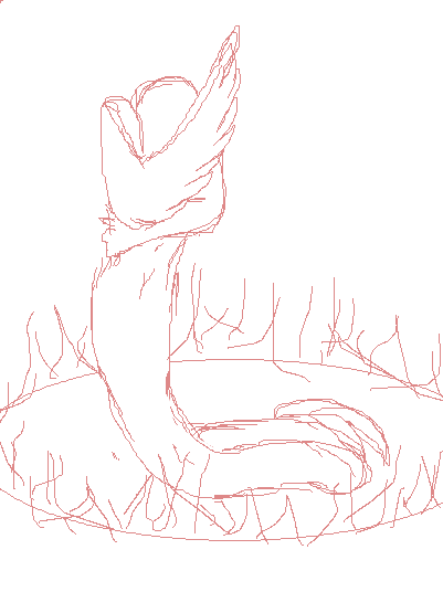
Alright I am afraid to add anymore to it. All I really wanted to fix way the skin to tail transition. Thank you to Maiko for the space! YAY you are awesome. If you guys feel that this should be moved then I can't stop youl, but I am proud of it.
fleeting_memory (Jul 13, 2005)
drawn in 20 min
fleeting_memory (Jul 13, 2005)
drawn in 46 min
fleeting_memory (Jul 15, 2005)
drawn in 29 min
fleeting_memory (Jul 16, 2005)
drawn in 50 min
Xodiak (Jul 16, 2005)
Nice strange looking creature. I like the snake body and tail and the bird wing. Very nice drawing! >:D
|XOD|
hideyourface (Jul 16, 2005)
hmm, I dont think this will be advanced.
Gigandas (Jul 16, 2005)
Aww c'mon, hideyourface, you shouldn't be judging a drawing before it's even completed.
So far, I think I like your clouds the most with all it's different shades of the greyscale. I think the first thing you might wanna do here is keep the snake-half of the body from almost blending in with the background. You can always add scales too which would make it more interesting too. The fire itself could also use bright red tips too (make the tips of the flame throw itself towards different directions for a natural look). You can also try to add things onto the ground he/she is on such as sand grain textures with rocks or bits of grass. More things you could do are detailing the hair with more individual strands, draw out the feathers on his/her wing, identify more anatomy on his/her body. Hope some of that comes in handy for ya :). An unfinished piece has infinite possibilities.
hideyourface (Jul 16, 2005)
well I only said it because of the pencil lines and blurry colouring.
Shanghai (Jul 16, 2005)
Although it's still listed as unfinished, and yes it is hard to judge something before it's done, I'm not really seeing anything else in their gallery to suggest this can be taken far enough without some major revisions throughout it. For example the use of a solid black line, with jagged edges, on only the character and no where else does seem to conflict with the blurry colors. I think gigandas's suggestions would help a lot though.
fleeting_memory (edited Jul 17, 2005)
drawn in 2 hours 31 min
Oh ye of little faith-gimmie a chance to finish it first eh?
Fire in the rain? Sure why not, its magic :)
Not quite done....
Shanghai (Jul 17, 2005)
Right now the fire is looking more like an irregular glow than actual flames. If you add a few sharper lines/shapes into the fire that may help.
Qwerty_Wittle_Fawah (Jul 17, 2005)
I think the fire looks cool because its like glimmering and its blurry...its not supposed to be the focus. She is looking pretty cool! Scary as hell too...a snake that has wings? a flying snake? I am sure she can't fly with one wing, but you know I am over the actually scientific study of the mythical creature lol NICE two thumbs up...or one and a wing
Gigandas (Jul 18, 2005)
Looking better for sure :)...! I really like those glowing scales on the tail. The different shades of green on them make 'em interesting to look at. Hopefully on your next revision, you'll make the body sharper to match the tail so they seem to be on the same level in perspective. Can't wait to see what you have in store for your further edits ;).
fleeting_memory (Jul 21, 2005)
drawn in 20 min
fleeting_memory (Jul 22, 2005)
drawn in 1 min
Gollywoggers (Jul 22, 2005)
I think you did a wonderful job. It is stressful to post something on advanced I imagine. Props for bravery as well as a very nicely done picture.
hideyourface (Jul 22, 2005)
I still say its a big blurry bananaish mess.
Gollywoggers (Jul 22, 2005)
or you're just an a$$hole. And by looking at some of your comments on other people's paintings I think that is the more accurate of the two. At least say something constructive. That or keep it to yourself.
Asriel (Jul 22, 2005)
for all the simplicity of the rain and lightning, it still works. and yeah, lets see hideyourface do better, or copy it for that matter.
hideyourface (Jul 22, 2005)
hey, It's just my point of view.Im giving my thoughts on the picture.
Gigandas (Jul 22, 2005)
I think there's a difference between helping and just saying that you dislike the picture. If you don't like something, you could point it out? Then say what you think needs to be done to fix it. That way, it'll be beneficial.
I like the rain, but now the tail seems to blend into the background a bit. You could try lightening up one or the other to separate the two. I might also add some glow around the lightning too. I like seeing how hard you're trying here for sure :). Keep on going.
Knockoff (Jul 22, 2005)
Pretty cool idea, unfortuantly this isn't advnced quality. The clouds are a bit blurry and could have more detail in them, Maybe a bit more variation in them too, it look like one big line of clouds. The lightning is a bit harsh on the eyes, no offence. It looks like you used the linetool. The rain is too thick and you can see it too much. Blocks the picture a bit. Good wings, but they look a little thick at the edges. I'm not sure about the hand behind the back, and after that the proportions go whacky. (though I think that was on purpose) The colors in the black sky are neat, but maybe you could add more detail and add variaiton. The circle of light really needs work on. Make it brighter and less blurry. (it'll bring your eyes to the character) Good attempt. More practice would be better if you plan on taking your art into this board.
post comment
You need to be logged in to post a comment. If you don't have an account, sign up now!