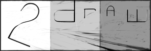
boards2draw ink2draw Logo.
100% - zoom in - zoom out
drawn in 6 hours 38 min with Lascaux Sketch Classic
Collaborators
iconFin_beast
Addict
4 versions
2 hours 6 min
iconHarmanye
Artist
1 hour 13 min
iconmethod3
teh f00z4h
3 versions
3 hours 18 min
Fin_beast (Mar 15, 2004)
This is so much better than everything I sketched out before.
I cleaned up some of the line art but I might wana clean it up some more.
Any idea's on colour schemes?
I thought maybe really reflective metal... Or maybe just Gradients of colours?
Whad'ya think?
-----------------------
Finished version for now until someone on Ink goes at it again.
~method3
Fin_beast (Mar 15, 2004)
drawn in 50 min
davincipoppalag (Mar 15, 2004)
this one I like alot.. its an unusual position for the letters.. I think the color gradients would be better..more suggestive of pallettes than the reflective metal would be.. nice.. this one gets my vote..
staci (edited Mar 15, 2004)
ZORAW! yeah looks like zoraw on the thumbnail but i like the idea of it also
suggestions: maybe more of a '2' shape, slightly bigger and spaced a bit away from the 'draw' part. but im not graphics thingy person so yeai, just tell me to go to hell.
Fin_beast (Mar 16, 2004)
drawn in 31 min
Fin_beast (Mar 16, 2004)
drawn in 20 min
Would someone like to colour this?
I have had several attempts, and all of them have been bad.

Do whatever you feel like. Just don't do anything to the line art layer.
Fin_beast (Mar 16, 2004)
drawn in 24 min
erm... I think I improved it.
staci (Mar 16, 2004)
weeeow! i really like the style of the letters (and number) now this is my favorite
davincipoppalag (Mar 16, 2004)
this is even better! looks great
Fin_beast (Mar 16, 2004)
Anymore suggestions for improvement?
Harmanye (Mar 16, 2004)
drawn in 1 hour 13 min
I didn't touch your lineart, I swear, I just made a layer over it.
I used three layers, sorry if that's a bit extravagant -_-.

I'm not sure what you'll think of this, bu tI do like it, otherwise I wouldn't have submitted it. Sorry if I'vve disappointed you...
davincipoppalag (Mar 16, 2004)
I kinda like the raised highlights on the top... I dont think I care much for the splotchies on the sides.. and the goldy color is kinda bland...no real pizzaz... still like the shapes and orientation..and that raised bit on top.
Harmanye (Mar 16, 2004)
Well he changed it to olive, and since I wasn't allowed to mess around iwht the lines, I had to work with what I was given.
I kinda liked the splothies thoguh :(

...
*shrug*

Trial and Error, eh?
staci (Mar 16, 2004)
weow again...i like the splotches and the way the top now looks raised or rounded. and again i do love the lettering. but! i do agree that it needs a little pow of something. maybe more brightness somewhere..i cant tell you exactly but i do know that the lines for the 3-d part seem out of place..like perhaps they should be a darker olive? thinner? dunno
method3 (Mar 17, 2004)
drawn in 2 hours 7 min
Bleh... boy am I tired. I figured I might get to coloring this baby, but I ended up just going back through and smoothing the hell out of everything I could.
Fin_beast (Mar 18, 2004)
Very smooth.:D
davincipoppalag (Mar 18, 2004)
I still like it simpler like this but the color needs a kick in the butt.. its kinda drab this way..
Fin_beast (Mar 18, 2004)
Hmm... duno... It would just be... kinda...cheesy if the colour is too bright... but i'm willing for it to be changed.
method3 (Mar 18, 2004)
It doesn't necessarily need to be bright, but it needs more contrast. I'll work on something tonight and see if I can come up with a color scheme that works well.
method3 (Mar 18, 2004)
drawn in 40 min
I was going with the original colors, but then I thought about what people would want to wear... Cloxboy suggested darker bold colors, so here's what resulted. I tried to keep the super bright shiny look to a minimum.
Fin_beast (Mar 18, 2004)
Shouldn't there be a shine on the top of "d" tho?
I really like it how it is anyway! :D
davincipoppalag (Mar 18, 2004)
this is way better... I like the coppery look.. think you got a winner goin here...
dixielandcutie (Mar 18, 2004)
i like version five the best...but this is pretty darn cool too
sal (Mar 18, 2004)
this is my fav version so far.... looks cool
staci (Mar 18, 2004)
nice...very nice. better color, the style just rocks my world tho.
method3 (Mar 19, 2004)
drawn in 30 min
I wanted to fix a couple things that were bugging me and hopefully add some stuff, but I guess it's fine as it is for the most part. Everything I added just kinda took away from the simplicity of it.
staci (Mar 19, 2004)
id wear it
Knockoff (Mar 19, 2004)
Thats awesome, The colors catch your attenton really quickly.
Very nice job! (I would also wear it)
mazi (Mar 19, 2004)
kickass.

i'd wear a red version of v4/6 or maybe 8 too. the rustish colored parts on the ends of the letters is sexy.
concannon (Mar 19, 2004)
I'd wear version 4/6, and definately version 8. Version 8 is just has me lusting after it.

Really.
DeadlyBlondeArcher (Mar 19, 2004)
The 3-D with the angle ya'll have to it is awesome. I'm not personally into the colors used, I think it could use more pop, (maybe something brighter) but that's just a color issue. Overall, I think this rocks. (I am, however, still partial to the bubble floating around here that says draw, though.)
LovelyLori (Mar 30, 2004)
this is GREAT
Ari (Apr 3, 2004)
Oooh, sexy... ^_^ Ari likes ^_^ I, too, lust after v8
marcello (Apr 3, 2004)
looking at it again, reminds me of yes.
method3 (edited Apr 7, 2004)
It reminds you of "yes"? What does that mean?

Hey, have any ideas for a matching smaller logo for the front of a tshirt (this design possibly being the back)?
staci (edited Apr 7, 2004)
yah just '2d' or..'draw.online.'
davincipoppalag (Apr 7, 2004)
a portrait of Marcello? lol
rainstar (Apr 21, 2004)
love this one! it's so cool! again, if it were a shirt, i would wear it!
staci (Apr 27, 2006)
i still like this one.
sparklycupcake (Jul 2, 2007)
i like this 1
post comment
You need to be logged in to post a comment. If you don't have an account, sign up now!