| |||||||||||
| Misc. Boards/Sprites | |||||||||||
|
Urei-sama
(Sep 6, 2004)
mmm finally its finished. big thanks to hakkai for granting me space. really appreciate it |

| ||||||||||
| Public Boards/Beginner | |||||||||||
|
Koneko-sama
(Aug 11, 2004)
No, seriously. Stop me.
Pence (Aug 11, 2004)
*laughs* but bg's are fun! good jorb on your picture by the way.
~TaKeRu-San~ (Aug 12, 2004)
Illuvet*-stares at the bg- -gains a headache- The colors... they're so bright and neon-like... and the shapes are so random... But who says that's a bad thing? Well... maybe my aching head, hehe ^_^;;. Yet I still like the originality of the bg, and the colors fit strangely well together... either that or my vision got impared ^-^;;. The colors of the girl (probably you) are good and fit well, although you could've done more shading (don't mind me much when I'm on that topic: I'm somewhat obsessed on the quality of shading *sweatdrops and Koneko-sama rolls her (or his {snicker}) eyes* The lines could be more accurate, and although the color of the lips goes very well with the pic, I don't think the dots are supposed to be there... O_o I love the brilliance of the eyes, and although the font color could be changed, overall, I like this picture. ^_^ You're improving fast, Koneko~ ~Takeru P.S.: Do you want to know why I said *(or his)* in my above comment? It's because I don't think your profile is correct, telling other people you're male... *smirks* Well, I hope you corrected the mistake before you receive this! ^ ^;;
Urei-sama (Aug 30, 2004)
weeee! i will. At least it doesnt look bad... The only thing to make this picture alittle more stylish would be to use the pen or airbrush tool on the lineart. thats all ^_- |

| ||||||||||
| Public Boards/Intermediate | |||||||||||
|
Urei-sama
(Aug 23, 2004)
*sigh* finally finished. concider it realisim if you want... i think the shadeing on the face is as real as i can get it...
Sutafani (Aug 24, 2004)
I like it! i like te colorin' and lineart.....
Koneko-sama (Aug 24, 2004)
Beth, you are amazing. *hug* I felt compelled. Sparklies are fun! *eats the sparkles*
Kit (Aug 24, 2004)
Beth, I never can critisizesomething very well on your art, you know that... but right now the only thing, is that the lips are so...dollish, like a perfect shape, lips aren't perfect, but these are like parallelled all around. thats all...~*~Kit:.:.
~TaKeRu-San~ (Aug 29, 2004)
So this is the finished product, huh? I love the hair color (so brilliant red ^_^), and I agree: the face's shading is as near as perfect as it can get... or at least, until I can research more into this criteria, but moving on... I also admire how you colored and drew the golden stream, and the sudden change of the shape really improves your oekaki ^ ^. Plus, the semi-transparent stars circling around it add a nice touch. Yet I can't help agree with Kit, at least a litte... the eyes are great, but the lips (although very good) don't look very natural, and the upper nose line could've been erased, too. However, they are only small details you can improve, and the overall work looks terrific! WhOa... the girl reallly is going to drown in her hair... *runs away before Urei-sama can attack* |

| ||||||||||
| Public Boards/Beginner | |||||||||||
|
Koneko-sama
(Aug 11, 2004)
So far, I think it's finished... It lacks something though...ANYWAY! The hand belongs to Sango, from InuYasha... Can you guess whose prayer beads she's holding? -_-;; it wuold be after he got sucked up into his wind tunnel... (Don't ask me how the prayer beads survived...) *sniff* Meh poor baby! T_T *clings to Miroku* The hand gave me absolute hellllllll. Here's the Reference Pic for Miro's prayer beads. Like I needed one. You know... I think I have a hand fetish at this point in time.
~TaKeRu-San~ (Aug 12, 2004)
Hey~I really like this artwork... the hand is slightly blurred and the prayer beads even more, and I think that adds a great effect to your oekaki ^_^. Once again, might I wonder to myself how you and Urei can do such great hands...? Very precise. And the background somewhat portrays a portal (a tunnel to be accurate, I know), and that's very clever: I love how you're playing with the colors for it ^_^. And I noticed the shadings of the hand... I think you're improving in that category ^ ^. If only I knew how to do that, too.... I love the words and the font, although the rough, white outline could be better... but that's only minor ^_^. Great work, Koneko! ~Takeru
Urei-sama (Aug 24, 2004)
oo, this looks really good, but do you use layers? that would stop the outline... but the hand shape is done very well. maybe define the beads alittle... find a light source and have a light spot on the surface where it faces the source, darker on the the side. easy easy and very useful for defination ^_-
friend (Aug 24, 2004)
suks 4 him...just joking this is VERY dramatic!!!! |

| ||||||||||
|
Koneko-sama
(Aug 11, 2004)
Oi. The last one sucked. Horribly. So I redid it. There ya go.
Pence (Aug 11, 2004)
Wow, that's a deep thought. *snif* I really like the picture and the saying! good jorb.
~TaKeRu-San~ (Aug 12, 2004)
~Yo*stares at self* If only I had that sweater... *stares more* Do I actually have that long hair? *stares until my eyes pop out* How can you still remember what I said the other day...? *Koneko-sama glares* I'll stop now. The yellow color of the yang is probably better than the original white in this oekaki, and I'm glad that it's that color ^_^. I like the symbol, I love the swirls, and I adore the circles ^_^. The face is elegant, too, and although once again the lines could be more accurate, the figure seems almost perfect for some reason ^_^. I guess it really fits in this drawing. I see that you haven't put any shading in this picture, and looking at it, I think it would've been nice if the left side was light while the right side was darkened to put more emphasis on the meaning inside the drawing. Yet it isn't as if it looks as if that's missing in the picture... to be honest, it looks as fulfilled as can be... except for minor adjustments ^ ^;;. I love this oekaki: it's so meaningful *sniff*. Of course, this may be because that's ME, but still ^_^. The picture really goes well with my quote, and this whole thing inspired me to do ANOTHER poem that you have already read. It is an outlet for inspiration! ||Fantastic|| ~Takeru
Koneko-sama (Aug 19, 2004)
Heh, to tell you the truth? I copied-and-pasted it.
Urei-sama (Aug 24, 2004)
ooo, i like it alot!! very well done ^_^ |

| ||||||||||
|
Pence
(Aug 17, 2004)
2draw went wacko so i couldn't finish the color, oh well... Maybe later i'll add to it. (title changed)
LovelyLori (edited Aug 19, 2004)
yeah this is cool... but ya know, and maybe I'm being a beast for mentioning it... but I can't take this "teh" instead of "the" much longer.... or maybe I'm just too old...
Pence (Aug 19, 2004)
OKay i'll change teh to the and I might draw his body, but before i was tired of it so i didn't do the body. I'll do another version then. ^_^ thanks for the wonderful comments!
Seshio (Aug 19, 2004)
O.O GREEN HAIR!! YA FOR FLOATING HEADS! Great job on Shading!!
Koneko-sama (Aug 24, 2004)
*bows down to the goddess of profiles* |

| ||||||||||
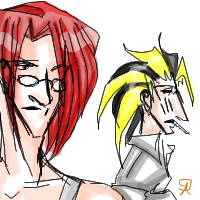
|
arborwin
(Aug 14, 2004)
squee requested fern and curtis. Here you go. ^^ They don't like each other very much ......
~TaKeRu-San~ (Aug 15, 2004)
Wow... this is a very detailed picture, yet it appears so simple. You can clearly tell by a glance that these two people resent each other, and their appearances are very unique. The linart of the redhead's hair are smooth and accurate, although the lineart for the rest of his body could be smoothed out somewhat. I love how you drew and shaded the blouse of the spiky-haired (kind of) guy... it's simple, but elegant in its own way... although the shading could be improved. However, all in all, I love your shading technique, and your skill really shows in the color of the skin and the redhead's hair ^_^. Great job, great job~
squee (Aug 21, 2004)
hehehe.. soo cyooote! its pretty good.. Curtis looks a lot diff from the comic but still himself.. and I love it. You're good at requests. nice details.. |
| ||||||||||
|
LovelyLori
(Aug 19, 2004)
this is my cat, Copper. Just bought him a "catnip bed" the other day... for all cat lovers... get one! Ya just sprinkle a little kitty nip in this fleecy bed, put it in his/her favorite spot... and they are in kitty heaven... Copper has barely left the thing since I brought it home... and will NOT let our other cat touch it....just a silly cartoon ;)
LovelyLori (Aug 19, 2004)
invest in a laptop for these types of occasions ;)
marcello (Aug 20, 2004)
or a tablet pc O_O
damnskippytakn-a-break (Aug 20, 2004)
This is sweet. I like it, and the picture would make a really sweet welcome home greeting card. = ) Is Copper your kitty?
LovelyLori (Aug 20, 2004)
yup, Copper's one of my babies |

| ||||||||||
|
Scaramouche
(Aug 19, 2004)
This is my first attept and probably my last after finding out i cant actually draw. o_O I didnt have a reference, i just started drawing a tree and it went from there. Any comments or suggestions are very welcome. : ) Edit: OMG, Ive just noticed how long it took me to draw, how embarrassing.
sapphirefairy47 (Aug 19, 2004)
The style of the tree just amazes me. Your art style is very unique, in a good way. I like that you can just sit there and draw without a reference. Keep it up!
emmamommalag (Aug 19, 2004)
Wow, this is wonderful. I love your sun pic almost as much as your moon pic. Can't wait to see what else you're gonna do. :)
davincipoppalag (Aug 19, 2004)
Not bad at all for a first try..The shapes are very nice, as are the colors. I like the moon picture better but this is a good start.Keep at it!
damnskippytakn-a-break (Aug 20, 2004)
This is your first attempt? I HATE you, just kidding. You really seem to have a good command on the tools. Perhaps you're already working in computer graphics? = ) |

| ||||||||||
|
Mipunai
(Aug 19, 2004)
Same person, only without her hat X3
Pence (Aug 19, 2004)
I like the idea of this picture it's cooli!
~TaKeRu-San~ (Aug 19, 2004)
Wow, I love your shading techniques! They truly add volume to the whole picture! And your wings aren't white like most of them are, and although I love white wings, your uniquely (is that a word?) colored wings are beautiful and do fit in this pic ^_^. I like the bg, although it may be too much in contrast compared to the bright colors of the focus, and I also like the way you hid the girl's eyes... a wise decision *nods*. However, maybe you could add a little more details to this picture, such as putting more detail in the hair and maybe drawing creases and such on the clothes...? I don't know, but it feel as if something's missing. Yet this oekaki is already fantastic, and I love it!
Seshio (Aug 19, 2004)
OOO! I agree with Pence, I like the idea! Awesome job!
Mipunai (Aug 19, 2004)
Thanks X3 |

| ||||||||||
| |||||||||||
| 2draw.net © 2002-2026 2draw.net team/Cellosoft - copyright details - 0.98sec (sql: 35q/0.21sec) |
~ TK-San