| |||||||||||||||||||||
| Misc. Boards/Sprites | |||||||||||||||||||||
|
squee
(Jun 22, 2004)
hee hee my new icon.. i felt cute... and stupid today |

| ||||||||||||||||||||
| Public Boards/Advanced | |||||||||||||||||||||
|
EverDream
(Jun 4, 2004)
...need...sleep...finally finished. Scares me how realistic his face turned out. *shudders* A re-take on a character of mine. Enjoy. Zzzz
MariaMinamino (Jun 8, 2004)
Oh wow - I really love those bleeding roses!!! It looks so cool and creepy!!!! awesome job!
squee (Jun 8, 2004)
wow..i love it..hes so sexy XD
LKC22 (Jun 23, 2004)
sexc! i luv it
cheetos (Jul 16, 2004)
oooooo thats awsome I love creepy pictures |

| ||||||||||||||||||||
| Public Boards/Intermediate | |||||||||||||||||||||
|
Shiek
(Apr 5, 2004)
A question for the more skilled oekaki-ers:- How can I make my colors smoother and my objects less two-dimensional? Some help would be greatly appreciated.
tappie_chan (Apr 5, 2004)
to smooth out colors, try erasing the edges of your blocks of colors w/the eraser on a pretty low opacity, then blurring it. for more 3-dimensionality, you have to develop your skill with light and shadow; namely the use of 'core shadows', which are very important in creating that 3d look. i don't think i can explain it adequately, so look it up. i'm sure there are lots of drawing sites that can explain it pretty well. anyways, this is looking really good so far! i especially like the lion. ^___^
Shiek (Apr 7, 2004)
Thank you! _(._.)_I'm not terribly sure what these two broke into conflict about, but I hear it had something to do with one of them calling the other mean names, like 'Sir I'm-Too-Good-To-Make-My-Own-Damn-Body-Heat.'
|

| ||||||||||||||||||||
| Public Boards/Advanced | |||||||||||||||||||||
|
EverDream
(May 5, 2004)
My interpretation of a griffin, here we have a small grey femal roosting at her favorite spot near a brook. :) Hadn't had an original from me for a bit so I thought this would be good. Enjoy.
IDontLookTooGoodInPink (Nov 26, 2004)
I want to cuddle with it!!!! That is amazing.
cianteed2 (Jun 28, 2006)
the light on the fur is gorgeous, and the rocks look surprisngly soft and inviting! i love it!
JK-Arts (Jun 15, 2007)
Love this
davincipoppalag (Jul 5, 2017)
needs front page again |

| ||||||||||||||||||||
| Public Boards/Intermediate | |||||||||||||||||||||
|
TheCrimsonKing
(May 1, 2004)
I don't know...I was thinking this turned out too comic like. Oh well..it was fun ^_^thanks for viewing if ya did.
marcello (May 2, 2004)
dunno, maybe it'd be better to be inside her vest pocket?
Konaru (May 3, 2004)
i really really like this, awsome, you need to do more like this i love the style and colors
tappie_chan (May 4, 2004)
i really love the eyes. very beautiful they are.
DaggerQuill (May 20, 2004)
this is really cool, i love the eyes and the hair, good job! |

| ||||||||||||||||||||
|
coriolis
(Apr 19, 2004)
It didn't turn out as well as I wanted it to. But I'm running out of space and getting rather tired of working on it too.
tappie_chan (Apr 22, 2004)
this is really beautiful. i really love the shape of the lips and the facial expression. the left eye is a bit too high, but it doesn't detract from the overall beauty.
coriolis (Apr 22, 2004)
Was kinda like that in the original photo. I probably should have found one that was easier to do ^_^ I'll try to finish this one later.
Pandora (Apr 23, 2004)
This is a great drawing to learn from ..it does look like a oil painting. Wish I could use it for an example of using tones when I draw, just so I could understand at least that part of it.It's to bad we can't pull the drawing down at the same time. Not for copying but for understanding.Exquisite!Still not quite happy with it. But I ought to quit while I'm ahead.
|

| ||||||||||||||||||||
| Misc. Boards/Sprites | |||||||||||||||||||||
|
evil_cloud
(Apr 29, 2004)
angry moments
tappie_chan (May 4, 2004)
i love this. you can REALLY feel the anger. its kinda scary... :P
bumpinthenight (May 26, 2004)
very kool sprite.... Interesting expression! |
| ||||||||||||||||||||
| Public Boards/Intermediate | |||||||||||||||||||||
|
evil_cloud
(Apr 29, 2004)
the way I feel today
Kloxboy (Apr 29, 2004)
Dood, you rock and we love you, just know, even though we're miles apart and we've never met face to face, I think you're cool as hell. You're a cool artist and anyone who says otherwise can suck my broccoli.
davincipoppalag (Apr 29, 2004)
Why do you want to go??
strangeoid (Apr 29, 2004)
You know I love your style, and you're fun to talk to (online, anyways... :P). If you had a fan club, I'd be president. I'm sorry you're sad, and I hope whatever is bothering you turns out well in the end.
tappie_chan (May 4, 2004)
awww e.c., i hope you feel better by now. |
| ||||||||||||||||||||
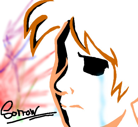
|
evil_cloud
(Apr 25, 2004)
My name is John CrichtonAn astronaut Three years ago I got shot through a wormhole I'm in a distant part of the Universe Aboard this living ship of escaped prisoners My friends I've made enemies Powerful, dangerous Now all I want is to find a way home To warn Earth Look upward and share the wonders I've seen
strangeoid (Apr 29, 2004)
Great job! *applauds* The words are, like, perfect... did you do those freehand? Lovely partial face. The incompleteness definitely adds to the mystery of it all.
marcello (Apr 29, 2004)
My only suggestion would be to add a lot more contrast to the face. It is completely overshadowed by the text logo, and loses most of its importance that way. I think if you took some of the brightness of v10 and added it to what you have now (and I'm not saying to make the whole thing bright, just towards the center, probably), I think you may surprise yourself. Then again, you may not.
evil_cloud (Apr 29, 2004)
Well i took a decision ... THIS WONT FINISH LIKE THIS... er.... i need space
tappie_chan (May 5, 2004)
i like this. it looks like it could be the shows logo. i love the text! how did you do it?? very nice buddy! keep it up! ^____^ |

| ||||||||||||||||||||
| Public Boards/Beginner | |||||||||||||||||||||
|
vanilla
(Apr 28, 2004)
Moo. I still can't draw hands. ><; Oh well...
tappie_chan (Apr 28, 2004)
very pretty! i love the clean colors and the floating ball of light. oh, and blue is the best color ^___^
davincipoppalag (Apr 28, 2004)
I kinda like this. Good job on the light reflections
lp_phaery (Apr 28, 2004)
i love the eyes and the light coming from her hand (the hand is really good!!). yeah and the light on the person is well done too (i wish i was good with light !_!)
haruko_ryuu (Apr 29, 2004)
o.o *pokes the blue thingie* X3 wow! this is so good i love it. nice work! you really did well with the light reflections and shadowing and stuuffness! i love the bluuuuuuuuuueness of it =^-^=the eyes are cool to..there all...eye-ish..><;; |

| ||||||||||||||||||||
| |||||||||||||||||||||
| 2draw.net © 2002-2024 2draw.net team/Cellosoft - copyright details - 0.35sec (sql: 37q/0.22sec) |
*mo-fafa*