| |||||||||||||||||||||
| Public Boards/Beginner | |||||||||||||||||||||
|
sal
(Feb 20, 2004)
... |

| ||||||||||||||||||||
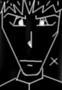
|
sal
(Feb 18, 2004)
... c&c? i would realy appreciate any comments on how to make it better......ty.....
sal (Feb 19, 2004)
ty 4 the usefull shi7....
Zappo (Feb 19, 2004)
No need to fear Sal! I'll Help ya Out! CAUSE YOUR TH"E COOLEST P.S. HAVE MY BABIES
brushes4 (Feb 19, 2004)
ewww u realize i'll have nightmares for a month now! Sal, i cant figure out your work, its crude and primitive, warped and freaky and rarely fails to impress me. in this ode to halcyon (and my personal opinion only) i think a few defined lines of gore and perhaps bone frag where the mouth used to be, would sharpen it up, just tiny little specks of ooze, this might look like a bad comment, but it isnt meant to be, i like the piece, even tho now im afraid to close my eyes lol.
Deformed (Feb 19, 2004)
GORE!!! Yayness!!! Well unlike most of you mfers, I LOVE It!! |

| ||||||||||||||||||||
|
sal
(Feb 16, 2004)
... |
| ||||||||||||||||||||
|
sal
(Feb 16, 2004)
lol |
| ||||||||||||||||||||
|
sal
(Feb 15, 2004)
... |
| ||||||||||||||||||||
|
sal
(Feb 15, 2004)
... |
| ||||||||||||||||||||
| Public Boards/Intermediate | |||||||||||||||||||||
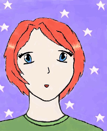
|
sal
(Feb 9, 2004)
...
Zappo (Feb 13, 2004)
Wowie Zowie! this pic is soo sexy im sporting instant chub harder then chinese algebra! gotta love the green shirt........ *Mission Acomplished* |
| ||||||||||||||||||||
| Public Boards/Beginner | |||||||||||||||||||||
|
sal
(Feb 10, 2004)
...
dixielandcutie (Feb 10, 2004)
aw thats so cute! and i love the bg...very nice!
Deformed (Feb 10, 2004)
WE COME IN PEACE! *switches back to 2draw mode* nice line art!! i like the glowey feeling about it. |
| ||||||||||||||||||||
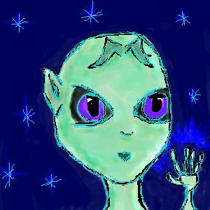
|
sal
(Feb 9, 2004)
...
davincipoppalag (Feb 9, 2004)
I like this..good sense of depth...
mazi (Feb 9, 2004)
ok so you used linear perspective to add depth. some other good ones are changing values. (aka light in back dark in front or vice versa). texture gradient (aka making those lines on top closer and closer together as they get further away). adding detail when its closer, blurring further away. as well fog makes things look far away.
dixielandcutie (Feb 9, 2004)
i have nothing better to add except for that its lookin pretty cool...i like the colors you used
bakayaro_onna (Feb 10, 2004)
Looks a lot like real paint. I like the veined texture in the dark 'triangle' section especially. |

| ||||||||||||||||||||
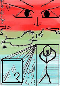
|
sal
(Feb 3, 2004)
...
amaranthine (Feb 8, 2004)
very cool. I like the colors. Love the stick people. |
| ||||||||||||||||||||
| |||||||||||||||||||||
| 2draw.net © 2002-2025 2draw.net team/Cellosoft - copyright details - 0.42sec (sql: 27q/0.26sec) |
I think whats wrong with the blade is its curved and the bottom and not on the top.