| |||||||||||||||||||||
| Public Boards/Intermediate | |||||||||||||||||||||
|
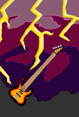
AuschwitzBurns
(Sep 5, 2005)
Bass. (Not see until after submitted with background) if you click on the image to see the series of revisions and to leave a comment, the grey at the bottom is the exact same shade as the window that surrounds it. CLICK ME. I couldn't start another image until I got rid of another one. It won't let me delete any so fuck it. This is the closest one to finished. |
| ||||||||||||||||||||
|
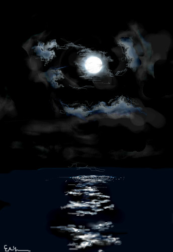
starmarked
(Jul 22, 2005)
Um...I am all out of comments...all black was fun :]
lycene (Sep 14, 2005)
This is beautiful; I especially love the clouds.
LasRever (Sep 15, 2005)
Wow this is neat. I loooove the dark colors, and the clouds. Great work!
starmarked (Sep 15, 2005)
Thanks everyone!
p3ndragon (Sep 15, 2005)
Wow, those clouds right next to the moon look very wispy and realistic. Beautiful. |
| ||||||||||||||||||||
|
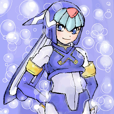
Maiko
(Sep 15, 2005)
Leviathan, from Rockman Zero :3 I like her second best, after Harpuia~ <3but I can't draw Harpuia... *sob* dunno how to draw her other arm like though, so yeah, unfinished for now! |
| ||||||||||||||||||||
|
Renuar
(Aug 22, 2005)
...
Renuar (Sep 12, 2005)
wow, thank you all for the comments. Here's the trick, use the 'Pen' tool, set to minimum, and make good use of the 'soft' tool :]
p3ndragon (Sep 12, 2005)
I love you.I love this style even more.
absolutindigo (Sep 12, 2005)
Beautiful , it looks like a "Cirque du Soleil" poster
comd (edited Mar 19, 2006)
I second HunterKiller's remarks. This is gorgeous. |

| ||||||||||||||||||||
|
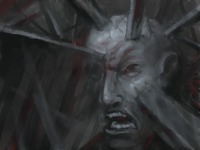
Zack
(Sep 9, 2005)
he's stuck angry
DeadlyBlondeArcher (Sep 10, 2005)
Imploding is such a deep word and this painting is very deep.... I want an explanation. ;)
Renuar (Sep 10, 2005)
P3, i think its the surroundings which have imploded, therefore, he's stuck and angry. Good work Zack.
Ty854 (Sep 10, 2005)
Wow, Thats awesome and creepy. I'd be angry too.
p3ndragon (Sep 10, 2005)
Ah. I see, Renuar.Looks great, Zack. Keep it up. |
| ||||||||||||||||||||
|
Rosemary
(Sep 6, 2005)
:) mythical elvish kinda thingy...
Phil (Sep 11, 2005)
its a fantasy pic shading has no meaning here if u ask me...
LasRever (Sep 14, 2005)
She looks more elvish then fairy-like. And yah, shading shouldn't matter that much. Iterpret it how you like, but it's really the artists decision. She created it! :D Anyways, great drawing, yes very minty ;)*sigh* think i let this picture and some of the comments get to me too much...to be honest it made me completly go off drawing...i havent done a thing "arty" in 2 or so weeks which isnt like me..i..liked this picture when i 1st posted it but now i cant stand to look at it anymore...think i'll just set it as finished and leave well alone....guess i gotta dig up some confidence from somewhere before i draw something again lol..(something ive always lacked) grr...
Phil (Sep 16, 2005)
i dont care what ne one else here thinks her eyes her lips her nose are better then ne think i ever could do and it got a pencil crayon feel to it , i find that unique here |

| ||||||||||||||||||||
| Public Boards/Beginner | |||||||||||||||||||||
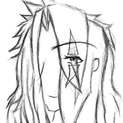
|
Jack_Fox
(Jun 28, 2005)
Yeah, something along those lines.
Inu-chan (Jun 28, 2005)
I like the eye. It's shiny. ^_^The eyebrow seems a little too long and high up, but maybe it's just me.
Axil62 (Jun 28, 2005)
or maybe it's not just you
Jack_Fox (Jul 17, 2005)
or maybe it's just your mom.
p3ndragon (Sep 9, 2005)
I think you need to work on facial proportions. The crazy hair is always a plus though. |
| ||||||||||||||||||||
| Public Boards/Intermediate | |||||||||||||||||||||
|
Destervetha
(Jun 1, 2005)
So yeah. It's big and, uh, flying.Edit Came back after summer, was really bored, and my studio was full of drawings I hadn't finished...plus I got a nice well-rounded critique on this one from the nice people over at Yerf...and I was bored. And had just gotten an iPod. And COULD NOT STAND the earbud speakers. They just kept...falling out!!!! And I don't see a box to check to put this on the beginner's board, so it is wherever it is (I don't remember where) Mods please switch it to a lesser board if it doesn't meet standards.
taori (Sep 8, 2005)
haha. i like this. i like what you were working on, too, but this is a rather elegant solution for what to do when one tires of the old pictures in one's studio.
p3ndragon (Sep 9, 2005)
:( I really like the first couple of versions!But this is great work too. I still don't understand why you didn't keep version 4. I wish I could do stuff like that :D
kiketsu (Oct 6, 2005)
haha. this is awesome and funny! love it
Sasuke-fan-Sapphire (May 2, 2006)
this is awesome. I love it =) |

| ||||||||||||||||||||
|
thesolarwinds
(Sep 8, 2005)
any better?
Phil (Sep 8, 2005)
time limit is low on this board:) and yes its much better then the lasttry blur tool out in the hair it works for me:)
darkshadow (edited Sep 9, 2005)
i like the water color look this has but i dont like how the black lines almost jump at me i would remove them if the are on their own layer or smoth them out the hair looks good and the blur tool could help but i like the blend moreedit* oh ya i like the disk in the back ground alot
emmamommalag (Sep 9, 2005)
Hey.. you're getting the hang of that hair drawing! Looks good. :)
p3ndragon (Sep 9, 2005)
I don't think you should use the blur tool. Try using anti-aliasing and a low opacity and work your way to thinner and brighter colors for the hair. Also, the body looks a little contorted. Looking at pictures really helps. Plus you can use layers to help you got rid of those messy scratchy pencil lines. |

| ||||||||||||||||||||
|
darkshadow
(Sep 8, 2005)
freind left one on a glass table liked how the smoke looked glass
i think its done still holding out for comments
thesolarwinds (Sep 9, 2005)
very nice... I like the way the smoke looks.
p3ndragon (Sep 9, 2005)
Looks good, but I don't think you are all the way there yet. Not really sure what is going on with all the lines and whatnot. |
This is hidden because it is rated 18+. Edit your privacy settings to make it visible.
| ||||||||||||||||||||
| |||||||||||||||||||||
| 2draw.net © 2002-2026 2draw.net team/Cellosoft - copyright details - 0.27sec (sql: 39q/0.16sec) |
I think that was an unnecessary bit right there. There's a difference between helping and hurting. If you think it's not up to whatever board's qualities, you might wanna steer them in the right direction and actually advise them on how to turn it into intermediate quality work. Any good art professor would be disappointed in anyone who doesn't back their "disliking" of the piece with some constructive criticism. And to diss them too, is kinda pushing the limit if you ask me.
Although Im probably just as bad as Zappo sometimes :o