| |||||||||||||||||||||||
| Public Boards/Beginner | |||||||||||||||||||||||
|
ky
(Dec 7, 2003)
This could have afforded to go into the Beginner board. I'm sorry. |

| ||||||||||||||||||||||
| Main Forums/Drawing Discussion | |||||||||||||||||||||||
 |
rydicanubis (Dec 7, 2003)
so i've always wanted to do a good collab with someone, something where we add our own styles and strengths to the picture to create something better than either could do alone... yeah... basically i still do bad lineart... so this: would anyone of the kickass lineart-ers like to ink up a sketch of mine; then one, or both of us could do the colouring and background? nothing critical, especially considering the copious amounts of studying i'm schelduled for the next week or two -__- ... just ...
12 comments
|
||||||||||||||||||||||
| Public Boards/Beginner | |||||||||||||||||||||||
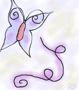
|
HJ
(Dec 7, 2003)
Just messing around, trying to test the technique Mazi said.
Harmanye (Dec 7, 2003)
Oh cool, this is neat! I love the swirly things, and that butterfly is spiffy, I can definetly say you are getting better ^_^ Since I am who I am I must say smoother (as in less jagged) lines would be nice, but I quite understand that it is difficult sometimes. Are you a mouser or a tablet-user (Tabby)? Either way qualities vary and it can be hard to get flowy lines.
HJ (edited Dec 7, 2003)
I use a mouse, but I am asking my parents for a Wacom Tablet for Christmas.. Possibly a Graphire or Intuos. Thanks for your comments! Yah, I hope I am getting better! I drew PowerPuff girls for the first months I started doing oekaki (I was at PowerPuffOnline). I started this oekaki-business in June. But I have 'branched out' to anime & a little bit of furries. My Next Goal: Scenery! Or maybe not..
mazi (Dec 8, 2003)
i reccomend the graphire. thats what i use.. i dont really see a need for the really expensive ones. i only have a graphire2 4x6. it was $99 at the time, and well worth it. the only diff with the "better" tablets is more pressure sensitivity, or a bigger space.. i dont even really use the pressure sensitivity.
marcello (Dec 8, 2003)
I recommend getting a 6x8, and not a 4x5, no matter which line you get. 4x5 just isn't worth it. Now, graphire3 has 4x5 for $100, and 6x8 for $200. Whereas intuos is $300 for a 6x8. The advantage with an intuos is you'll have a much more robust tablet, (plus you can get platinum, while the graphire 3 design sucks and the colors aren't great). So it's really a question of if you're willing to spend $100 more for a more powerful tablet. A side-by-side comparison. (I should mention I find the menu strip useless, the tilt can only be used in expensive programs like photoshop (7 and later), or painter (7 and later as well, I believe, 8 supports it). I'm working on a new applet that'll support tilt as well, though. I really like the intuos2 mouse, but I haven't used a graphire3 mouse to compare (The tablet mouse has completely replaced my optical). Since they have 6x8 in graphire as well now, that's not really a reason to go with intuos2 (one of the main reasons I went with it). Grip pen... that's probably also meaningless, it's nice, but dunno if it's worth it. |
| ||||||||||||||||||||||
| Public Boards/Intermediate | |||||||||||||||||||||||
|
quintessence
(Dec 6, 2003)
Not done yet. Finished tonight. |
| ||||||||||||||||||||||
| Public Boards/Beginner | |||||||||||||||||||||||
|
HJ
(Dec 6, 2003)
It is sad that my pictures usually look better when they aren't colored. =/ How do you guys get your smooth, liquidy coloring? Is it your mad skillz, or a secret button..? o.o;;
Edward (Dec 6, 2003)
I think your shading looks good! the only thing i think that makes this picture look a lil odd is the eyes have no pupils and have the white on the inside instead of the outside Oo....
mazi (Dec 7, 2003)
i dunno about everyone else but i use pen for lineart, and then pen on the next layer down to get the base colors and then the watercolor 2 tool to shade. using lots of the dropper (i think its ctrl.. or right-click.. or something..) helps blend colors. and in advanced mode (check your settings) you can right click on the color bars and get h/s/b instead of insane color bars.
HJ (Dec 7, 2003)
Okie, I think I get what you're saying, Mazi. Thanks for the critique, Edward! :) Yah, I draw my eyes pretty funky, heh. |
| ||||||||||||||||||||||
| Public Boards/Intermediate | |||||||||||||||||||||||
|
hannah_banana_2002
(Dec 6, 2003)
Intilectoe Training I'll be doing the coloring in Adobe Photoshop elements 0.2 ;):P taking me the long time
Complete. At least on oekaki, the finished product will soon be found on my deviant art gallery ;) I do better coloring on Adobe photoshop elements 0.2
mazi (Dec 7, 2003)
dontcha think his arms are kinda runty? his elbow should come down to about his waist and his hand halfway down his thigh. (check it on yourself if you want..) theyre a little bit scrawny for his build as well.otherwise really nice.
hannah_banana_2002 (Dec 9, 2003)
just realized that x.x thanks I gotta work on it. I'm like really bad at arms and leg XP |
| ||||||||||||||||||||||
| Public Boards/Beginner | |||||||||||||||||||||||
|
rydicanubis
(Dec 6, 2003)
another 'crawler pic, i must be inspired...mm, silhouetty...
tappie_chan (Dec 6, 2003)
this is wonderful! i love the concept. am i the only girl that thought nightcrawler was sexy? *tappie runs shame-facedly into the corner* anyways, I like this a lot, and the sky is a wonderful contrast to the figure and building. the tail looks a little rigid though (is that your tail, or are you just happy to see me ^__^. that was bad. sorry.)
hannah_banana_2002 (Dec 6, 2003)
Nightcrawler ^.^ Love em
mazi (Dec 7, 2003)
lmao. nice try tappie -_-;the only thing id complain about would be the hand. and the size of the arrow bit on his tail. other than that this is pretty kickass.
rydicanubis (Dec 7, 2003)
hey thanksi would fix the shape of his face a bit, and the building overhang too, but what about the hand and the tail? i'm thinkin maybe the tail could be a little smaller and refined...? |

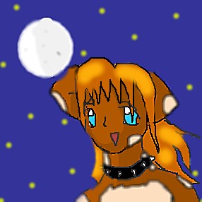
| ||||||||||||||||||||||
|
Danii221
(Dec 6, 2003)
THis is just a cat-girl I love to draw! I think she's fun and cool to draw! Saftey Save! What do u think?
mazi (Dec 6, 2003)
i think you need to lay off the blur tool. and this needs a lot more work.safety save? its not set to unfinished.. |
| ||||||||||||||||||||||
| Misc. Boards/Sprites | |||||||||||||||||||||||
|
Graffiti871
(Dec 6, 2003)
he needs a name. give this cutie a name.
Childlike_Vampire (Dec 6, 2003)
Hm..mebbe Bobby? He looks like he's ready to chuck a snowball at some unsuspeciting innocent...and Bobby always seemed like a troublemakers name to me, lol. This is cool, I like it alot, especially the hair. :D
Maiko (Dec 6, 2003)
I dub him, Shouji
mazi (Dec 6, 2003)
try out this link. its site of names and what they mean. good for characters.love his expression
Graffiti871 (Dec 6, 2003)
thanks for the link. mazi. thanks to wasil and vampy. i think i look in that kalabarians thingy. |

| ||||||||||||||||||||||
| Public Boards/Intermediate | |||||||||||||||||||||||
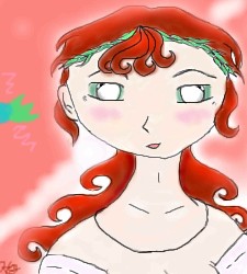
|
lucy_430
(Dec 3, 2003)
I'm trying to make an angry expression but its not working out very well.
Harmanye (Dec 6, 2003)
Wow, Awesome hair Lucy ^_^ I think though, that the tongue should have darker shading underneath it, because it looks 'rolled' in the picture, Unless that's what you were looking for. and a neck, necks are good ^_^. But the rest is amazing, and very realistic, Good job! Keep it up :)
marcello (Dec 6, 2003)
it's what'sherface from flcl :)
Tamuriil (Dec 6, 2003)
O_______________________________O Whoa..This looks almost identical to my friend...I thought I was blind or something when I first saw the picture(except her hair is a caramel color with blond highlights. XP)
laurael (Jun 7, 2004)
Wow...this is friggen awesome looking! The expression, the eyes, the teeth, the hair it's all totally cool! |

| ||||||||||||||||||||||
| |||||||||||||||||||||||
| 2draw.net © 2002-2026 2draw.net team/Cellosoft - copyright details - 1.68sec (sql: 39q/1.06sec) |
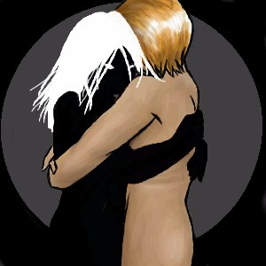
*shakes head* My poor fella, you need a physciatrist if you truly believe this should adorn the gallery walls beside our lowly creations.
Or is it that thing where if you wanna look -really- pretty you should stand next to someone -really- ugly?
The wings are Awesome.