| |||||||||||||||||||||||
| Public Boards/Beginner | |||||||||||||||||||||||
|
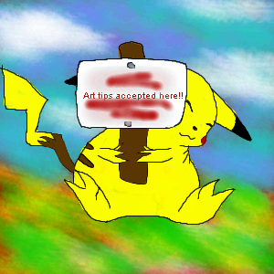
Drawing Tips Accepted Here!!
PinkuEspeon
(Feb 15, 2004)
Okay... yeah, that's a Pikachu... and, I bet your wondering why I wrote "Tsuki" (Japanese for moon) on the little picket sign that Pikachu is holding up... I wrote that there as a sub for drawing tips accepted here... why? Because, I'm like... not finished with the picture of the Pikachu holding the sign up! ^_^ I've still gotta write that (in English) on the picket sign that Pikachu is holding up. You may post some drawing tips here early, if you want to, that is! ^_^ But, first, look at my drawings that I have previously drew. Thanks! :D
marcello (Feb 16, 2004)
it could just be a fat pikachu
sal (Feb 16, 2004)
true, true
mazi (Feb 16, 2004)
read this
PinkuEspeon (Feb 16, 2004)
No, no, no... I wanted y'all to look at all of my other drawings. Not this one! |
| ||||||||||||||||||||||
| Public Boards/Intermediate | |||||||||||||||||||||||
|
mazi
(Feb 16, 2004)
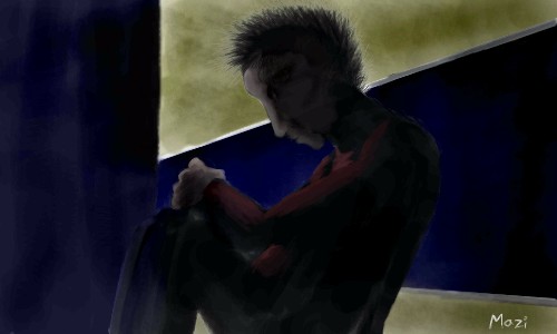
bleh. inspired from a scene in some movie my brothers watching..hope thats light enough for people with crappy monitors
Zinc (Feb 16, 2004)
"hope thats light enough for people with crappy monitors" Sure isn't.From what I think I can see, the eye looks too big and too far up. Nice job on the hair though. ;x
Zinc (Feb 16, 2004)
Wow.. My monitor sucks..
jord (Feb 19, 2004)
hmm, my crappy monitor tells me the eye is too much to the side of the head...why is everybody so bity at comments lately? but if you didn't draw an eye, than thats just a dark hole? then what's the little white dot?...blarh i like it anyway (realy) |
| ||||||||||||||||||||||
| Public Boards/Beginner | |||||||||||||||||||||||
|
Zappo
(Feb 16, 2004)
man this stuff is great! |

| ||||||||||||||||||||||
| Information/News | |||||||||||||||||||||||
 |
marcello (Feb 15, 2004)
Read the rules if you haven't! Poll: Do you think there should be an Expert Level board? Expert level is the next step up from advanced, where pictures have a level of finish and detail that sets them apart from the rest. Professional artists would have a hard time finding anything major to validly critisize. Drawings here would most likely be posted far and few between with 5 hours as a reasonable minimum time for this board. You would get ...
57 comments
|
||||||||||||||||||||||
| Specialty Boards/Collaborations | |||||||||||||||||||||||
|
Some conversation
16 comments
– latest 4:
Kasha (Apr 5, 2004)
the water has a nice effect. I'm not really sure if the mist was intended but it works really well. Great job :)
lilypad (edited Apr 24, 2004)
decideing to comment again on this pic because last time i was just talking to sahera. i really like this, nice job, you two! altho i DO agree with Daymeon...the boobs on the one sitting on the rock only look slightly odd because you can tell, but it's not completly there...the line for the right boob....i agree! they ARE sexy! it just needs a little more....er...obviousness. ok, so i'm not making any sense again...but i don't care! child, you know what i'm sayin'.... the coral and the starfish around the rock are cool, the waters sweet, the clifs are awsome. the merteens(o.O teens? or young ladies?) are the best part and icats is right, this pic needs more comments! this should be in the showcase(if it isn't already there) and get highly apreciated! ok..so it's not THAT good, but i would do all that stuff if this were MY site! anyways, this is neat and i like the idea that one would do the lineart for one of the merteens and the other colored her in and then visaversa for the other merteen. the bgs sweet, too(did i say that already??) and i think this just may be the longest comment on this pic yet....
bumpinthenight (May 26, 2004)
Very sweet... Such warm colors.... But not overbearing colors either.... Nice posing as well.... I just noticed somethine (and this is not a critical remark...)... Their hair is colored in two different ways... Neatoh!!! XD WAHAHAH!!! AlL Ph33r m4 c0mm3nt1n9 wr47h!!!
bakuraiscool (Jan 16, 2005)
This is pretty! |
This is hidden because it is rated 18+. Edit your privacy settings to make it visible.
| ||||||||||||||||||||||
| Public Boards/Beginner | |||||||||||||||||||||||
|
sal
(Feb 9, 2004)
...
davincipoppalag (Feb 9, 2004)
I like this..good sense of depth...
mazi (Feb 9, 2004)
ok so you used linear perspective to add depth. some other good ones are changing values. (aka light in back dark in front or vice versa). texture gradient (aka making those lines on top closer and closer together as they get further away). adding detail when its closer, blurring further away. as well fog makes things look far away.
dixielandcutie (Feb 9, 2004)
i have nothing better to add except for that its lookin pretty cool...i like the colors you used
bakayaro_onna (Feb 10, 2004)
Looks a lot like real paint. I like the veined texture in the dark 'triangle' section especially. |

| ||||||||||||||||||||||
| Public Boards/Intermediate | |||||||||||||||||||||||
|
pix
(Feb 8, 2004)
Just experimenting with Lascaux halftone tools...
LisaAnne (Aug 27, 2005)
Very nice...pointilism....I like that your mind has to fill in the gaps. Your work overall is wonderful though.
davincipoppalag (Aug 27, 2005)
well...too bad pix is long gone... he was an incredible artist..
LisaAnne (Aug 30, 2005)
Why thank you Zack...you are correct...my mistake. |

| ||||||||||||||||||||||
|
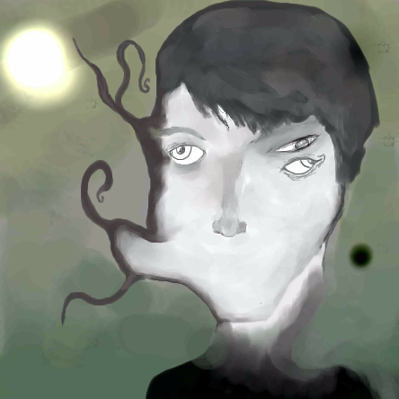
Zappo
(Feb 8, 2004)
its dexter
staci (Feb 8, 2004)
do you use the watercolor tool to get all that blendieness?
Zappo (Feb 8, 2004)
yea i use watercolor 2on 100 pressure about 7-15 size
dixielandcutie (Feb 9, 2004)
wow, dont know how i missed this one. i love it! its strange, its crazy, it rocks!
alwaysLearning (Feb 16, 2004)
Woah, this is cool, but I don't think I want to stare at it too long this soon after a migraine!!! <LOL> My eyes keep trying to resolve that doubled eye into one. I *REALLY* like your style! This piece in particular has actually inspired me, there's something I'd like to try based loosely on this piece (though when I say loosely, I mean it - I don't copy people's styles without checking with them to see if they mind). Keep up the good work, and though I've said this before, the more I see of your work, the more certain I am: I can't wait to see where you go from here! |
| ||||||||||||||||||||||
| Public Boards/Beginner | |||||||||||||||||||||||
|
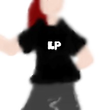
linkinpark_freak
(Feb 8, 2004)
i love lp
Fin_beast (Feb 8, 2004)
To bad it's blured to fuck ain't it.
mazi (Feb 8, 2004)
linkin park are the shit, but yeah i agree with fin. less blur is a good thing. some shading might be nice too. and a bg.
Zappo (Feb 8, 2004)
I like the Blur, the real prob is the LP on the shirt! Buwhahhahaha, but really, The real victim here today is not the blur tool, its the unfinished hidden feature........ |
| ||||||||||||||||||||||
| Main Forums/Drawing Discussion | |||||||||||||||||||||||
|
|
marcello (Feb 7, 2004)
Just an interesting-sounding contest with some pretty nice prizes (wacom tablets, wacom cintiq, and tablet pcs) for design and illustration: Only problem for most of the people here is there is an age restriction of 18+ (snooping around pulled that out from the rules). Worth checking out though...
11 comments
|
||||||||||||||||||||||
| |||||||||||||||||||||||
| 2draw.net © 2002-2026 2draw.net team/Cellosoft - copyright details - 1.90sec (sql: 35q/1.18sec) |