| |||||||||||||||||||||||
| Public Boards/Beginner | |||||||||||||||||||||||
|
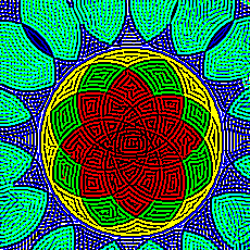
kohrak
(Dec 8, 2003)
it looks like a church´s window |
| ||||||||||||||||||||||
|
ky
(Dec 7, 2003)
This could have afforded to go into the Beginner board. I'm sorry.
Harmanye (Dec 8, 2003)
Ah eek. Beginner board? Pfft. We are unworthy of your wings. I can only speculate as to how you got those lovely sparkles and mists, is it like a Ky Secret Formula or what?*shakes head* My poor fella, you need a physciatrist if you truly believe this should adorn the gallery walls beside our lowly creations. Or is it that thing where if you wanna look -really- pretty you should stand next to someone -really- ugly?
ky (Dec 8, 2003)
It's only because of the requirements...
Knockoff (Dec 8, 2003)
Really nice ky.The wings are Awesome.
Daymeon_StormRider (Dec 24, 2003)
hnh i like the bony look to his back very cool indeed...reminds me of Hermes a bit, his wings and all...lovin it though. |

| ||||||||||||||||||||||
|
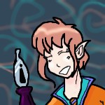
Edward
(Dec 7, 2003)
i just need to take a break from the other one that i am doing...thats all.working on line art...i likes it
Harmanye (edited Dec 8, 2003)
Coo, smooth. Pretty scribbles in the background. Funky tie.He could also fly with a collar like that. What's he holding BTW? *shrug* Cool, me likes. Ooh, fountain pen, gotcha, dad used to have one of those, I never could get it to work. The disproportionate-ness throw me off, looked like an confused exclamation mark in a bottle...
Knockoff (Dec 8, 2003)
Yay, Nice hair! Yes nice background.Yes what is that thing hes holding,. I must know <_<. It looks like and i or an upside-down ! .
marcello (Dec 8, 2003)
I believe they were once referred to as 'fountain pens,' though this ancient element isn't used much in today's electronic information age.
Edward (edited Dec 8, 2003)
XD its a fountain pen...i have 2 .... |
| ||||||||||||||||||||||
| Main Forums/2draw.net | |||||||||||||||||||||||
 |
Edward (edited Dec 7, 2003)
My question of the day...TODAY is: Marcello, Why in the world do you have a place for tutorials if you have no tutorials to begin with. This seems odd to me and may seem odd to others like me who think empty pages are usless and take up the space that you where complaining was being taken up by spammers just a month ago. For those of you who did not know that there where tutorials they are here Edward
5 comments
|
||||||||||||||||||||||
| Main Forums/Drawing Discussion | |||||||||||||||||||||||
 |
rydicanubis (Dec 7, 2003)
so i've always wanted to do a good collab with someone, something where we add our own styles and strengths to the picture to create something better than either could do alone... yeah... basically i still do bad lineart... so this: would anyone of the kickass lineart-ers like to ink up a sketch of mine; then one, or both of us could do the colouring and background? nothing critical, especially considering the copious amounts of studying i'm schelduled for the next week or two -__- ... just ...
12 comments
|
||||||||||||||||||||||
| Public Boards/Beginner | |||||||||||||||||||||||
|
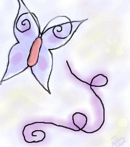
HJ
(Dec 7, 2003)
Just messing around, trying to test the technique Mazi said.
Harmanye (Dec 7, 2003)
Oh cool, this is neat! I love the swirly things, and that butterfly is spiffy, I can definetly say you are getting better ^_^ Since I am who I am I must say smoother (as in less jagged) lines would be nice, but I quite understand that it is difficult sometimes. Are you a mouser or a tablet-user (Tabby)? Either way qualities vary and it can be hard to get flowy lines.
HJ (edited Dec 7, 2003)
I use a mouse, but I am asking my parents for a Wacom Tablet for Christmas.. Possibly a Graphire or Intuos. Thanks for your comments! Yah, I hope I am getting better! I drew PowerPuff girls for the first months I started doing oekaki (I was at PowerPuffOnline). I started this oekaki-business in June. But I have 'branched out' to anime & a little bit of furries. My Next Goal: Scenery! Or maybe not..
mazi (Dec 8, 2003)
i reccomend the graphire. thats what i use.. i dont really see a need for the really expensive ones. i only have a graphire2 4x6. it was $99 at the time, and well worth it. the only diff with the "better" tablets is more pressure sensitivity, or a bigger space.. i dont even really use the pressure sensitivity.
marcello (Dec 8, 2003)
I recommend getting a 6x8, and not a 4x5, no matter which line you get. 4x5 just isn't worth it. Now, graphire3 has 4x5 for $100, and 6x8 for $200. Whereas intuos is $300 for a 6x8. The advantage with an intuos is you'll have a much more robust tablet, (plus you can get platinum, while the graphire 3 design sucks and the colors aren't great). So it's really a question of if you're willing to spend $100 more for a more powerful tablet. A side-by-side comparison. (I should mention I find the menu strip useless, the tilt can only be used in expensive programs like photoshop (7 and later), or painter (7 and later as well, I believe, 8 supports it). I'm working on a new applet that'll support tilt as well, though. I really like the intuos2 mouse, but I haven't used a graphire3 mouse to compare (The tablet mouse has completely replaced my optical). Since they have 6x8 in graphire as well now, that's not really a reason to go with intuos2 (one of the main reasons I went with it). Grip pen... that's probably also meaningless, it's nice, but dunno if it's worth it. |
| ||||||||||||||||||||||
|
supermonkey
(Dec 7, 2003)
Another something for a friend. |

| ||||||||||||||||||||||
| Public Boards/Intermediate | |||||||||||||||||||||||
|
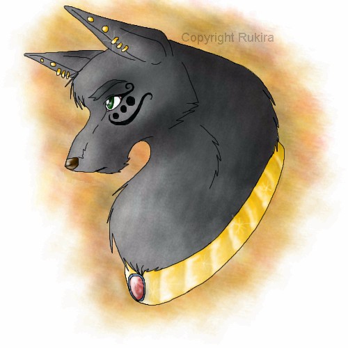
Tamuriil
(Dec 6, 2003)
XD Picture of my male Lupe on Neopets.
Edward (Dec 7, 2003)
i luv the lil tatoo around the eye and the shadint on the jewlery is beuty-mus (my wonderful vocabullary)
marcello (Dec 7, 2003)
I have no idea, irfanview is freeware, quite fast and powerful as well.
bluesky (Dec 7, 2003)
whew! that - that's pretty cool! aw it looks so nice! and the coloring is cute too!
Dragon_River_Spirit (Jan 7, 2004)
**screams, faints, screams again** LUPES **steals lupe** |
| ||||||||||||||||||||||
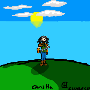
|
Clueless3
(Dec 6, 2003)
I based it on Elaine from Monket Island and Ewoyne (I hope I spelt that right) from Lord of The RingsIt's my first attempt on this site, hope ya like it:)
Clueless3 (Dec 6, 2003)
Well, I tried to avoid textures, cos i wanted a cel style look (how arse up THAT went)
marcello (Dec 6, 2003)
you can have textures and still maintain cel shading, it's simply a matter of making the shadows and shades more interesting. also cleaning up the lineart on the ground may help. But for example, you could have tufts of grass and maybe some flowers or plants of some sort sticking up out of the ground.you also might want to note how the shadow and lighting of the grass are in relation to eachother, and the sun. Since you have the sun rather low in the sky, it would actually be considerably redder, shadows would be very deep (and going in the opposite direciton of the sun), and the hill would be darker towards the bottom of the image, rather than towards the right/top.
Edward (edited Dec 7, 2003)
If you notice the shading on the face,body and the bodys shadows, go to the left side then when you look at the grass the shadow is on the right side and then the sun is behind you SO..the face should be complely shadowed and the hill should have a little highlight along the very top of it.i like the way the sun reflects on the water...AND...Welcome to the site! *pat*
elana (Dec 10, 2003)
its Eowyn... nice picture ; D maybe you should draw her fighting the Ringwraith next time. |
| ||||||||||||||||||||||
|
lucy_430
(Dec 3, 2003)
I'm trying to make an angry expression but its not working out very well.
Harmanye (Dec 6, 2003)
Wow, Awesome hair Lucy ^_^ I think though, that the tongue should have darker shading underneath it, because it looks 'rolled' in the picture, Unless that's what you were looking for. and a neck, necks are good ^_^. But the rest is amazing, and very realistic, Good job! Keep it up :)
marcello (Dec 6, 2003)
it's what'sherface from flcl :)
Tamuriil (Dec 6, 2003)
O_______________________________O Whoa..This looks almost identical to my friend...I thought I was blind or something when I first saw the picture(except her hair is a caramel color with blond highlights. XP)
laurael (Jun 7, 2004)
Wow...this is friggen awesome looking! The expression, the eyes, the teeth, the hair it's all totally cool! |

| ||||||||||||||||||||||
| |||||||||||||||||||||||
| 2draw.net © 2002-2025 2draw.net team/Cellosoft - copyright details - 5.78sec (sql: 37q/4.77sec) |
A little less sharpen though, this strains the eyes a bit...
haha, great worrk!