| ||||||||||
| Public Boards/Intermediate | ||||||||||
|
Untitled
TheCrimsonKing
(Apr 6, 2009)
Suntan (edited Apr 7, 2009)
Looks so cool. Really nice, great color.
lumpypixels (Apr 7, 2009)
Very nice drawing technique- wierd image- cant wait to see where it goes from here...
QTgillie (Apr 7, 2009)
this is lovely, great form, colour and wonderful angle, love the eyes.
Jodylicious (Mar 11, 2010)
First thought: Ear lobe stretching gone bad. |

| |||||||||
|
Axil62
(Jan 14, 2004)
It's gettin there.
Axil62 (Jan 15, 2004)
Yeah, that rim is trash. I guess I should have stuck with it and got it right but...nah.
lumpypixels (Jan 15, 2004)
At 25% it looks nearly photographic. Nice job!
Kloxboy (Jan 19, 2004)
Nice one Dan. You're right, this site is way cooler then youdraw.
shell (Mar 1, 2011)
4hours? you're faster now, nice shine |

| |||||||||
|
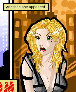
Porcelain
(Nov 25, 2003)
This, my friends, is B.M. (A differently-styled version of a character that is going in my new comic, "Discord"). Her real name is 'Black Mage' -- As in, her first name is "Black". But you know.. Too ghey for my taste. So BM as a nickname suits her fine. :) I'm drawing up her anime version soon, but this is the first of the concept art sketches.
mikhail (Nov 26, 2003)
looks real good, like the background...
IDontLookTooGoodInPink (Nov 26, 2003)
Ahhs hes pretty.. =D
LiLMac05 (Nov 29, 2003)
OMG...that looks like my ex-Girlfriend!?!?!?...dont believe me ill show u a picture...but dang thats GREEEEAAA ::Inhales:: AAAAAAT
tappie_chan (Nov 29, 2003)
the hair is fabulous! |
| |||||||||
| Specialty Boards/Contest! | ||||||||||
|
Porcelain
(Nov 18, 2003)
For the "In the near future" theme. :) This isn't necessarily what I want to be.. But you know. IT was cute.
Five (Nov 20, 2003)
I like the simplicity of the clean lines. Very good.
Childlike_Vampire (Nov 20, 2003)
I love the hair, and the lettering. Her eyes really grab me tho, so pretty!
lumpypixels (Nov 22, 2003)
Excellent B&W rendering. Those eyes rock!
Graffiti871 (Dec 1, 2003)
I like the black-white negative inverse girl you drew with the magazine font type letter. It looks like it could be part of one. Very cool,Porcelain. |

| |||||||||
| Misc. Boards/Sprites | ||||||||||
|
Doodlibop
(Nov 12, 2003)
Just a banner. I don't think I'm going to be using it soon. *giggles*Kuma! yay! I had fun doing this! :)
lumpypixels (Nov 16, 2003)
Doodli- VERY COOL. You work never stops amazing me. -Lumpy |

| |||||||||
| Public Boards/Beginner | ||||||||||
|
Childlike_Vampire
(Nov 11, 2003)
Just for fun.
HJ (Nov 11, 2003)
eek! mah eyes! how can a skinny thing like that ..... ?
furyofroy (edited Nov 11, 2003)
More titties! *squeals* I love eet!
lumpypixels (Nov 11, 2003)
Wowzers!
forgotten-memory (Nov 13, 2003)
implants....o.O |
This is hidden because it is rated 18+. Edit your privacy settings to make it visible.
| |||||||||
|
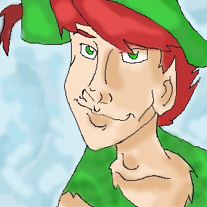
mundi
(Nov 5, 2003)
This is what happens after too much Disney World and one too many rides on Peta Pan. :BChanged the color of the feather so's you can TELL it's a feather...as my sister thought it was his braid, saying "Peter Pan has no braid." Me: "...That's a feather." Sister: ...O_o;;
lumpypixels (Nov 6, 2003)
Looks great small.
mazi (Nov 6, 2003)
looks good but the light is kinda off. pick one light source and shade to suit it. the lip would stick out so it would be a little more highlighted in the middle instead of just shadow.good job though |
| |||||||||
| Specialty Boards/Collaborations | ||||||||||
|
The game is Exquisite Cadavre.
10 comments
– latest 4:The playing field is 200px X 500px divided into 4 spaces- TOP PANEL(#1) = HEAD TO NECK; #2 PANEL = SHOULDER TO WAIST; #3 PANEL = WAIST TO KNEES; #4 PANEL = KNEES TO FEET. Free draw, no theme. If you want to draw- memo me. Open to just 2 other artists of worthy talent (as deemed by the Head Lump) needed.
lumpypixels (Oct 29, 2003)
GREAT THANKS TO ALL! Very funny head. Great skirt! Stylish boots! I love this collab function!!! should I do it next time on Lascaux?
Doodlibop (Oct 30, 2003)
yes! why don't you? that would be interesting!
mkkmypet (Nov 3, 2003)
Excuse me, can i edit it? I just want to put a finishing touch, I wont ruin it at all.
Doodlibop (Nov 4, 2003)
ahh, this is great. I love looking at it...specially the head! *laffs* |

| |||||||||
| Public Boards/Intermediate | ||||||||||
|
MAzi go for it. I had him kinda, driving out of himeself. Got the idea when i was listening to THIS song. C&C appriciated (I know im no good at proportions)
6 comments
– latest 4:[mazi: ok done i think. i was gunna make some attempt at a van gogh/starry nightesque bg but it ended up being smoke/clouds.. hm. i really need some good bg ideas.]
mazi (Oct 19, 2003)
wow o_o i didnt notice that before -_-;
Zappo (edited Oct 19, 2003)
the lower one is the back of a motorcycle,the other is smoke from the motorcycle........ oh yea and the lower trail is smoke, but i like it they way it turned out
lumpypixels (Oct 21, 2003)
AWESOME Piece! You 2 work very well together!
Artaxerxes (Oct 22, 2003)
Oh my gosh! The shading and highlighting are amazing. Great job. |
| |||||||||
| Specialty Boards/Collaborations | ||||||||||
|
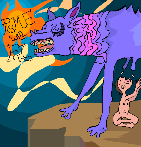
Zappo rocks the color!
4 comments
– latest 4:Zappo: I hope I lived up to your expectations Lumpy!
lumpypixels (Oct 15, 2003)
Excellent! Great color! Looking forward to our next collab!
misho1337 (Oct 15, 2003)
wow finally... a submittion with educated historical meaning behind it... i remember my dad telling me the story a while back... although, i really think you should have made the mother-wolf stronger, and romulus, (or rumus) who ever that is more "dignified" if u will... representing the power of rome... (rome has already fallen *news flash*) i like the abstract style you used.
coffeejelly (Nov 5, 2003)
interested style :D |
| |||||||||
| ||||||||||
| 2draw.net © 2002-2026 2draw.net team/Cellosoft - copyright details - 0.91sec (sql: 42q/0.24sec) |