| |||||||||||||||||||||
| Public Boards/Intermediate | |||||||||||||||||||||
|
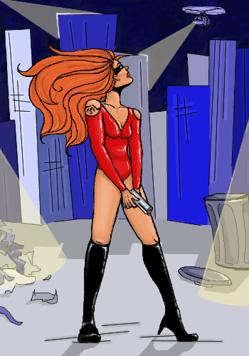
safescene
(Jul 22, 2004)
I don't know...I don't think there'll be a future for me and line art.I know there are probably a lot of little tidbits that are out of proportion and what not, but I needed extra space so I posted it on advanced. Feel free to move it if you are so inclined :P |
| ||||||||||||||||||||
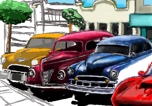
|
JackSprat
(Jul 11, 2004)
From a photo I took of cruise night in front of the restaurant, in progress.
kejoco (Jul 12, 2004)
this reminds me of something axil might dogreat job so far
KCBlueGal (Jul 14, 2004)
::waves timidly at Jack:: Heya stranger. Nice to see ya! I browsed through your gallery and I think this one will be my favorite so far! I can't put my finger on it but I really love how the blue and red cars look together. Can't wait to see it finished!
JackSprat (Jul 20, 2004)
Well, I'm hoping I get to finish it, LOL!Yay...got some more space to work with
Edit: Crap...put down 6 solid colors, and its past the limit. GRAAH! |
| ||||||||||||||||||||
|
misterjimsan
(Jul 15, 2004)
zack de la rrrrrrrrrrrrrrrrrrrrrocha
Aubrey (Jul 16, 2004)
I thought this was an Axil piece when I first saw it!! lol Great job Mister :)
davincipoppalag (Jul 16, 2004)
How about a smoke cloud with highlights from those "concert lights" you see on stages.. you know..the red blue background overheads and a spotlight on the singer kinda thingy..
Zack (Jul 17, 2004)
I really like this composition, Jim. You did a great job of cropping it. Seems fine without any fancy background to me. This really does look like vector art. Tell you in a second, Emma.
Urei-sama (Jul 17, 2004)
whoa thats crazy, i love the effect. its really good for the picture. really nicely done! |

| ||||||||||||||||||||
| Public Boards/Advanced | |||||||||||||||||||||
|
EverDream
(Jun 17, 2004)
I was watching Chamber of Secrets for the first time and was actually surprised to see Jason in the film. *laughs to self* I thought the blond hair was striking on him so I managed to scrape out this pic from an image not even half of the size I drew it from. Gotta love those chilling eyes! *shivers* :D
Ty854 (Jun 19, 2004)
Haha! i thought that his snake staff was one of those animal mouth grabbers. you know wheres the mouth clamps down and opens back up. awwww, but harry potter is a good movie. My uncles make fun of me by calling me hairy potter. my hair and glasses look like him or sumtin i guess......
Paranoidkittie (Jun 22, 2004)
this is really good, but is it just me or is his mouth a little small...
MC.Cracka (Jun 24, 2004)
Very nice picture. I like the pimp cane he is also wielding. Very great work you very stop to impress me.
cheetos (Jul 16, 2004)
I love to watch harry potter!! you got his stare down perfectly. |

| ||||||||||||||||||||
|
staci
(Jun 24, 2004)
teehee
Xodiak (Jun 30, 2004)
Fantastic drawing! I liked the balloon guy, the crazy guy with the lightning but I loved the floating meatball with the so many eyes! It could move so fast! Hehe, it was so cute... <:)I am sure the Mortal Kombat video game was inspired by that movie, many of the video game characters resemble some of the movie. Also, old people are sexy! >:D |XOD|
Kloxboy (Jun 30, 2004)
I would like to see more movies like BTILC now, the movie has a great story and the action is rarely cheesy like you see in the newer movies. Mortal Kombat could have been a cooler movie if it was more serious, if it had a better story development and less of a "good guys destroy the bad guys" set up. BTILC was solid, unique characters and some of the little details about Chinese culture make it a little bit more believable than just straight "monsters fighting the hero" fiction. Most fiction/fantasy films that entail a lot of fighting and action I watch once and never want to watch them again but I've seen BTILC about 12-15 now.
Bumble_Beez (Jul 2, 2004)
MEEP! -runs and hides- Good job though.
Dantei_GDF (Jul 11, 2004)
hey, its the dude from Big Trouble in Little China.... that movie was super funny. awesome portrait of lo-pan |

| ||||||||||||||||||||
| Public Boards/Intermediate | |||||||||||||||||||||
|
LovelyLori
(Jul 9, 2004)
I'm done playing now
Gigge (Jul 10, 2004)
This is like looking through a wrought iron fence at a shrine in the distance full of lit candles.
Aubrey (Jul 10, 2004)
Interesting take on it Gigge, it does kinda look like that. It's very pretty whatever it is.
emmamommalag (Jul 11, 2004)
That's exactly what I was thinking, Gigge. Pretty picture, Lori.
davincipoppalag (Jul 11, 2004)
It does look like some kind of ironwork . Cool idea Lori |

| ||||||||||||||||||||
|
Hakkai
(Jun 24, 2004)
XDD Guess where I'll be!
emmamommalag (Jun 25, 2004)
Yeah, they look like blisters. It's a very nice drawing, though. :)
lp_phaery (Jun 25, 2004)
great colouring,great line art,what else can i say......its great!
Aubrey (Jun 26, 2004)
He's been in the sun way too long if he's hallucinating flowers are floating everywhere in the desert lol. Nice picture though, he looks all tuckered out. Poor guy.
cherikit-chan (Jul 9, 2004)
WOw! I luv your style! ( that must be really heavy bag tho..) |

| ||||||||||||||||||||
| Public Boards/Beginner | |||||||||||||||||||||
|
LEELEE
(Jul 1, 2004)
/
kejoco (edited Jul 9, 2004)
this looks like latoya jackson...doubt it was intentional but thats who i see. or maybe donna summer anyway, good job...but i wouldn't use the blur tool on the outside edges if you're going to keep the inside lines clean.... |

| ||||||||||||||||||||
| Public Boards/Intermediate | |||||||||||||||||||||
|
kejoco
(Jun 22, 2004)
originally i picked the advanced board just cause i wanted the space, but i'm posting it in intermediate but i would love extra room to keep working on it
davincipoppalag (Jun 25, 2004)
This is excellent good work!
emmamommalag (Jun 25, 2004)
Indeed it is! Wonderful job!
Aubrey (Jun 26, 2004)
Great job on the picture Kejoco :)
LovelyLori (Jul 3, 2004)
yeeez, I hate to see what you do when you're seriously drawing.... just practice.. phhff! :) |

| ||||||||||||||||||||
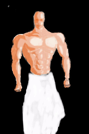
|
kejoco
(Jun 5, 2004)
yeah, so this is crap...please ignore
bumpinthenight (Jun 15, 2004)
err, not bad at all with the exceptions being the head and hands.... the musculature and skintone is great!
emmamommalag (Jun 15, 2004)
His head is way too small and his arms are too short but you've done a great job on the rest of it. Very good shading.i think i want to get this set back to unfinished and take it in another direction....
Ty854 (Jul 1, 2004)
I actually like v1 the best. |
| ||||||||||||||||||||
| |||||||||||||||||||||
| 2draw.net © 2002-2026 2draw.net team/Cellosoft - copyright details - 1.48sec (sql: 37q/0.90sec) |
great job on the hair!