| |||||||||||||||||||||
| Public Boards/Intermediate | |||||||||||||||||||||
|
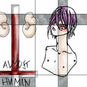
Clown
brainspiller83
(Oct 17, 2005)
For my friend
Deino (Oct 18, 2005)
So far so good! The coloring looks really nice!
Axil62 (Oct 18, 2005)
I like the brown base color. I must remember to try that.
jord (Oct 18, 2005)
I like this alot. To be honest, i feel like the black outline and the colouring don't fit together that well. I do like them both, especially the colouring. Nice work anyway!
woah_pockster (Oct 18, 2005)
sweeeeet xD he looks great xD <333 It looks a tad unfinished but eveything is awesome, none-the-less. and I agree the black outline stands out a bit tooo much BUT THAT'S OKAY. I stilll l love you x3 |

| ||||||||||||||||||||
| Public Boards/Beginner | |||||||||||||||||||||
|
7 comments
– latest 4:
Noremac (Sep 27, 2005)
albert
kiketsu (Oct 6, 2005)
this is really cool! and how about....hm....i dunno, Aris? ^^;;
whitebunny1063 (Oct 11, 2005)
How about James?
kristine (Oct 16, 2005)
Bob. |
| ||||||||||||||||||||
| Public Boards/Intermediate | |||||||||||||||||||||
|
mooseflower
(Oct 10, 2005)
Reach rhymes with peach which rhymes with leech which is distantly related to the butterfly!
Gigge (Oct 10, 2005)
That's neat. The butterfly looks as if it's heading toward the hand, but the hand looks as if it's just released the butterfly. It kind of makes me wonder who's catching who.
LisaAnne (Oct 11, 2005)
I dig it.
jord (Oct 11, 2005)
i love the sharp white lines of the background and the white shadow-outlines on the hand (even more). this is cool
DarkCloak (Oct 11, 2005)
Cool! I do like the way this was drawn and colored! |

| ||||||||||||||||||||
|
Alex-Cooper
(Oct 4, 2005)
bring me some wine. chop chop. let's go. move it.
Caddris (Oct 4, 2005)
Mmmmmm. . . coffee. I need some of that right now. It's 3am here and I'm still not done studying. . .Anyway, wicked awesome picture.
Kloxboy (edited Oct 4, 2005)
5 heads are better than one. ZING!Some crazy necks you drew there. I like the overall feel, the faces look like something out of a Doze Green painting. Well done.
davincipoppalag (Oct 4, 2005)
They must fight over that one cup of coffee. Nice bold Alex toon..
jord (Oct 4, 2005)
this is really nice. i love the woodcut-y feel. they seem to suffer too much or too few coffee.. |

| ||||||||||||||||||||
|
Phil
(Sep 26, 2005)
heh heh heh fanced a change from boobs
jord (Sep 27, 2005)
whow, a very small angel
hideyourface (Sep 27, 2005)
his nipple looks like it's on fire.
Caddris (Sep 27, 2005)
And I laways thought angels were androgynous . . .
Boichi (Sep 27, 2005)
Why's he sitting on an elephant? 0.o?? |
This is hidden because it is rated Extreme. Edit your privacy settings to make it visible.
| ||||||||||||||||||||
| Public Boards/Beginner | |||||||||||||||||||||
|
5 comments
– latest 4:
davincipoppalag (Sep 25, 2005)
It's cute, but I don't get it either...
HunterKiller_ (Sep 26, 2005)
Er... guess i'll join the club.
jord (Sep 26, 2005)
maybe he doesn't controll his fireskills too well?i love the lineart and colouring.
staci (Sep 26, 2005)
no he's a terrible dragon who told terrible lies and broke that pile of ashes' heart. because he was just jokin. ahahahaha. |

| ||||||||||||||||||||
|
Alex-Cooper
(Sep 26, 2005)
I think i'm going to be sick. I also think that I will get a hot lava burn.
davincipoppalag (Sep 26, 2005)
Lol ..love the funnelhand and the forkhand...
HunterKiller_ (Sep 26, 2005)
I love this.
D-Yoop (Sep 26, 2005)
love the colors and the style
jord (Sep 26, 2005)
this is cool! i like the idea and the colouring very much. Only the white border on the right side bothers me a bit. But i'm easily bothered... |

| ||||||||||||||||||||
| Main Forums/2draw.net | |||||||||||||||||||||
 |
mazi (Jun 18, 2005)
im curious to know what is your favorite alltime drawing from 2draw. theres been so many drawings, its hard to pick just one, but a few stand out in my head. i'd say if i had to pick one, it would be the beauty within by kasha, and a close second is sjazbot by two-na.
61 comments
|
||||||||||||||||||||
| Public Boards/Intermediate | |||||||||||||||||||||
|
You can colour it Miss Marini, it is better if you use the layers beneath, but please leave the hair uncoloured because I have an idea.
20 comments
– latest 4:|XD|
maiino (Jul 19, 2005)
wow n__n= at first i was just scrolling by n i noticed ur kittie x3 when i got a good look at it xD it waslike *smack* x3 aw.. xD its so nice ^^= teh way u did the hair is absolutely great xD nice stuff &^^=
Kenshin (Jul 19, 2005)
That coloring is so unique and interesting.I like it a lot.
Cordelia_Pink (Jul 22, 2005)
Purdy! I just love how you do your coloring, xod. it's like nothing i've seen before. lol it's really neat how you made the hair as if it was part of the background considering how it's like the sky and the trees as if I was looking at something invisible. But the real background is the one that looks like out in space. It's a neat illusion. This is a neat idea and great job, both of you!!
Cianteed (Jul 23, 2005)
Awesome illusion! I like how her body looks like a candy cane, too! XD |

| ||||||||||||||||||||
| Public Boards/Beginner | |||||||||||||||||||||
|
jord
(Jun 7, 2004)
ehh... lineart-thing i guess...man, i'll never draw clothing again, ever! ;)
Knockoff (Jun 7, 2004)
Oh!! I like this very much! Your lineart is uber cool, and your coloring is nice and simple.I'd also like to see more. ;)
bumpinthenight (Jun 7, 2004)
very kool.... yaay!!! someone else who does very pronounced lineart! wahahha!!! XD... man.... if only I had this mutch skill on computer coloring.... :D
jord (edited Jun 16, 2004)
8) thanks very much guys!! *flies off*
Xodiak (Jul 19, 2005)
This is very nice! I like the hair very much. And the face looks cute too, hehe. Awesome drawing! >:D|XOD| |
| ||||||||||||||||||||
| |||||||||||||||||||||
| 2draw.net © 2002-2025 2draw.net team/Cellosoft - copyright details - 1.02sec (sql: 34q/0.28sec) |