| |||||||||||||
| Public Boards/Intermediate | |||||||||||||
|
kejoco
(Jun 13, 2005)
.... |

| ||||||||||||
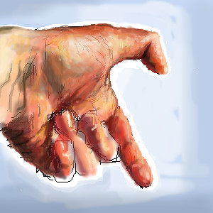
|
ironoxide_red
(Jun 15, 2005)
and one hand for drawing.
DieChan (Jun 16, 2005)
From the thumbnail, it looks like a real hand. It's really good, the coloring is awesome. I'd get rid of the black lines, though. Really good!
Gigge (Jun 16, 2005)
The colors you used for fleshtones look awesome.
brenndurdrykkur (Jun 16, 2005)
the looseness of this is great
ironoxide_red (Jun 19, 2005)
Thanks. I didn't want to overwork it. |
| ||||||||||||
| Public Boards/Beginner | |||||||||||||
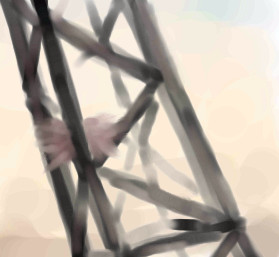
|
concannon
(Jun 7, 2005)
So I look at the clock, think "okay, I've got ten minutes 'til I get booted offline", and promptly begin a drawing. I'M A CLEVER ONE.Okay, it's mostly that I haven't drawn anything in a really long time and I was feeling antsy. This is a little tidbit from an idea I want as a full scale painting (watercolor, most likely); a forest of cranes, filled with bird nests, etc, all kind of dull and drab, with a really washed out sky. Dunno where it came from...probably something about deforestation, or something. ...er. And now I away to finish reading Frankenstein.
Zack (Jun 7, 2005)
nifty, I was actually thinking about drawing some construction machines recently. something about the pathos of overworked and rusty machines interests me. the contrast of placing a birthing place in the midst of gloomy, decaying structures is pretty cool.
davincipoppalag (Jun 8, 2005)
I used to see nests in the bell buoys ..this looks like that to me..
ironoxide_red (Jun 15, 2005)
Oh, I love cranes, and watercolor. I'd like to see some "dull and drab"! |
| ||||||||||||
|
Gigge
(May 30, 2005)
Based on a sincity suggestion (killer beets in Antartica). No reference used.
Gigge (Jun 1, 2005)
Yeah, I know Lori. It's more than a little odd. Thanks Sincity and Davin. I'm glad it made someone laugh. :D
ironoxide_red (Jun 16, 2005)
Well. I'm glad I don't live in Antarctica! :D
Gigge (Jun 16, 2005)
Yes, the truck jacknifed and there was a frozen vegetable break. Antarctica has never been the same. In fact, the name seems to have been changed to Antartica.
laurael (Jun 16, 2005)
Funny! Love the penquin...he's awesome...great stuff! |

| ||||||||||||
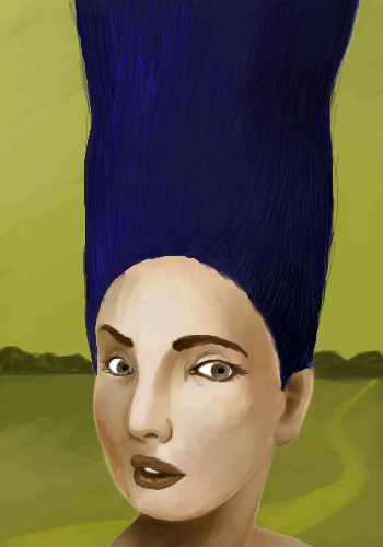
| Public Boards/Intermediate | |||||||||||||
|
huirimeir
(Apr 26, 2005)
and cut everything
safescene (May 14, 2005)
Perfection! I love this.
featherstone (May 14, 2005)
I could so cut that hair for her
huirimeir (May 14, 2005)
scissors sister
ironoxide_red (Jun 16, 2005)
...everything but her hair! Or is this the "Before"-picture? |
| ||||||||||||
| Specialty Boards/Collaborations | |||||||||||||
|
Kloxboy
(Jun 13, 2004)
I designed a basic background so our characters have a lot of room to do the power move. I'll start tonight, I dunno if I'll finish though.
Ty854 (Dec 5, 2004)
Lol, thats going to be hard to beat.
Kloxboy (Dec 5, 2004)
Kinda, it's actually finished now, Zack and I decided that the power moves will be solo projects. But the final piece will be a collab, I think.
spiritdweller (Dec 5, 2004)
hehe you two are outta control...
K-Dizzle (Dec 5, 2004)
lol!... this is awesome. Zack's gonna need some serious help, cuz that bastard is beyond jacked...i love the way you color all of your work...very cool :) |

| ||||||||||||
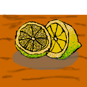
| Public Boards/Beginner | |||||||||||||
|
2 comments
– latest 4: i need some one to paint it
please
ironoxide_red (Aug 8, 2004)
And lived to tell the tale? Wow! ;) This looks like a good beginning.
LEELEE (Aug 8, 2004)
lemons or limes? its all in the colors...lol..great so far..love the pulpColors or something.
|
| ||||||||||||
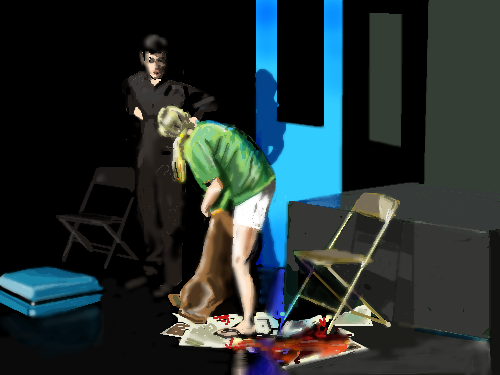
| Public Boards/Advanced | |||||||||||||
|
Axil62
(Aug 12, 2004)
Someplace to hide at the airport.
fleeting_memory (Aug 15, 2004)
how embarassing-white shorts too. I get it and all but what the hell is that brown thing?Aubrey> it looks like she'll need more than a pad for that disaster^^
DejasView (Aug 15, 2004)
There is so much more to this picture than what might be considered the blood. It definitely keeps you wondering about what the hell is going on here. Lots of possibilities. I love the shadows and and variations in lighting. The chair on the right appears to be screwed up a little bit on the perspective though...or am I just not looking at that right?
quintessence (Aug 16, 2004)
If I was having a 'women leak' of those proportions, I'd be in the hospital, not the airport. o____oLove the chairs and the bright blue suitcase.
shell (Mar 1, 2011)
chair looks nice |
| ||||||||||||
| Public Boards/Intermediate | |||||||||||||
|
Axil62
(Aug 6, 2004)
Quran (9:11) -- For it is written that a son of Arabia would awaken a fearsome Eagle. The wrath of the Eagle would be felt throughout the lands of Allah and lo, while some of the people trembled in despair still more rejoiced; for the wrath of the Eagle cleansed the lands of Allah; and there was peace. From the Quran. Notice the chapter and verse number, no joke.
DeadlyBlondeArcher (Aug 12, 2004)
No eye contact is what I hate.
shell (Mar 1, 2011)
A lot of innocent lives lost and a lot of stigmatism for islamic people.
Axil62 (Mar 1, 2011)
Islam can suck it.
shell (Mar 2, 2011)
I knew you'd say that. |

| ||||||||||||
| Public Boards/Beginner | |||||||||||||
|
ironoxide_red
(Aug 11, 2004)
Well, I promised my sister to draw her a cat and I did. Not sure what board this should be on, I'm submitting it here and then the moderators can move it to Beginners if they think that's better, ok?
mx (edited Aug 12, 2004)
I think it should at least be in intermediate. (i think it has potential for going to the advanced...with work of course:) )Maybe consider adding more light to the road around the cat and add more definition to the cat. Have a play between "dark - light - dark" In other words...dont have the same tonalities next to each other, especially with the vocal point(the cat). Also get rid of the white in the top corners. It makes the painting feel very unlayered. It will seem much more finished if the white is gone:) I likes mx
Dragnakita (Aug 12, 2004)
Aww... I think that you have put this on the right board. The kitty cat is very cute. I think that you did a splendid job. I think that the bushes need a little help, though... more detail could have been added to them. The cat is really, really awesome, though. I also like the pavement. Overall great job.
ironoxide_red (Aug 12, 2004)
Oh, wait, I did put this on the Beginners board after all... Oh well. MX: Good points, though I think the whites could work - with a bit more work!:) I know I cheated a bit there, all I can say in my defense is I concentrated on the cat since my sis doesn't really care about bushes...;) Though I have a feeling something is very wrong with the perspective and/or anatomy of the cat... just can't put my finger on it.
mx (Aug 24, 2004)
well...i like it in any case:) |

| ||||||||||||
| |||||||||||||
| 2draw.net © 2002-2026 2draw.net team/Cellosoft - copyright details - 1.64sec (sql: 40q/0.51sec) |
drawn in 16 min