| |||||||||||||||||||||||
| Public Boards/Intermediate | |||||||||||||||||||||||
|
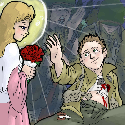
DarkCloak
(Oct 7, 2005)
Wade's voice is fading, he's still calling for a stretcher... It's too late Wade, I'm going home. Home to Marissa... |
| ||||||||||||||||||||||
|
thesolarwinds
(Oct 11, 2005)
http://www.socalequine.com/classified_ads/Images/Horses%20for%20Sale/terry_lg.jpgpic of a chick and her horse.. playing on a cold and stormy day at the beach.
Caddris (Oct 12, 2005)
I absolutely love the lighting on the horse's face.
darkshadow (Oct 12, 2005)
i dont see any poo is it behind the horse ?i like thisone of corse i like a lot of your stuff wind! god colors the water is great and i really like the stormmy look the sky has
Gigge (Oct 12, 2005)
It looks very nice, solarwinds. I like the musculature on the horse and the splash. It shows a lot of strength in a storm. The colors are beautiful too. Very different from the reference, but lovely just the same.
Miss_DJ (Mar 26, 2006)
lovely! love the water! the horse is great too! |

| ||||||||||||||||||||||
|
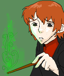
Boichi
(Oct 11, 2005)
Oh crap. He did it wrong again. *Sigh*
Fobix (Oct 11, 2005)
YAY YOUR DRAWING THEM! ^^
Boichi (Oct 11, 2005)
Just for you.
hideyourface (Oct 11, 2005)
isn't he fatter looking.
Boichi (Oct 11, 2005)
Nah. If he was i would've renamed this picture, "Neville Longbottom" |
| ||||||||||||||||||||||
|
brainspiller83
(Sep 9, 2005)
my pathetic attempt at drawing Takeshi Ueda. Will make it look better when my brain is in a drawing mood... :D
davincipoppalag (Sep 9, 2005)
It's looking pretty good to me so far...!
Rosemary (Sep 9, 2005)
looking great so far lil :)meh!?!?!
hideyourface (edited Oct 11, 2005)
I liked the first version because it had nice colours, but I like this one too because the face doesn't look demented anymore :Dedit: after further speculation I realized his arm is too big. |

| ||||||||||||||||||||||
| Public Boards/Advanced | |||||||||||||||||||||||
|
xiau
(Oct 8, 2005)
My mouse kept freaking out... And I got to finish it, 'cause my teachers didn't give us homework today!~I improvised this one to make it fit on a smaller picture than the reference was on. All I can say is: I tried. No, really, that's all I CAN say about this one. I guess it turned out pretty good for my first realism attempt, though. Remind me to never try realism again. Ugh... NOTE: This is from the movie scene in Final Fantasy X where Yuna's doing a "sending" or whatever. It's so sad, but so pretty. I remember watching this video on the computer months before we got it in America, and watching it over and over, because I loved it so much. The title of the movie in the game was "The Dance", hence, the name.
Prettylilies (Nov 26, 2005)
It's so beautiful...
22darkangel22 (Dec 17, 2005)
*collapses from heart attack* 7th grade?!wtf mate? your so much better than me...and younger....life is not fair -___-
theonlyone (Mar 19, 2006)
FINAL FANTASYYY!=]
ajbabyaj13 (edited Oct 24, 2006)
Final Fantasy X rox! This is so pretty!! Great job!I love the detail... the water, the sunset, the clouds.... the debris... Yuna looks great, too! You gotta tell me how you made this!!! I suck! XP |

| ||||||||||||||||||||||
| Public Boards/Beginner | |||||||||||||||||||||||
|
woah_pockster
(Oct 4, 2005)
hrm.. just something I was doing out of boredom. Tell me what you think. Most probably disaprove of the darl outline in contrast to the faded coloring. ^-^;
fleeting_memory (Oct 10, 2005)
hey its sasuke. This is pretty good-it might look better with a solid outline but the colors on the shirt are great nontheless.
JK-Arts (Oct 10, 2005)
are you guys searious?
christiangirl (Oct 10, 2005)
omg omg omg !!! SASUKE! I luvers him to death ^.^ Awesome job though. Wooot Sasuke! (in case you didn't know I love Sasuke) lmao.
KaykuyoAkabane (Nov 25, 2005)
^-^ Sasuke~~<3 |

| ||||||||||||||||||||||
| Public Boards/Intermediate | |||||||||||||||||||||||
|
Hopeless
(Oct 9, 2005)
Real people don't need labels.
hideyourface (Oct 9, 2005)
well I hope you dont judge people who use labels before you know them :o |

| ||||||||||||||||||||||
|
Alex-Cooper
(Oct 7, 2005)
News Flash!
Alex-Cooper (Oct 10, 2005)
Perfect. Thank you method3. I think that's an excellent closing statement for this debate.
marcello (Oct 10, 2005)
love the link.
Caddris (Oct 11, 2005)
I'm sorry. That was a generalized statement; not directed all at you.Isn't that how all this got started in the first place?
ambermac (Oct 20, 2005)
nice rant. i agree. copying is a fine exercise as long as you credit the original photo. using your own voice is always a greater risk--which is why it's much more fun on all sides. in the fine art world, artists who do this sort of thing always add an indicator in the title. they'll say, "after ____insert artist's name". what gets me are those "pros" in galleries who blatantly lift another artist's style and call it their own. |

| ||||||||||||||||||||||
| Public Boards/Advanced | |||||||||||||||||||||||
|
19 comments
– latest 4:
IamaCunt (Oct 11, 2005)
awesome to max mon, it looks almost real
hideyourface (Oct 11, 2005)
I think the tongue and teeth should be a bit sharper, and the lips, a little softer-particularly the top lip.
srarh1122 (Oct 24, 2005)
The toung looks real, well done!!!
sarah.com (Oct 27, 2005)
Nice job...>_< |

| ||||||||||||||||||||||
|
Fatalinjection
(Oct 5, 2005)
I'm thinking about the colors.
Kloxboy (Oct 7, 2005)
I remember when I was like 5, I thought it was called the "drunk droor". I like the line art, I'm interested to see the finished product.
nekodesu (Oct 9, 2005)
Wow...looking at this freaks me out. o_oBut it looks awesome so far.
Boichi (Oct 10, 2005)
You should color it! It would look awesome!!!
meobi (Nov 17, 2005)
I like it it looks quite disturbing but cool... do it in black&white |

| ||||||||||||||||||||||
| |||||||||||||||||||||||
| 2draw.net © 2002-2025 2draw.net team/Cellosoft - copyright details - 1.64sec (sql: 38q/1.05sec) |
i dont agree with hide on this one i like it how it is i would say leave it faded
great pic