| |||||||||||||||||||||||
| Public Boards/Intermediate | |||||||||||||||||||||||
|
Say ah!
The_Chosen
(Aug 14, 2005)
XD I`m going to try to go to the Numa-Rei-No-Con anime Convention as Integra this year so I just had to draw this
davincipoppalag (Aug 15, 2005)
Really good job on this one.. I love the shading on the coat
Heartsdomain (Aug 17, 2005)
hellsing love it nice a good on the glove you got the detales right!
sephiroth54321 (Sep 1, 2005)
cool :P
woah_pockster (Oct 16, 2005)
omg you are gellin like a fellon. :D I love thissss, it's bitchin' B] |

| ||||||||||||||||||||||
| Public Boards/Advanced | |||||||||||||||||||||||
|
The_Chosen
(Aug 19, 2005)
This started out as something completely different & mutated into this but I am pleased with the outcome even if it is a bit odd.Edit: I tweaked it ^_^
hideyourface (Aug 20, 2005)
probably that the lips dont get thinner at the sides.
lycene (Aug 22, 2005)
I really like the background on this. The floating island thingies and the clouds are very cool, and his skin tone is very well done.
Queen_Asheer5600 (Oct 1, 2005)
I like the longing look he has in his eyes, and the little trinkets he has on his forehead and ears =D It's a really nice touch with the body and everything. I was never the best at drawing humanoids (Computer or Traditionally) and this is truely stunning =D Keep up the great work *claps*
woah_pockster (Oct 16, 2005)
mmh yummy collar bone <33 The face could use a bit of work *at stated in earlier comments* but I love your shading <3 |

| ||||||||||||||||||||||
| Public Boards/Intermediate | |||||||||||||||||||||||
|
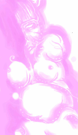
solve
(Aug 12, 2005)
whoa compression! changed it up.
LisaAnne (Aug 12, 2005)
Haha you know who this reminds me of! Hans Bellmer :)Also seems like an "opera lady" Yeah I still know nothing of the "anime" type stuff...I'm sorry. Interesting color...when did pink become feminine anyway? Yeah I'll shut up now.
hideyourface (Aug 12, 2005)
I really like this. Your stuff keeps getting better and better.
SimplyX (Aug 14, 2005)
I love it!! It's sort of a hidden 18+ pic and that's the beauty of it! I love the curves and the roundness. Soft colors and lines really makes this captivating in a way.
woah_pockster (Oct 15, 2005)
your art is so purly organic. it's very whole and it's just all around beautiful |
| ||||||||||||||||||||||
|
woah_pockster
(Oct 10, 2005)
This is pretty much done. I'm leaving it as it is and not going to make the outline blend more. :]THANKS CONOR for all the help and advice with this. It's much better with your help and I dun care about the outline. ^_^ <33 thnx again dolleh
darkshadow (Oct 13, 2005)
this cane out great like the tones and blending
Urei-sama (Oct 14, 2005)
this is really pretty. i like the pose
Etheon (Oct 14, 2005)
it's very pretty. for some reason, it reminds me of the art in DNAngel.I'm going o make the lines smooth =]
|

| ||||||||||||||||||||||
|
Rudeezy
(Oct 13, 2005)
i'm hungry.
hideyourface (Oct 13, 2005)
yeahh, blurring is bad in most cases.
HunterKiller_ (Oct 14, 2005)
Good to see new subject matter, and it sure is a good one. Food is great, especially potato chips.
JK-Arts (Oct 14, 2005)
Doritoes are better
featherstone (Oct 14, 2005)
I love food drawings :)Staci does them best. ya know what kinda chip is sooo yummy? onion & garlic chips mmmm |

| ||||||||||||||||||||||
| Public Boards/Beginner | |||||||||||||||||||||||
|
zeldafan
(Oct 13, 2005)
i am sry that its not intermediate material,i like it and i mostly wanted more pixelsi now know were i belong.i wish i could get some coloring tips I still need to color it better plz give me some more room
Fobix (Oct 13, 2005)
it doesnt look closed ~_~
hideyourface (Oct 13, 2005)
I thought it was closed the first time I saw it. But still, it's not intermediate. You need to learn to use the tools in the applets better, and colour properly.
22darkangel22 (Oct 13, 2005)
cuz of zeh eyebrow shape and lookingness....yes lookingness is word....no its not in the dictionary...stfu
zeldafan (Oct 14, 2005)
thx ill do what i can |

| ||||||||||||||||||||||
| Specialty Boards/Elite Bastards | |||||||||||||||||||||||
|
staci
(Oct 11, 2005)
hee
Kloxboy (Oct 11, 2005)
I like the style, it's like a comic. Her hair rocks.
davincipoppalag (Oct 12, 2005)
She's got pink eye! It's amazing how such detail can be suggested with a few solids.
darkshadow (Oct 12, 2005)
you are right davin this is great like the hearts in her eyes and the hair wowwho is she
hideyourface (Oct 13, 2005)
I love the simple colours and shading in this. But I think her nose should be a bit more to the right :p |

| ||||||||||||||||||||||
| Public Boards/Intermediate | |||||||||||||||||||||||
|
JK-Arts
(Oct 13, 2005)
She has her head down so the hair is opening up a bit revealing the neck. (i had to make this finish out of space oh well)
darkshadow (Oct 13, 2005)
like the blending and shading
Gigandas (Oct 13, 2005)
That was a pretty low blow there...
jayceepearl (Oct 13, 2005)
Making friends, Dan?
Axil62 (Oct 13, 2005)
No, they already love me, I'm just treating them shitty for now. |

| ||||||||||||||||||||||
|
hideyourface
(Aug 4, 2005)
it's me
hideyourface (edited Aug 4, 2005)
email: electricxcucumber@hotmail.comyou can search for me on myspace ;o. my small brain cant work links properly :)
Drummer6 (Aug 4, 2005)
That's one of the best I've seen here. It's cute too. :)
Gigge (Aug 5, 2005)
:( You look so thrilled to be here. I like the lighting on the face.
woah_pockster (Oct 13, 2005)
what a hottie :DDD <333 x] alsooo you made yourself look sadder :\ |

| ||||||||||||||||||||||
|
woah_pockster
(Oct 12, 2005)
A simple picture of a geisha. The white makeup of the geisha covers their face and it goes down and around their neck. The kimono is set loosly around the collar to show a bit of fleshy skin. This is done to make a mand being entertained think about what lies under the white makeup and under the kimono. ^_^ I love geisha and most everything about them. x] <3 Tell me what you think.
darkshadow (edited Oct 12, 2005)
i like the golw she has and ya i agree with what these 2 are saying it could use a little more detail good pic
Gigge (Oct 12, 2005)
It is a little blurry, but the colors and composition are very nice.
lycene (Oct 12, 2005)
I own a couple of kimonos; I find Japanese culture fascinating. I really like this picture, as is said concerning the composition and all. I don't really mind the lack of detail, it reflects the simplicity of ink paintings. I think, though, that it would be really effective if you maybe sharpened the lines defining the change between her back and the kimono, to really draw the eyes in.
woah_pockster (Oct 13, 2005)
Thank you everyone so much for the comments <3 I'm glad you noticed the kimono, I hated it as well but I left it as it was, I didn't want to make it look overdone but it could use a bit more work. And lycenee, thanks for your comment I'll think about that next time. ^^ <3 |

| ||||||||||||||||||||||
| |||||||||||||||||||||||
| 2draw.net © 2002-2025 2draw.net team/Cellosoft - copyright details - 1.62sec (sql: 36q/0.81sec) |