| |||||||||||||||||||||||
| Public Boards/Intermediate | |||||||||||||||||||||||
|
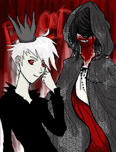
Gandalf
Axil62
(Oct 24, 2005)
Saw a suggestion in the forms about star wars, Lord of the rings and such..
nehra (Oct 25, 2005)
teh smechs!!! <333 me lurfs gandalf!!!!!!!!!!!!! I'd love to have him as an extra grandpa. i mean, think of all the great stories he could tell!!! xD
Amethysts (Oct 26, 2005)
*stare* *stare* *stare* o_o we envy you
bring_tha_funk (Oct 27, 2005)
axil schooling artist since the sands of time!
rosalyn (Nov 6, 2005)
This does not looklike Gandalf in my opimion but more like the man on the book cover of "the giver" |

| ||||||||||||||||||||||
| Public Boards/Beginner | |||||||||||||||||||||||
|
hyschara
(Sep 6, 2005)
...bad eye day >.> couldn't get it right at all <.< anyone wanna colour this, let me know. His wing is like opaque crystals :3
fleeting_memory (Oct 24, 2005)
hey very nice-you didnt need any help coloring. I like the wings the best. The hand looks a little like it could be in front even though I can tell it is really behind-maybe more wing coloring over it?
narutofan (Oct 24, 2005)
pretty
hyschara (Oct 25, 2005)
yeah maybe the wing colours should've been a little more defined above his hand^^; but yes, the hand is beneath the wing^^thanks for the comments ^^
ladycrystal6 (Mar 6, 2006)
really pretty ^_^ I love the hair. |

| ||||||||||||||||||||||
| Specialty Boards/Collaborations | |||||||||||||||||||||||
|
This is a collab with me and Truarashi, with my character Kachi and her character Soul Fire
5 comments
– latest 4:
fleeting_memory (Oct 24, 2005)
someone on the right has been enjoying themselves ~.^
devilgirl (Oct 24, 2005)
thisis sooo cool !
Truearashi (Oct 24, 2005)
^^; well... my man SoulFire tend to ... overreact xD
whitebunny1063 (Oct 24, 2005)
i have an original character back when I was a kid! |
| ||||||||||||||||||||||
| Public Boards/Advanced | |||||||||||||||||||||||
|
22 comments
– latest 4:
solve (Nov 20, 2005)
showcase please.
terracotta (Dec 28, 2005)
Very beautiful. The colours are so lovely and her expression is compelling--I get a sense of worry or indecision. The only thing I might suggest working on is the dark shadow above her eyelid--if you could soften the edge of that to give the impression of a smoother increase in the roundness of the bone structure just below the eyebrow.
shell (Apr 2, 2010)
pretty
dorothyblueeyes (Apr 2, 2010)
I agree,it's so good it should be on the showcase |

| ||||||||||||||||||||||
| Public Boards/Intermediate | |||||||||||||||||||||||
|
yoyoma
(Jul 16, 2005)
A bad representation of Gerard Butler. Don't kill me over this please ladies.
davincipoppalag (Jul 17, 2005)
I knew I was gonna like your work!With hair and a background. Enjoy!
fleeting_memory (Aug 11, 2005)
oh its ok-as long as you did't mess up Micheal Crawford's face then you're fine. Actually you didn't do to bad with Butler-I can definately see him in there :) good job-phantom rocks my socks and all my other clothing as well.
kristine (Oct 23, 2005)
AAAH! Great movie! Nice pic! |
| ||||||||||||||||||||||
|
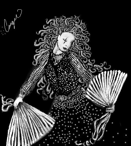
Felistorm
(Oct 21, 2005)
Okay yeah don't like this one as much but put too much work into it to delete it. :P There are some things I do like such as the hair but didn't really fit in w/ the series.
fleeting_memory (Oct 21, 2005)
This one and Yellow are my favorite of the series. This one is my favorite of those two. I agree with you, I love the hair. The concentration of white in the dress diminishing toward the bottom is set off well by the fans as they lead your eyes right back up to the top of the picture again-this creates good movement in the picture. Good job.
davincipoppalag (Oct 21, 2005)
What fm said.. I like the hair,too. |
| ||||||||||||||||||||||
|
GundamWing
(Oct 7, 2005)
Something differnt
fleeting_memory (Oct 21, 2005)
So much for Spinderman eh? That's cool cause this looks nice. Colors are great. The way you did the lighting on the sides of his pants reflecting the glow of the explosion looks kinds weird on the viewr's left but it works well everywhere else. Nice picture.
GundamWing (Oct 21, 2005)
the first to see it haha..same here. i spent most of the time on ver 3 trying to get the head to look right but the eyes are 4 pixs wide and im not use to drawing small detailed images, sleeping is good, the guy burning was a must :) spiderman missed the ledge and died, yeah after i fin. pics i notice all the mistakes for some reason... i would fix but i hit limit, and i got bored with it thanks for the coments.
HunterKiller_ (Oct 21, 2005)
Wow wow, nice piece, great sense of movement.
DarkCloak (Oct 21, 2005)
Ooh! That poor guy in the background, getting blown apart. What a way to go. heh. I'd love to see what's shooting at him.I've noticed the character's eyes are red. That and by the way he's running towards the enemy makes me think he's a cyborg of sorts. Am I right? :P |

| ||||||||||||||||||||||
|
somebody
(Oct 19, 2005)
More shading funjust a couple touchups
StrawberryPaintbrush (Oct 29, 2005)
Ohhhhh this is very nice stepmom! You should draw me sometime...
somebody (Oct 30, 2005)
hehe will do sweetie. Maybe next time you come you will be on here. XOXO
bad_dream18 (Aug 18, 2006)
I like the blood. This is really good. Nice job. |

| ||||||||||||||||||||||
|
kristine
(Oct 16, 2005)
Eh, i sketched it in pen, and i decided to leave it that way...looks better than those crappy pencil lines i guess...but i dont htink ill be doing at again ._. dont like the coloring ive done so far...ill just do it over.I "deduced" that if i colored the face in the background it would be too much and would "conflict" with the color on the main subject... =D
sorry went a little crazy with the signature. i cant even read it =P. i had to hurry to get this finished cus i need to finish my others.
Deino (Oct 19, 2005)
Aerith is my favorite character of FFVII (then comes Sephiroth :D )Great lineart, the coloring is beautiful too! I hope we can see this finished soon x)
fleeting_memory (Oct 21, 2005)
*Goes to watch FFVII AC again* weeeeee!I like how you have this picture set up even though I was never partial to the character myself. Great bold coloring as well. |
| ||||||||||||||||||||||
|
TaCO
(Oct 16, 2005)
This was good practice, but I'm still having trouble with a few areas.I been using a mouse for a year but I still draw much much better with Traditional media. Mouse art is hard:(
Gigge (Oct 18, 2005)
I think it's starting to look cool already.
woah_pockster (Oct 18, 2005)
woo I love the shading and I'm glad it's done! you did a great job with the shading <3
TaCO (Oct 20, 2005)
But It's not done.
fleeting_memory (Oct 21, 2005)
something about this picture reminds me of dinoflorist-hmmmmm |

| ||||||||||||||||||||||
| |||||||||||||||||||||||
| 2draw.net © 2002-2025 2draw.net team/Cellosoft - copyright details - 3.24sec (sql: 43q/2.57sec) |