| |||||||||||||||||||||||
| Public Boards/Beginner | |||||||||||||||||||||||
|
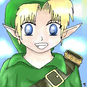
Fluffysheep
(Feb 17, 2004)
Ok, I could really use some tips for the lineart here...I'd be very happy if someone could help me to make it smoother and nicer. Thanks :) |
| ||||||||||||||||||||||
| Public Boards/Intermediate | |||||||||||||||||||||||
|
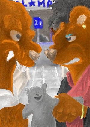
DinoFlorist
(Feb 17, 2004)
Why do retailers always underestimate the seling power that tickle-me plush toys have?
dixielandcutie (Feb 18, 2004)
lol, dino. i have no idea...looks like apromising start. cant wait to see whatcha do with it.
alice_the_one (Feb 18, 2004)
hey?do you know how to scan pictures on? hey dino! i love your picture
Yair (Feb 18, 2004)
Why not cutting it into half? So every father had an unforgotten gift for the sake pleasure and joy of his beloved child? |
| ||||||||||||||||||||||
| Public Boards/Beginner | |||||||||||||||||||||||
|
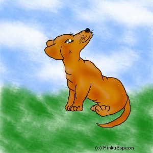
PinkuEspeon
(Feb 16, 2004)
This is what my dog looks like. Do you like the shading... I am trying to learn how to shade using the shi-painter. That's the only painter I'm going to use. Okay... well... just post comments on this and tell me how you like it. I will be adding a background soon. On version two. That's the last version of this. But, I haven't started on the background (v. 2) yet...Oh, this is the finished drawing. Make your main focus the dog. Don't mind the background. Tell me how I'm doing on the shading. Please leave comments telling me how I could improve.
dixielandcutie (Feb 18, 2004)
your shading is definitely improving a lot. great work! few things to maybe look at while you're workig on it..his rear paw looks kinda bent funny, and try and make the background more solid rather than having all that white space. keep up the good work!
Knockoff (Feb 18, 2004)
Hmmm, not bad. The face looks good, though the ears need just a little work.ear: They should be so pointy on the bottom, and the should be a little smaller. The front paws look good, but the back ones, look a little smushed. backpaws: They should be just a little longer, and the one closes to us should be facing up, or mabby it should, but it doesn't look right (like I said mabby just a little longer) The wrinkles where the dog bends are good, except the one is indented to much, and it makes the dog look a little fat. Shading: I think your getting the hang of shdaing though, it doesn't seem to have a light source. I think the background could have a little more detail, jsut not textures,. Its still good, and your getting better. |
| ||||||||||||||||||||||
|
larcilem
(Feb 17, 2004)
Wooowee.
foxman8245 (Feb 18, 2004)
wow.. I didnt even see the fairy at first glance... pretty cool.
dixielandcutie (Feb 18, 2004)
cool use of color! maybe a tad more shading in the bg? but i like the water. overall, great work!
PinkuEspeon (Feb 18, 2004)
Oh, I see the faery. Very... uhm... neat! ^_^
darklittlewolf (Feb 20, 2004)
tht really nice ....*in happy place* good |
| ||||||||||||||||||||||
| Public Boards/Intermediate | |||||||||||||||||||||||
|
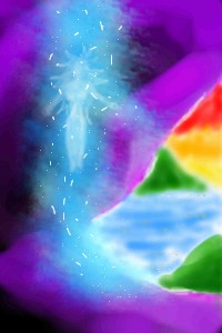
lp_phaery
(Feb 17, 2004)
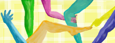
I was focusing more on colour with this pic
Tuukke (Feb 17, 2004)
haha, awesome pic! different from the others. quite abstract. the colors are nice, and the background. that blue hand is a bit weird? :) nice picture, a bit more shading could be nice.
dixielandcutie (Feb 18, 2004)
that is a really neat idea. the colors are so very cool. and im lovin the bg
alice_the_one (Feb 18, 2004)
very intriguing i love it sooo divine!!! |
| ||||||||||||||||||||||
| Public Boards/Beginner | |||||||||||||||||||||||
|
YukiEiriSan
(Feb 17, 2004)
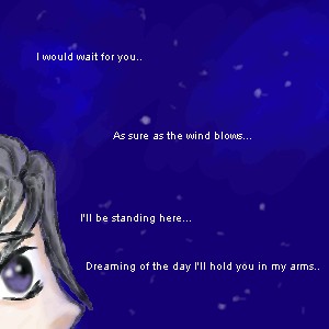
Not finished.. But what do you think? I mean.. Not my best obviously. >< But It's good for now..
dixielandcutie (Feb 18, 2004)
i think its lookin pretty cool so far. ill be interested to see whatcha do with it
YukiEiriSan (Feb 18, 2004)
Yeah. ... I drew this when I was trying to fix things that I screwed up with my boyfriend... SO my hand was shaking and I was upset. It's not the best drawing I'll admit.. But.. Maybe I can fix it.. That eye is waaay too big. |
| ||||||||||||||||||||||
| Public Boards/Advanced | |||||||||||||||||||||||
|
Axil62
(Feb 17, 2004)
Horsey
snow_child (Oct 22, 2004)
hey frank frazette! i'm drawing this one too on my dads garage door. why did you block it out?
Pkingsora (Jan 21, 2005)
O . O maybe he blocked it out becuase of art thieft...anways I really like it..the blend of colours is amazing!
davincipoppalag (Jan 22, 2005)
Ya.. you cant go back to a previous version and take the black off Dan? This was a great one.
shell (Mar 1, 2011)
god, I really am ignorant. and very ashamed. this looks great |

| ||||||||||||||||||||||
| Public Boards/Beginner | |||||||||||||||||||||||
|
larcilem
(Feb 17, 2004)
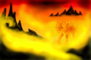
Playing with colors. ;D
Gigandas (Feb 17, 2004)
Nice warm colors here.I like how you sorta hid the cat figure in the yellowish fog.Very nice idea.This is another fun picture to stare at for awhile.Kinda relaxing XD.
Tuukke (Feb 17, 2004)
warm colours and that is also impessive that there is bright red and yellow, and then those black mountains :) that looks nice
dixielandcutie (Feb 18, 2004)
the colors are so cool. and i love the swirly yllow fog |
| ||||||||||||||||||||||
|
BlackLaertes
(Feb 8, 2004)
Yes, I am the Italian Clown. Dressed in red and black. I mark your trail, follow you around. Wait for you to turn your back. I am the one whose mask can't be taken. I am the one whose soul is forsaken. Yes, I am the Italian Clown. Dressed in Red and Black.
Gigandas (Feb 17, 2004)
please load,please load.........ugh....not again^^;;;.My comp must hate your pics or somethin...but I wanna see 'em danget><.Once again, all I can say is that from the thumbnail that it look really cool....><....I hate my computer^^;;;;
foxman8245 (Feb 18, 2004)
I had the same problem untill I got cable........ now, speed rules!!
Cytheria (Apr 8, 2004)
This is just freakin' awesome. The tentacles of red plume coming from his head make a really effective visual echo of the tear of blood down his face, and the mood created by the absence of eyes and his wasted posture make the red parts of the costume remind me of exposed muscles. If you chose to change anything, I'd request to see his hands, since they might provide some of the expression of emotion denied by the mask of the face.
BlackLaertes (Apr 11, 2004)
I would, cytheria, if I could ^^;; I didn't have enough space! And I don't think I can change the width of the drawing |

| ||||||||||||||||||||||
|
BlackLaertes
(Feb 7, 2004)
This is me...I think...it started as a self-portrait, but now I'm not so sure...ah well.Sorry, this sucks, but for the record, the flames are *supposed* to look sketchy!
Gigandas (Feb 17, 2004)
Danget, another picture my computer can't support in loading.....><.Because of that, all I can say is that this pic looked like Sephiroth as a thumbnail pic^^.I can't make it out too well being that small(in the thumbnail), but I'm sure you did a great job with it^^.
marcello (Feb 18, 2004)
It's quite possibly not loading because it's a PNG image... you might want to try switching to a real web browser like mozilla. It seems as if yours cannot load PNG images. What browser are you using?
Cytheria (Apr 8, 2004)
The winsome, distant expression of the girl is really singularly executed -- it suggests a narrative that truly makes me wish it was the cover to a novel.I'm also keeping up with your tarot series: you've made incredible works with your freehand style, but if you feel comfortable continuing the tarot series with tools instead to create that sense of surreal fractured geometric forms, by all means make that choice as the artist! Keep up the awesome creations! Give us more to see, Kiku-chan. |

| ||||||||||||||||||||||
| |||||||||||||||||||||||
| 2draw.net © 2002-2026 2draw.net team/Cellosoft - copyright details - 1.84sec (sql: 38q/0.75sec) |
drawn in 1 hour 58 min
I like the shading and the clothing rocks, you did a very nice job.