| ||||||||||||||
| Public Boards/Beginner | ||||||||||||||
|
comd
(Mar 12, 2006)
Just starting out. It transformed quite a bit: the original picture was a doodle I made when I was starting out, and I hated it, so I drew over it and made a pseudo-caricature (not really a caricature since I hardly exaggerrated anything) of a guy I know. Reference photo: http://www.feebonics.org/images/genia4_photo.jpg. |

| |||||||||||||
| Public Boards/Advanced | ||||||||||||||
|
comd
(Apr 2, 2006)
Trying a bit more than a head this time since I have all this canvas space in the advanced section. I'm just going to try to copy the photo directly this time as closely as possible.http://www.kristiaknowles.net/images/gallery/fitness/fit2.jpg I'm not sure I'll get anywhere. Thanks all for the encouragement. [Edit] This is the opposite of what I'm striving to do artistically as my goal is to draw more loosely from references (using information from the reference to make a completely different picture, not drawing the reference) and ultimately without needing references at all, but I wanted to try a shot at being unpainterly and more photorealistic: the antethesis of what I've been trying to do. To get the line drawing and major landmarks as accurately as possible, I initially started with a grid for the line drawing. This allowed me to shade and color more loosely without worrying about correcting inaccuracies from the previous stages. I don't think I quite got there as I still got lazy on the shading and didn't quite interpret the values correctly. It looks correct sized down, but not up close.
Zack (Apr 5, 2006)
You might find it an interesting exercise to take a ref and try drawing it at a different angle. As soon as I have more free time I intend to make a number of drawings that are loosely referenced like that; maybe they have the same angle but different lighting, or they have different shading styles, etc. Personally, I see loose references as training wheels and strict references as crutches, but that's in terms of my own artistic goals and not a criticism of other artists here. In light of your goals, I'd say dropping the grid system is probably a good idea.
comd (edited Apr 5, 2006)
Modifying angles, lighting, or the original 3D form of the reference is the kind of stuff I'd like to ultimately do when using references. Just anything that demands the 3D form is understood so that it could be used to produce other 3D forms is what would benefit me most. I tend to be more 2D-oriented when copying photos regardless of whether I'm using measuring devices or just freehanding, and that's useful for copying 2D images, but not for inventing 3D ones. I tend to ask questions like, "what's the 2D shape of this highlight? How does it relate vertically and horizontally to this other mark?" Rather than, "what's the 3D form of this figure"? If I understood the 3D form, then I could invent my own highlights without using the precise shapes in the photograph.I pretty much knew this picture wasn't what I should have been doing when I started on it based on my goals, regardless of the grid (though the grid made it that much worse). I set out only to draw the reference as accurately as possible and nothing more. In that sense, it's one of my biggest failures since that's the last thing I want to be doing in the future as I progress. I didn't even try to experiment with painterly techniques - I was trying to be as unpainterly as possible in this one so that it would look just like a photo. Generally I get the most comments about the painterly aspects of my works when working from photos, but this time I really wanted to try not being painterly (I tend to be painterly for economical purposes, not intentionally). I didn't even really achieve the photorealism I intended to achieve despite the use of the grid for the line drawing, so I didn't even succeed in that respect. While it's completely against my personal goals, I still admire the artists on here who can make their paintings look just like a photograph. I was hoping to achieve it here, but I think I deviated too much in the shading and still relied too much on lines which gave that sort of cartoony effect in places.
frootcake (Apr 6, 2006)
omg biggest posts ever. great pic and i've been a victim of the grid in the past. when the masters of the past were working on frescoes - they couldn't draw straight from life, so they did their preliminary drawing and they would grid that whole wall up before doing some of the greatest paintings ever made, theres no shame :):)
HunterKiller_ (Apr 7, 2006)
Mmm... (damn you essay writters.) |

| |||||||||||||
|
comd
(Apr 1, 2006)
Nothing has been popping out to me from the blank canvas to doodle, so I went back to trying to draw from a photo again, but this time I played around with features even more than usual.Reference photo: http://gallery.amazon.ee/view_photo.php?set_albumName=European_Championships_2005&id=abh I was originally planning to do an orc and sought out a scary-looking bodybuilder for the reference, but I ended up with a wizard instead. This is my first attempt at submitting something in the advanced category. I hope it's okay: I spent ages on it, and I wanted to have the extra space available for revisions since I'm always running out of space.
woah_pockster (Apr 2, 2006)
I'm loving all of your work dear, this definatly belongs on advanced. keep up the good work, can't wait to see what you do next =] <3
Opium (Apr 2, 2006)
I really like this! did you really spend that much time on this?? Now that's patience. He looks so much like someone I know....I can't put my finger on it...
Sweetcell (Apr 2, 2006)
Wow just..... wow. You belong, believe me.Reminds me of General Zod from Superman. Without the crown. Version 1 looks like a comicbook panel. Version 2 looks like a bronze statue. And the 3rd I mentioned. WOWZERS.
Miss_DJ (Apr 3, 2006)
just awesome! love the tendons in his neck..yowza. |

| |||||||||||||
| Public Boards/Beginner | ||||||||||||||
|
comd
(Mar 30, 2006)
123
Moosh (Mar 31, 2006)
...Yikes. D:
davincipoppalag (Mar 31, 2006)
This would have been great when we were all doing Halloweeny pics ..hehee she sorta looks like Rush Limbaugh.. hehe
zep (Mar 31, 2006)
nice!! i like the colouring...and the face of course :) |

| |||||||||||||
|
comd
(Mar 29, 2006)
Just doodling around.
davincipoppalag (Mar 29, 2006)
I keep seeing more things in that guy. This is very imaginative.
Skai (Mar 29, 2006)
DOODLE MORE. <333
IkariIreuL (Apr 25, 2006)
Looks like that alien from simpsons
Sweetcell (Apr 25, 2006)
I wish you would work on this a bit more comd, it's a fabulous detailed piece. Color color color.... |

| |||||||||||||
| Public Boards/Intermediate | ||||||||||||||
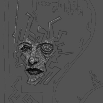
|
comd
(Mar 29, 2006)
Was trying to draw a female face without reference but ended up hating the result, so I started messing with the right eye which I especially disliked and then ultimately just started doodling random, disjointed shapes all around her face.
woah_pockster (Mar 30, 2006)
very cool <3 I'm surprised there aren't more comments =]
Sweetcell (Apr 1, 2006)
It has a Giegeresque feel to it. This will be great.
DeadlyBlondeArcher (edited Apr 1, 2006)
pretty cool stuff, David...looks a little bit like one of the coneheads from Saturday Night Live... :) (I like the labyrinth design inside the outline of her face) |
| |||||||||||||
|
comd
(Mar 29, 2006)
Searching for a feeling or a shape while watching T.V.I couldn't find any shapes I wanted in my original scribble, but the void gave me some ideas. Couldn't really find shapes, so I went with the mood I felt from the void after tinting it with a red background and some blue darks.
davincipoppalag (Mar 29, 2006)
Creepy lookin fella! |
| |||||||||||||
| Public Boards/Beginner | ||||||||||||||
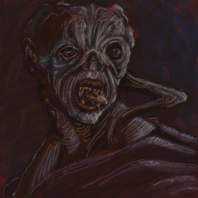
|
comd
(Mar 12, 2006)
Just scribbled over the original image since I didn't like it.
DeadlyBlondeArcher (Mar 29, 2006)
I can sincerely say that I like both of them. The second version you say you "scribbled" over... I think it looks a bit more like Monet impressionist strokes insted of scribbles. They are both really interesting and pleasing to look at.
davincipoppalag (Mar 29, 2006)
I like them both, too. This latest one sort of looks like a combination of Anthony Hopkins, and Charles Laughton.
patienceisoverrated (Mar 30, 2006)
Anthony Hopkins and Charles Laughton.... on a stick!!! ...I'm sorry. I like this thing you do where you add colour/value with little short lines. Looks cool, very different from other stuff seen here.
comd (edited Apr 4, 2006)
Thanks everyone, but yes, I was really wondering what was up with the comments. Did everyone else realize this is a head impaled on a stick with blood coming out of the eyes and the eye on the right being pushed out of the eye socket? I think it's really ugly and nasty: a terrible thing to look at. I was in a terrible mood when I doodled this, and it was really frustrating to me that I couldn't delete that original version which wasn't even marked as finished. Now I wish once again that I could delete, as this is a thing of nightmares.The short little strokes and scribbles are really just me being lazy. I want to not be so painterly and blend things in, but I had a hard time doing this in lascaux. In painter, I tend to paint this scribbly way at first, but then I use the blend tools to quickly smudge them into these nice smooth regions of color. I can't really do that so easily in lascaux. :( |
This is hidden because it is rated Extreme. Edit your privacy settings to make it visible.
| |||||||||||||
|
comd
(Mar 25, 2006)
I don't think I'm ready for this angle yet.
comd (Mar 26, 2006)
Hmm - he does look kind of like Don Knotts. I was trying to make a guy who looks tougher, but oh well.
Gigandas (edited Mar 26, 2006)
Hmm, if you're going for tougher, I think first thing you might wanna do is, get rid of some of the 'aged' definition in his face. You'd especially wanna lighten up on the wrinkling below and around the eyes, and the lines going all the way around the mouth (mostly that bit under the mouth). Another tip to making a 'tough' looking character would be to go for a more square-er face, especially in the jaws (widen them and making the angles of the jaw, sharper).Hopefully this will help some :-/...
comd (edited Mar 26, 2006)
Thanks Gigandas - this is just a construction schematic, so the contour lines are there not to add character but just for me to establish a feel for the topology. By tougher I just mean not necessarily comedic or prone to caricature, as Don Knotts certainly is (not necessarily a tough character, but just some head with a very prominent skull which doesn't have any really exaggerated features). I'm hoping to find some way to establish the base for a skull-head from which I can get some sense of how to draw heads at different angles, but a Don Knotts head is kind of an odd one to start out with. I'd appreciate any help along the way with respect to anatomical correctness and perspective (digital alterations appreciated). The faster I can construct them without significant errors, the better.
Zack (Mar 26, 2006)
I agree with Gig about tough guys often having a squareness of the face, that kind of hulking-brute look. But I think that wrinkles and such don't detract from a person looking tough; done a certain way, wrinkles and other imperfections can make a guy look wizened and tough. Clint Eastwood has had wrinkles for quite some time but with that squint of his he still looks tough as nails.I'm really impressed by your dedication, comd. If you don't end up improving by leaps and bounds (good as you are already) I think it'd be some sort of cosmic crime. I can't really give you any advice on anatomy or such, but you might try asking Cloxboy about that - he draws tons of faces at all sorts of angles without references. IIRC, he did tons of anatomy drawings back in the day, so he might be able to guide you along the path to anatomical enlightenment. ;) |

| |||||||||||||
|
comd
(Mar 25, 2006)
Just trying to construct heads some more without a reference. I really need help. This one is really boring and symmetrical because of the angle, but I don't think I'm ready to tackle 3/4 views yet (sometimes I can pull them off, but only when I'm lucky - I'm tired of depending on luck).I stopped using antialiasing at the advice of Maiko since it makes the files take so much more space which, in turn, ends up limiting the number of revisions I can make. Besides, the antialiasing doesn't really help me for practice drawings.
davincipoppalag (Mar 25, 2006)
If you can do this without a reference , you're already way ahead of most here. If this is boring, put horns on him , or give him an unusal mouth or ears. I didn't know antialiasing made the files larger, thanks for that.
comd (edited Mar 25, 2006)
Thanks danvincipollag. I want to be able to tackle some complex angles. This one was just a straight on shot, so I just tried to draw fairly symmetrical here. I still got the eyes pretty off. :( I noticed in the thumbnail for the earlier revisions that one was quite a bit higher than the other. I'm still quite stuck at just drawing heads. I still have a long way to go before I can draw full-figured characters at any angle I want without creating a picture I hate. For the antialiasing, it makes a huge difference in file size. I think I would have went past my limit already by now if I had turned it on. |

| |||||||||||||
| ||||||||||||||
| 2draw.net © 2002-2025 2draw.net team/Cellosoft - copyright details - 0.88sec (sql: 29q/0.41sec) |
drawn in 37 min