| |||||||||||||||
| Public Boards/Intermediate | |||||||||||||||
|
stained glass
brushes4
(Mar 4, 2004)
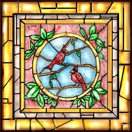
from a card i got years ago. I got as far as i can and I'm not 100% satisfied. I'd really appreciate any suggestions. Oh and subtract about 25 minutes off the timer, i had to watch the tuna?chicken? episode of newlyweds roflroflrofl
Axil62 (Mar 7, 2004)
It turned out better than I had imagined. Nice work.
davincipoppalag (Mar 7, 2004)
turned out wonderful... it looks like a photo of a stained glass window.. you did great!
brushes4 (Mar 7, 2004)
oh my, i'm speechless...thanks so much u 3, compliments from talent like you( and the others) really makes me feel good. it does reassure me that i can draw lol. i think the leading looks a bit um, forced, but im truly happy with it. thanks aggain for the suggestions :o)
DeadlyBlondeArcher (Mar 7, 2004)
This is just perfect - just what I was thinking you needed to do to it, and nothing else needed. :) |
| ||||||||||||||
| Public Boards/Beginner | |||||||||||||||
|
brushes4
(Mar 4, 2004)
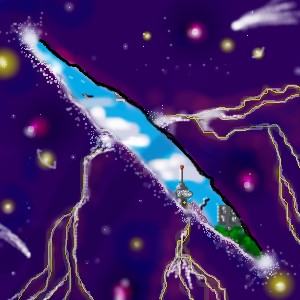
view from the curtains in my old downtown apt. first time in a long time using the lascaux...what the heck is the wand? lol..i accidently clicked it and was from then on annoyed my the moving border lol. HMMM i didnt mean to post it as finished...i want to sharpen up a few things, will gladly accept suggestions as well :o)
foxman8245 (Mar 4, 2004)
this is toooo cool.... twilight zone kinda !!
fleeting_memory (Mar 4, 2004)
this is pretty sweet-reminds me of stuff Thecatspaw used to draw-I love this concept-keep drawing!
fleeting_memory (Mar 4, 2004)
this is pretty sweet-reminds me of stuff Thecatspaw used to draw-I love this concept-keep drawing!already starting to overwork it....so im not gonna even try, sides...i like it :O)
|
| ||||||||||||||
| Public Boards/Intermediate | |||||||||||||||
|
brushes4
(Feb 14, 2004)
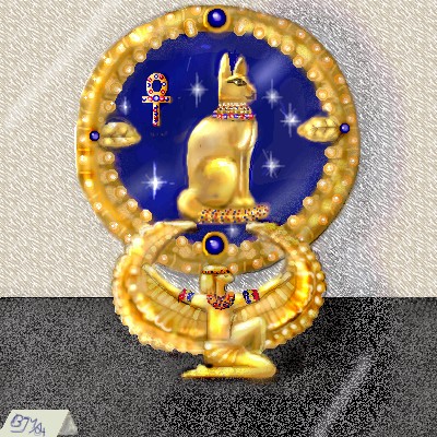
i think it turned out ok, i'm on a bit of an egyptian kick since visiting the ROM but hey, its all good :o)ok i think this has it... dont want to overwork it lol, added a few highlights and touched up a few rough edges...i'm pleased.
Gigandas (Feb 19, 2004)
That's some real nice designs you slapped on that artifact^^.That's also cool how you snuk in your sig in the tag thingy in front of the artifact XD.From the thumbnail, this picture looked like a photo.
Alinnia (Feb 19, 2004)
Hey.. I like that XD That's pretty good.
dixielandcutie (Feb 19, 2004)
oh wow, awesome shading, cool sparkles...and really neat texture. nice work!
DeadlyBlondeArcher (edited Mar 3, 2004)
Wow, how could I have missed all your great stuff? I love this...that is exactly the color of 24k and the way you got those cabechon sapphires so round and glowing is amazing. I gotta check out the rest of it! :) |
| ||||||||||||||
| Public Boards/Beginner | |||||||||||||||
|
brushes4
(Feb 24, 2004)
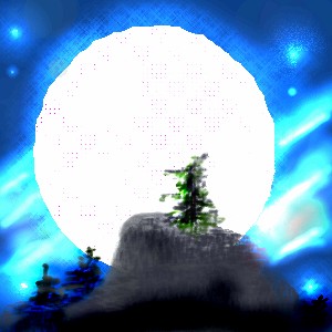
started out with the paper moon idea, then accidently hit the dodge and was tempted to try some northern light type effect. it will be good eventually i promise.
davincipoppalag (Feb 24, 2004)
its good now! I love the background and I can see it will be a really interesting scene already..nicely done
dixielandcutie (Feb 24, 2004)
oh awesome. cool use of textures |
| ||||||||||||||
| Public Boards/Intermediate | |||||||||||||||
|
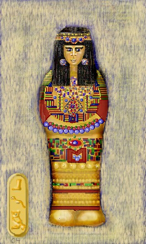
brushes4
(Feb 12, 2004)
inspired by the marvels we saw on a field trip to the ROM. i think shes a little overworked...especially the bg, i aimed to make it look like 4 thousand yr old linen, just looks like mud lol. owell, we like her..and yes i really did put all that time into it lol.
Alicia (edited Feb 20, 2004)
This is great work, I would like a printed copy.:) You can tell you poured yourself into it.:) I took a look at the other one , Yours is better. The other casket is brown and boring, yours is more decorative .:)
davincipoppalag (Feb 13, 2004)
wow..this is wonderful...the detail is amazing..and I think you did a great job on the linen! the eyes bug me...any suggestions? so they look ok to you folks?
davincipoppalag (Feb 15, 2004)
probably remove the highlights.. take a look at this one http://www.louvre.fr/anglais/collec/ae/n2609/ae_f.htm |
| ||||||||||||||
| Public Boards/Beginner | |||||||||||||||
|
brushes4
(Feb 10, 2004)
just what it says, a valentines greeting, and the animation is kinda neat lol
lp_phaery (Feb 14, 2004)
hey this is neat |

| ||||||||||||||
| Public Boards/Intermediate | |||||||||||||||
|
brushes4
(Feb 13, 2004)
i watched "the ring" or at least the ending of it this morning...
Edward (Feb 13, 2004)
hmmm....she looks kinda fat and her arms are too short at least thats how i look at it. i really like the sky and the tree farthest away .
brushes4 (Feb 13, 2004)
ok well her arms are bent up at the elbow...guess i need to shade that area a bit better, and shes in a loose old fashioned nightie...shes also slightly decomposed so shes thinner than the average corpse but the nightie is still loose, and yeah i like the tree too.ok i tried to make the arms look more bent...i hope they do. I'd appreciate any comments, quips and quirks u may have :o)
sal (Feb 14, 2004)
looks cool... dont like the look of the grass tho... doesnt seem right |

| ||||||||||||||
| Public Boards/Beginner | |||||||||||||||
|
brushes4
(Jan 11, 2004)
just having fun, learning and enjoying the possibilitiesok now im done
honeywhiska (Jan 11, 2004)
this is SOOOO PRETTY...reminds me of...those little paintings on teacups OK IM GOING CRAZY
brushes4 (Jan 11, 2004)
actually a coffee mug a :o)
Alicia (Feb 13, 2004)
I like the softness in the flowers in the background.:) |
| ||||||||||||||
|
brushes4
(Feb 1, 2004)
i did it in layers! need lots more practice but at least i know now how to use them lol, thanks to that wonderful tutorial by childlike vampire :o)
Childlike_Vampire (Feb 9, 2004)
Yay! *missed this before* I like the perspective, and the stars in the sky. And the billboard, haha. ^__^ |

| ||||||||||||||
| Public Boards/Intermediate | |||||||||||||||
|
brushes4
(Feb 5, 2004)
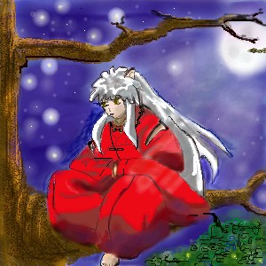
i'm totally addicted to inu yasha, never had the nerve to try a pic, but my son begged me to try so i did,i'd really appreciate some feedback on this,suggestions for improvement, or whatever. thanks :O)
Mafuyu (Feb 5, 2004)
Inuyasha-samaaaaaa!!!*glomp**purrpurrpurr*ok..its a bat in front of the moon(for ozzie :o) and fireflies in the trees. i tried to sharpen a few lines. but his hair is really bugging me...hmm one more try later.ok i tried to finish it up, sharpena few lines and tidy it up a bit, but it says im poutta space, ask th moderator for more...ummm any suggestions how? do i memo? just wait and hope they see this comment? i guess ill find out soon lol.
Neko (edited Feb 9, 2004)
Wow. o.o Is there really anything to improve? Everything just seems to click together. The background, Inu and the tree; colours and the lineart all work in together to create this awesome image. Maybe the only thing that may bug some silly goldeneyes ("I DON'T LIKE IT BECAUSE THAT DOT IS TOO CLOSE TO THAT OTHER ONE!!!1") is that it looks a bit pixelated, but it really only gives it some oekaki-feel. I'd like to nominate this for Showcase ASAP. o/ i guess this is as good as it gonna be. im happy with it though,
|
| ||||||||||||||
| |||||||||||||||
| 2draw.net © 2002-2026 2draw.net team/Cellosoft - copyright details - 1.36sec (sql: 33q/0.62sec) |